WorkWork
Take a gander.


Based in Philadelphia
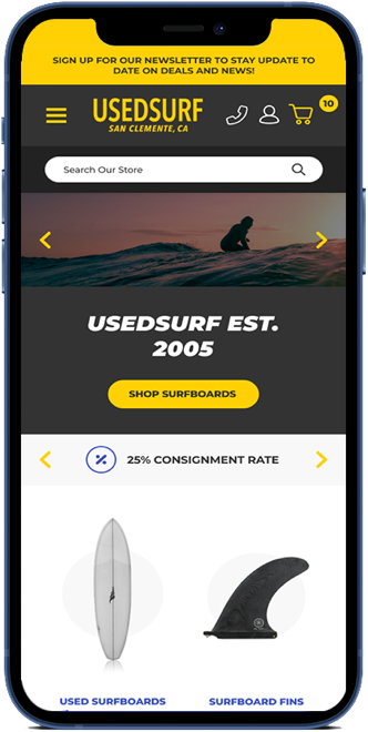
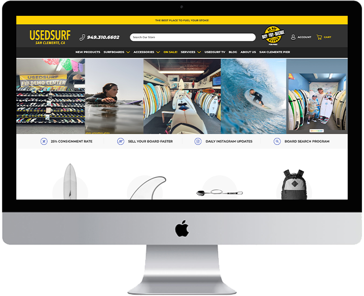
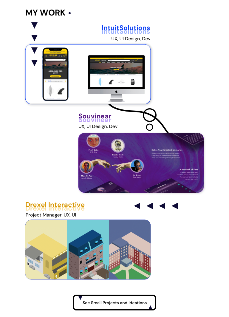
At IntuitSolutions, I worked my first job after graduating from college: a full-time front-end developer, designer, and UX advisor. IntuitSolutions functions as a software and web development agency providing e-Commerce solutions for sites utilizing the BigCommerce platform. They are based out of Old City, Philadelphia, PA. However, after a year of my employment in the office, the company transitioned to remote work during the 2020 pandemic. I left with solid experience working at a digital agency and confidence in imparting my knowledge and expertise.
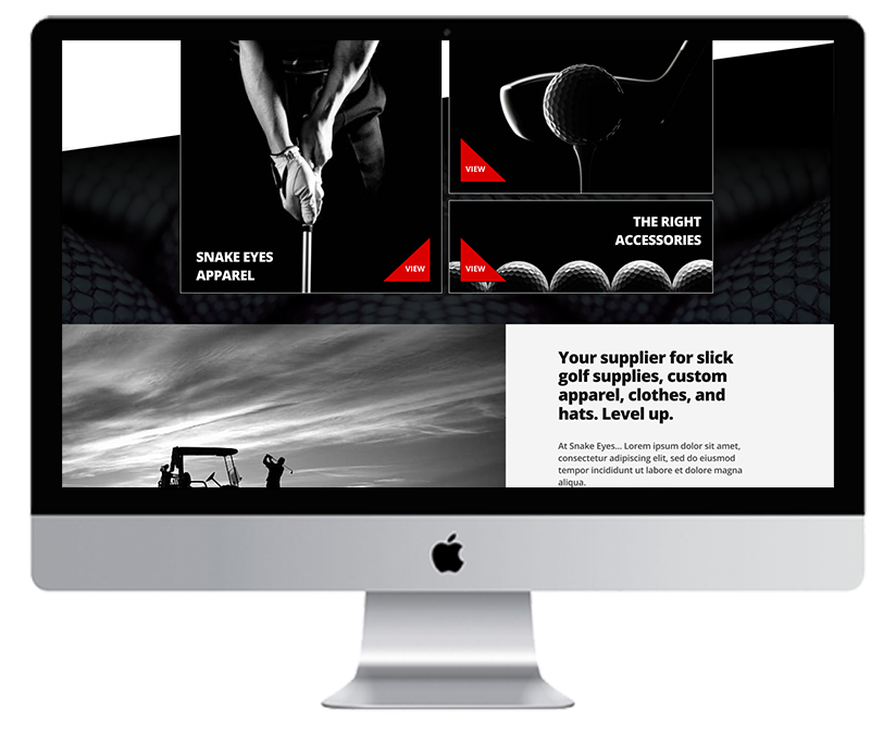
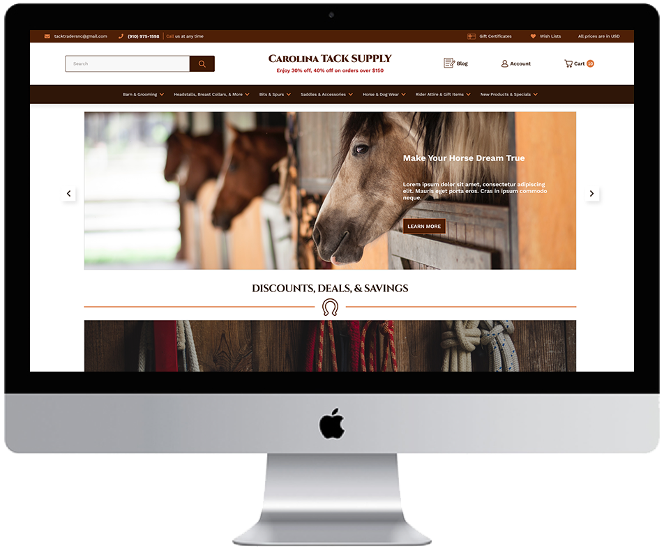
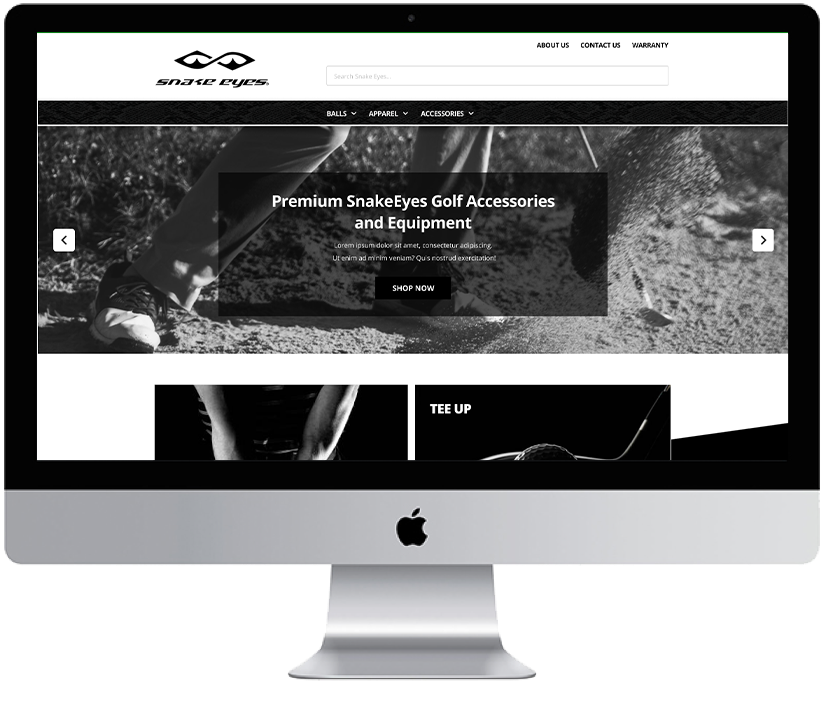
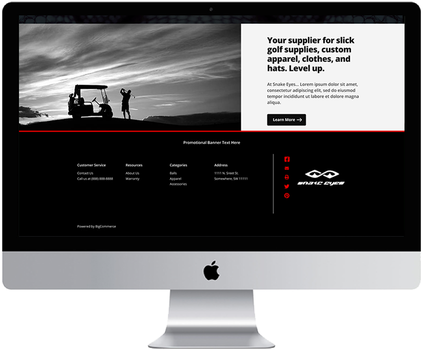
Fully launched sites with live links. I was full-site solo lead developer on development projects, coding the entire website ground-up from our base theme. I was also a team lead developer on full-site website projects with other team members and a developer under other leads. Garnering more design responbilities (as I was hired as a front-end developer) also lead to me taking on some full-site design builds. These are all outlined adjacent for some of the projects I completed while there.
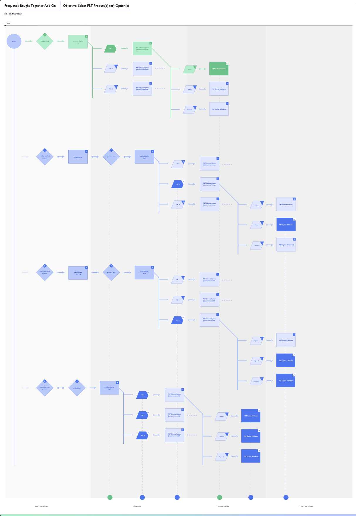
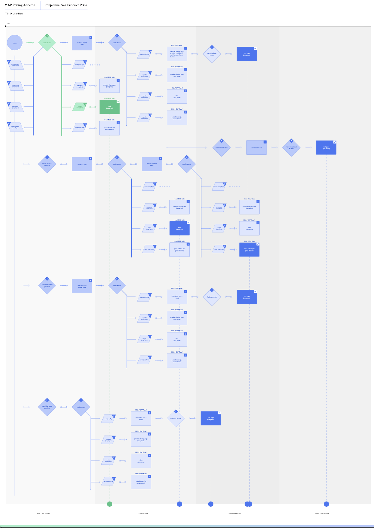
Some of my daily work at the company would involve performing a wide range of digital tasks for clients. Certain tasks could range between taking a few hours or days, but often projects could last for weeks to months (such as full-site development for clients). I utilized my front-end development skills employing knowledge of HTML, CSS, and JavaScript. My workload at the company consisted of full-site development projects, development work orders, recurring client updates, SEO audits, Accessibility audits, UX audits, UX work, design discoveries, client interaction, and full-site designs (wireframe e-Commerce pages with low to high fidelity).
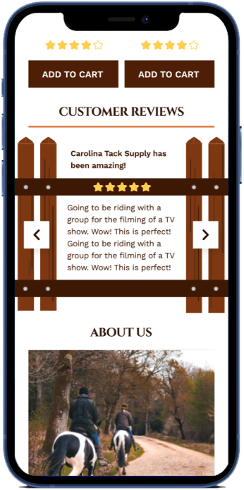
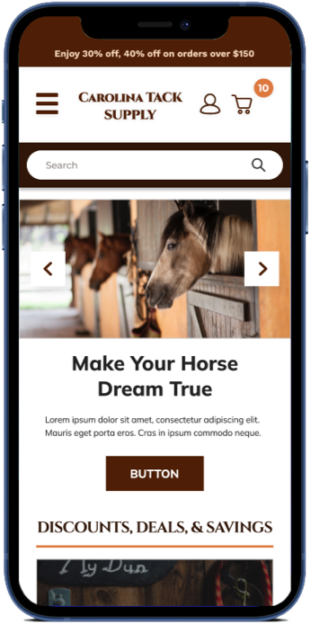
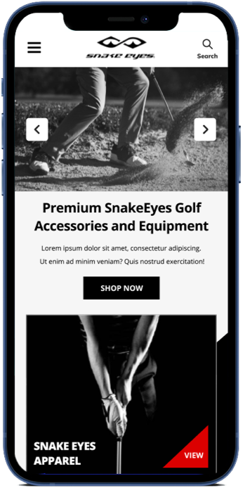
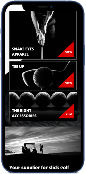
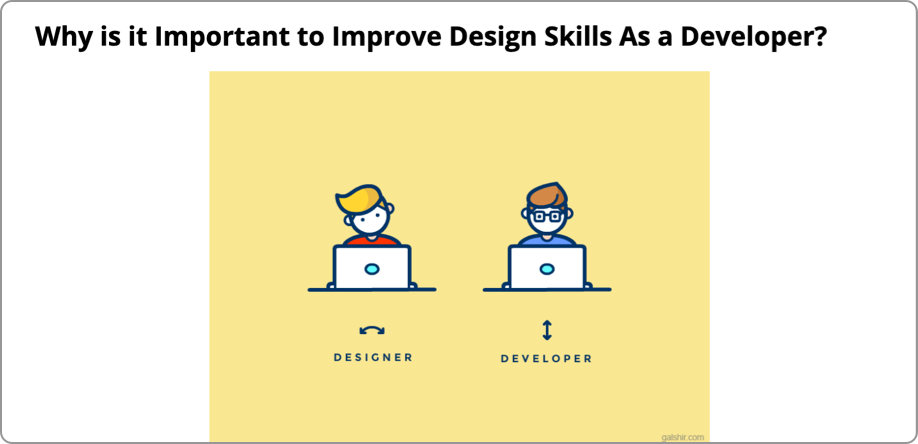
Since working at IntuitSolutions, I introduced three new workload tasks to the team. UX audits, wireframing, and design discoveries are key tools to expanding and learning about the users as well as gathering strategic design/pre-dev information. Most importantly, I felt comfortable using these tools and advocating for them. I know how important these tasks can be to the company, especially the marketing and development teams, and anyone dealing with the frustrations of digital interactions each day.
One of the toughest challenges here was being a more design-minded individual and not being able to express it. There was a different set of values in place for design thinking and practices present. The consideration for UX design (my preferred field) was not at the level I needed to create a positive digital impact. Thus, the big challenge here was attempting to bolster my responsibilities and the company’s to be more involved and set a standard for their design and UX.
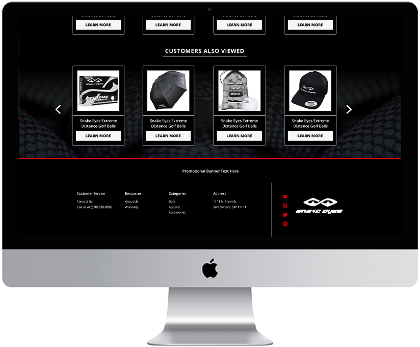
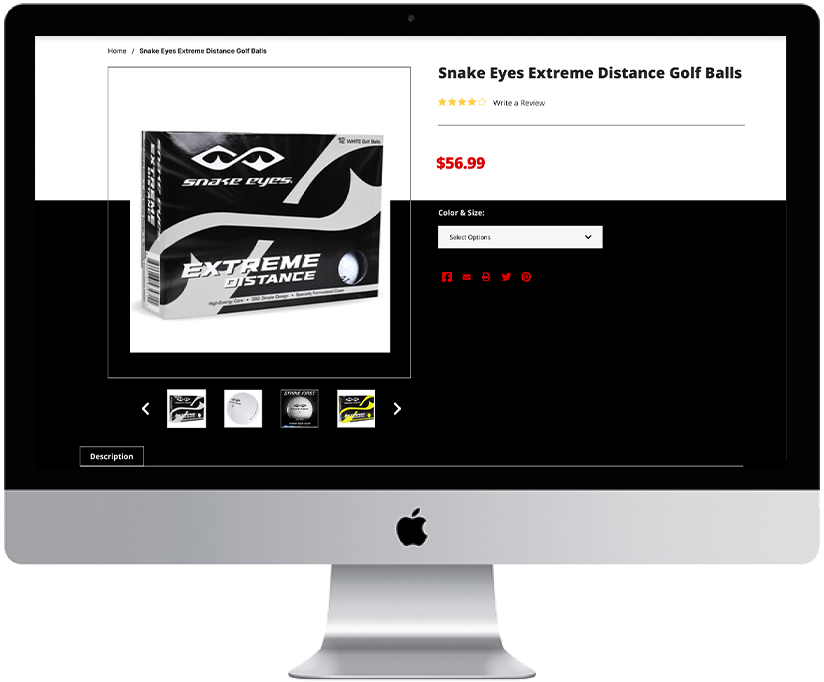
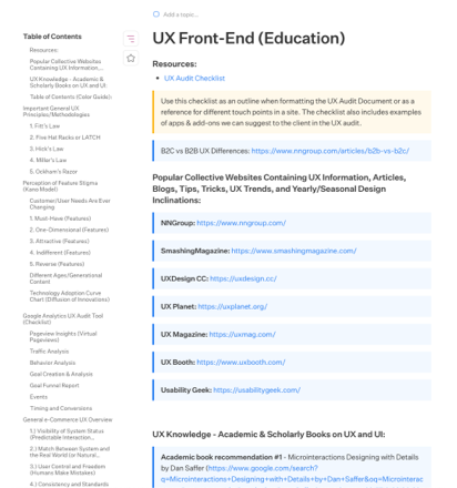
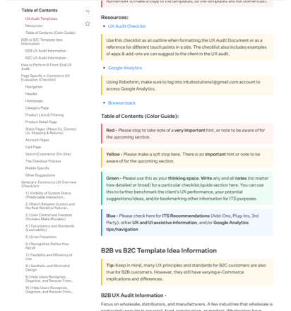
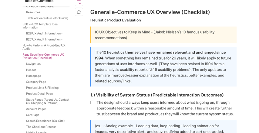
I was one of the only employees to have a skillset in UX, UI design, and front-end development. Therefore, I had the possibility and potential to work on UX tasks, but the company was not yet ready to implement that discipline. While I am grateful for the in-person office experience they provided me, going remote during the pandemic caused obstacles that I am sure many companies faced as well.
My day-to-day duties included managing priority work and completing service that came in the form of design, UX tasks, and development tasks (work orders, add-on installs, full-site builds, documentation, SEO/accessibility fixes). I use quality assurance methods to test site-specific functionality/overall site design and functionality viability across responsive sites (mobile, tablet, and desktop). I communicated with team leads, project managers, and co-workers to ensure everyone was informed about current projects, allowing for efficient planning of initiatives, tasks, and projects. Lastly, I utilized UX, design, and development knowledge to determine feasibility and what is possible when visualizing designs for development and what is viable on the BigCommerce platform.
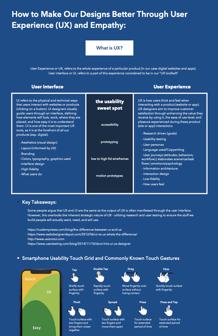
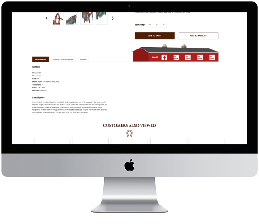
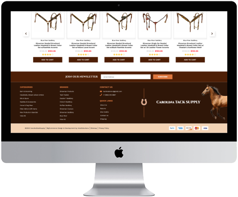
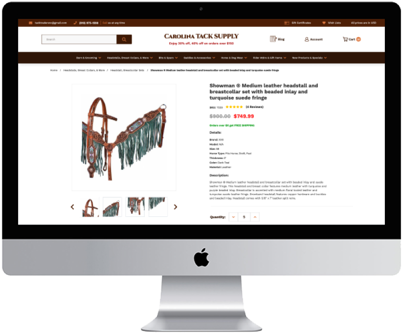
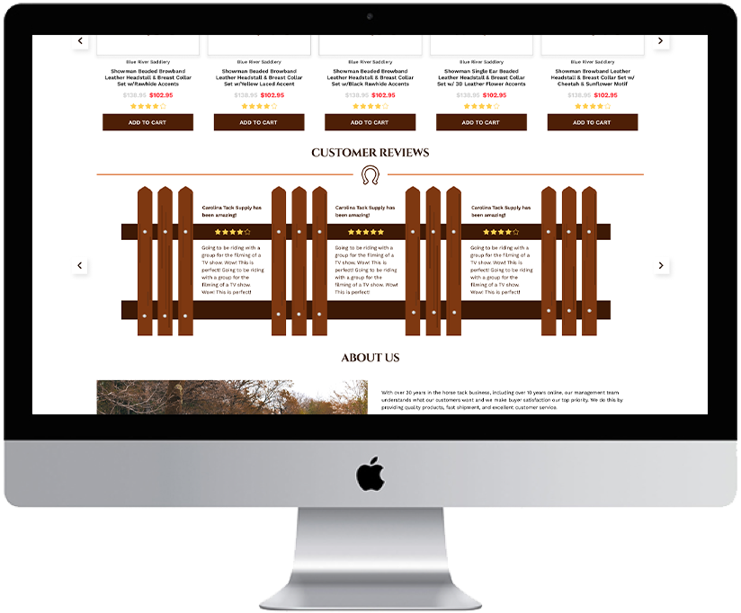
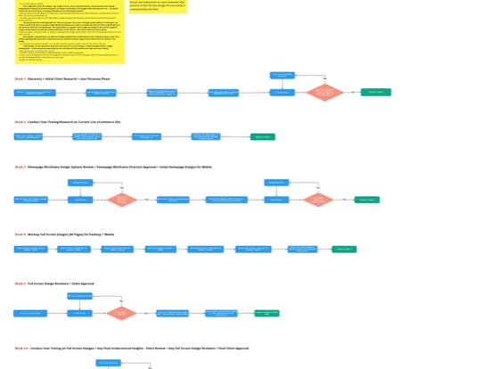
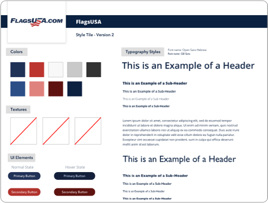
IntuitSolutions was a versatile experience. I was often asked to step out of my comfort zone with certain tasks, using technologies, frameworks, or CMS (content management system) functions I was not acquainted with. However, it was a better learning environment due to that. Contributing to a variety of internal design, UX, development, and client-facing documentation was also a part of my duties. These were insightful, team-based, and analytical exercises. Going into the intricacies of a particular system, technology, or methods/principles was a way for myself and the team to understand, as well as co-workers to come. I am excited to go on future opportunities with the knowledge and skills I have learned working at the company and am appreciative of my exposure there.
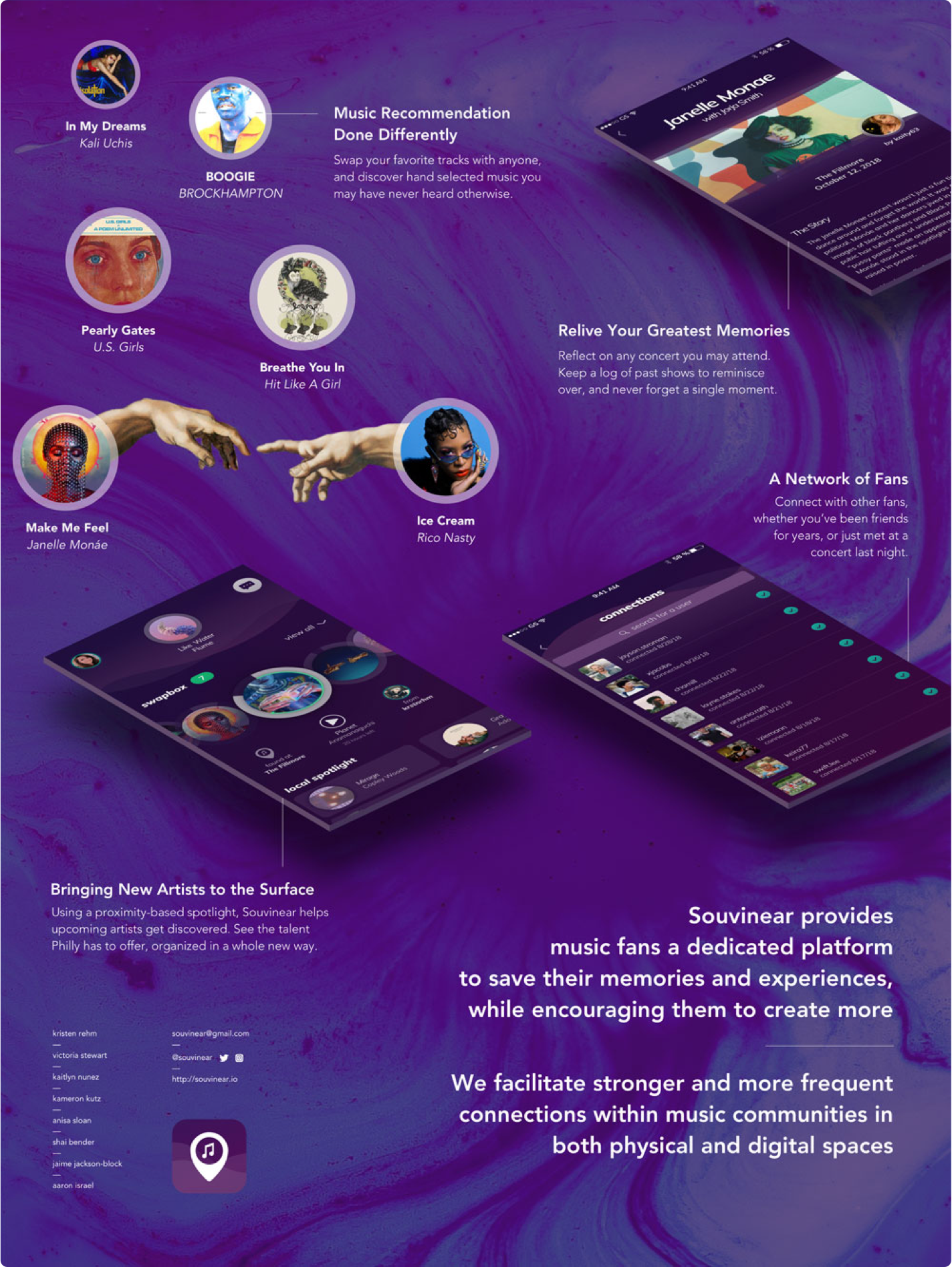

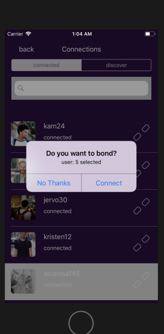
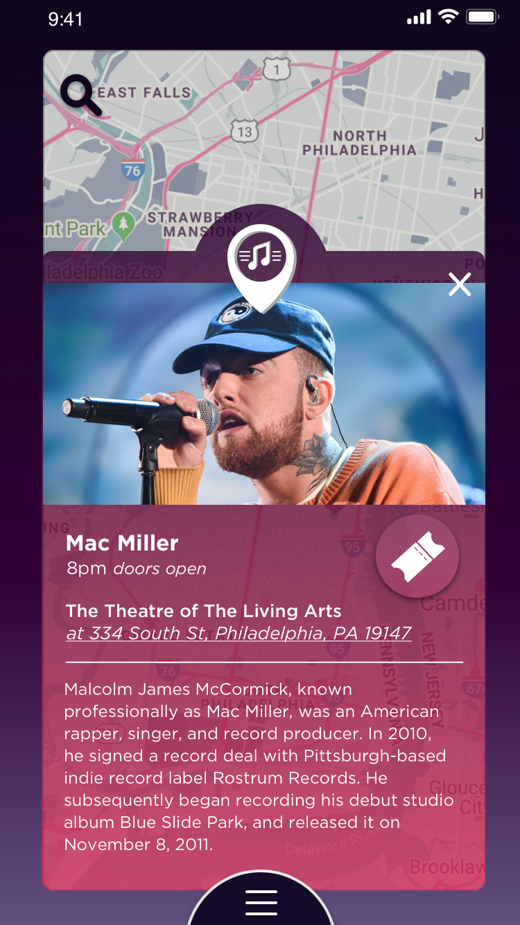
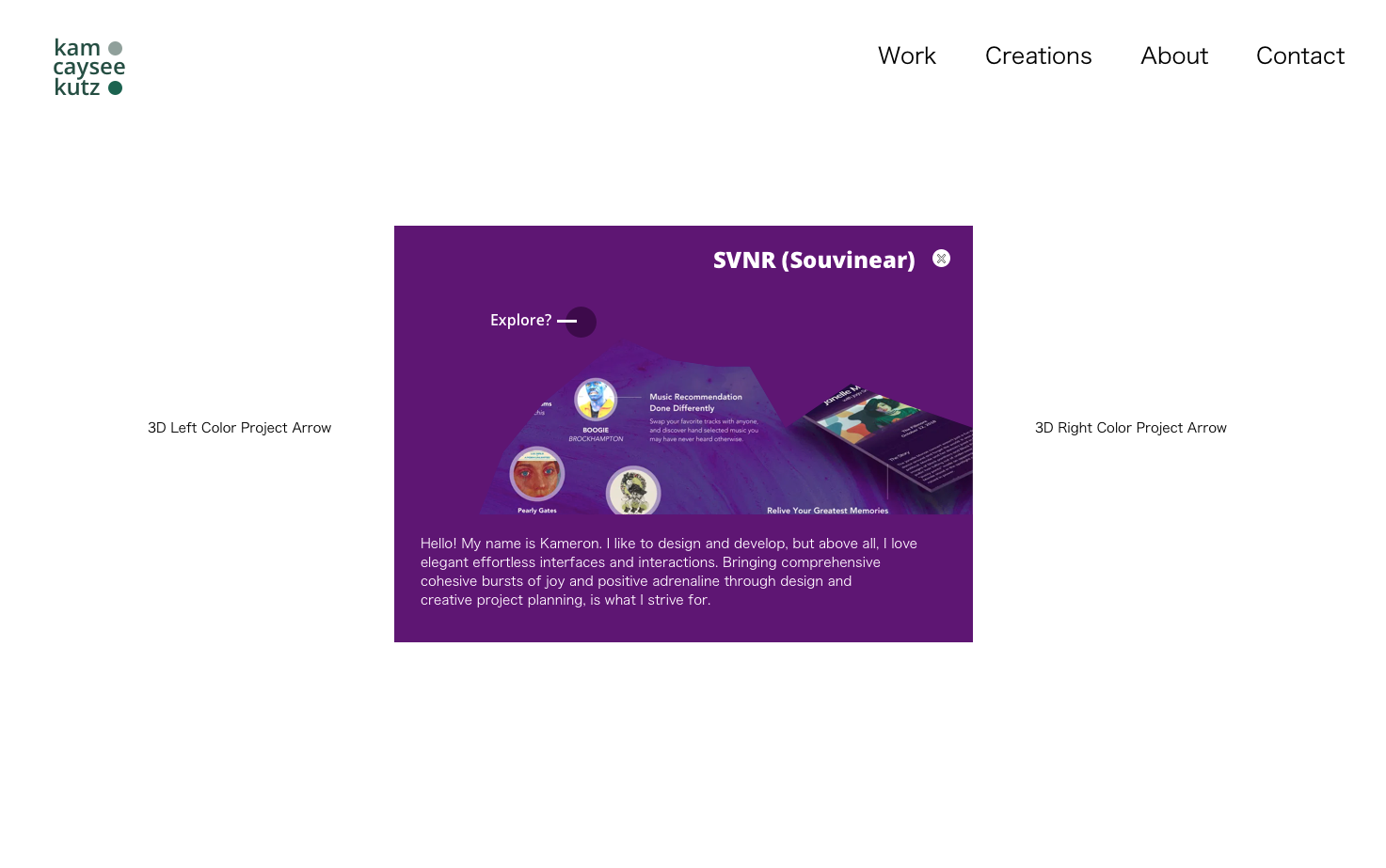
Souvinear was a proof of concept iOS app aimed to provide music fans a dedicated platform to save their memories and experiences. Souvinear encourages users to create memories of their own. Our app functioned to facilitate stronger and more frequent connections within music communities that are both physical and digital environments. With Souvinear you could swap your favorite music with other users and discover curated music recommendations or “Souvinears.” The journaling feature allowed you to reflect on those memorable nights.

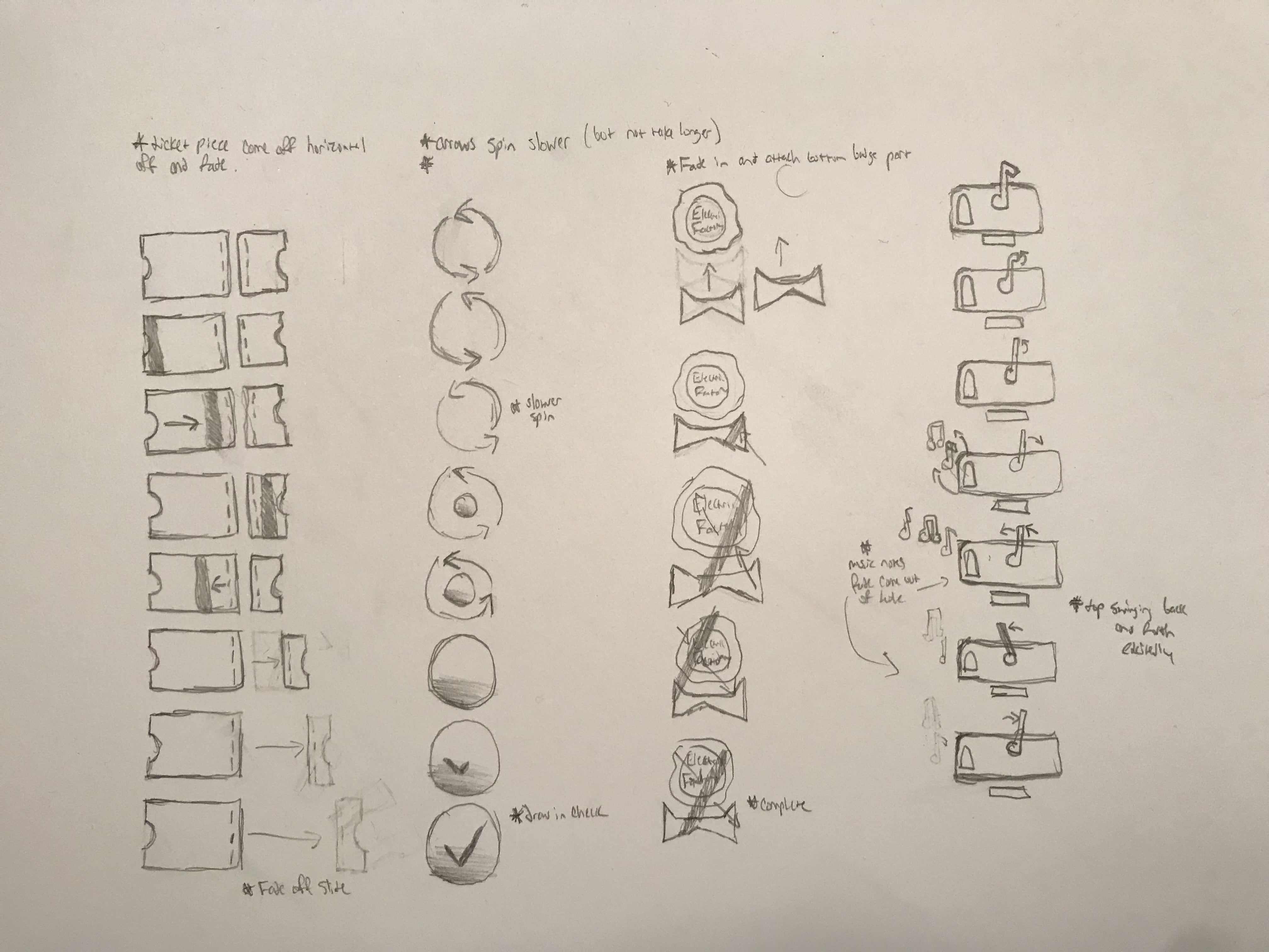
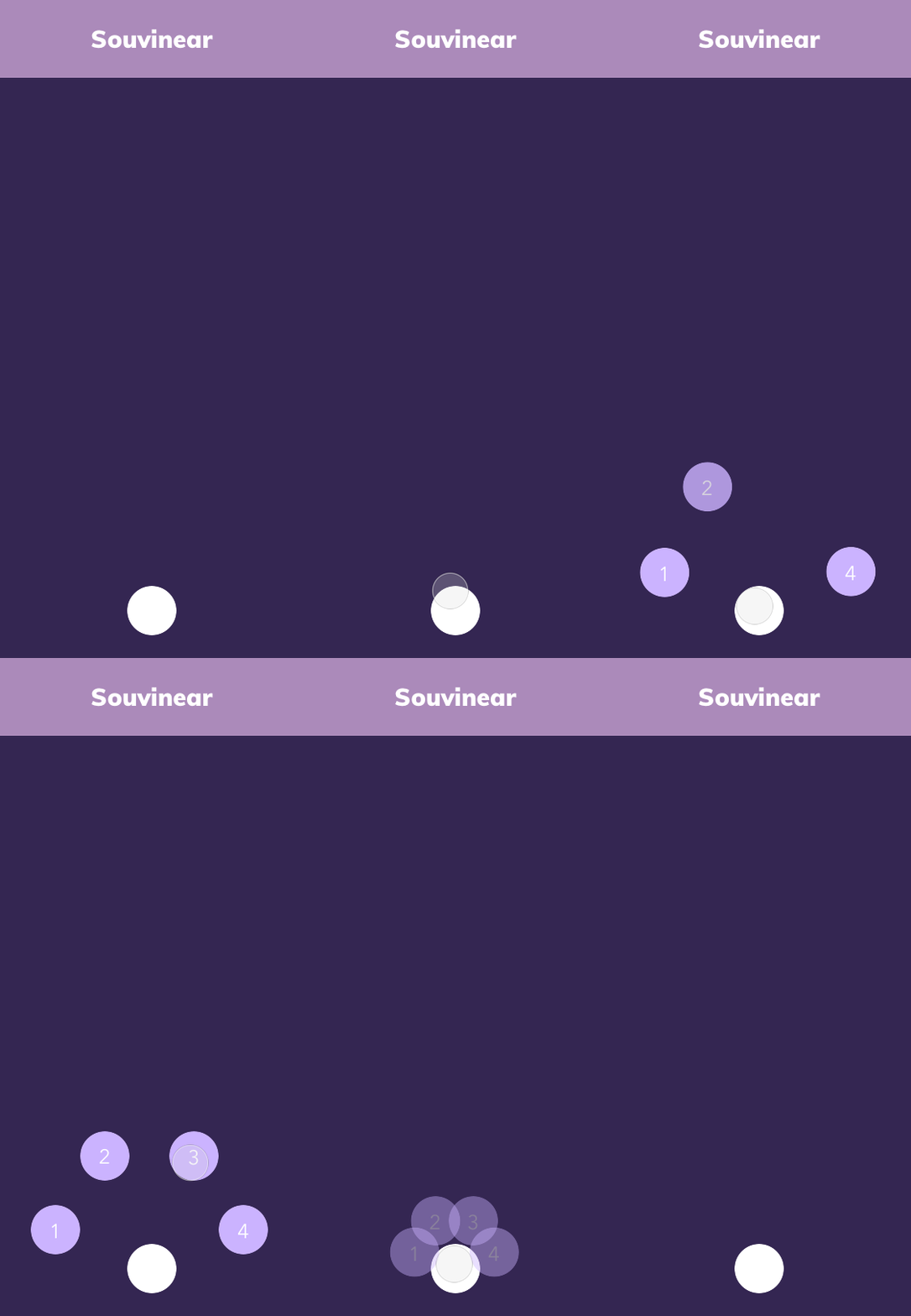
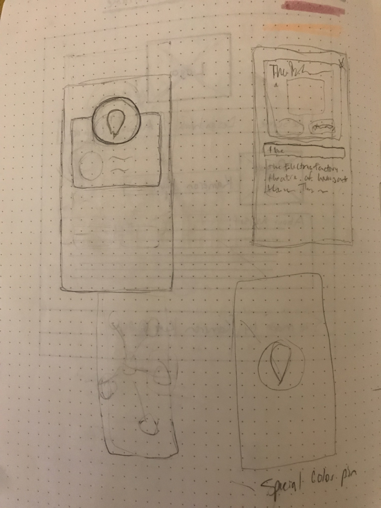
As a front-end designer and developer, I focused on solely front-end systems; which entailed styling (low to high fidelity wireframes, interaction flows, icon work, etc.), basic Xcode development prototyping, and most importantly, micro-interaction animations. I included examples of some of my work during my time with Souvinear. I created multiple documents outlining exactly what micro-interactions needed to be created for the future, functionality analysis/descriptions, and the animation language to be used for micro-interaction elements. The purpose of these documents was to streamline concepts related to functionality, animation, and design guidelines to the rest of the team, so they could keep this in mind when developing or designing. Throughout my senior year at Drexel, we were required to make weekly posts about what we did for the week, what we were planning to do for the next, and any challenges we were having. These posts mainly showed my rudimentary ideas, sketches, and work-in-progresses rather than completed designs and interactions. Most of my posts included links, live demos or examples, and GIFs/design samples.
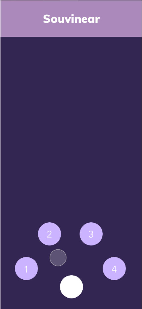
At project conception, we noted that the market for music apps and social media combined was limited. Souvinear aimed to bridge this gap by promoting social sharing features such as swapping songs with another person or sharing a journal post. All time spent on Souvinear could be either discovering new music and experiences or connecting with individuals who have diverse tastes in music.
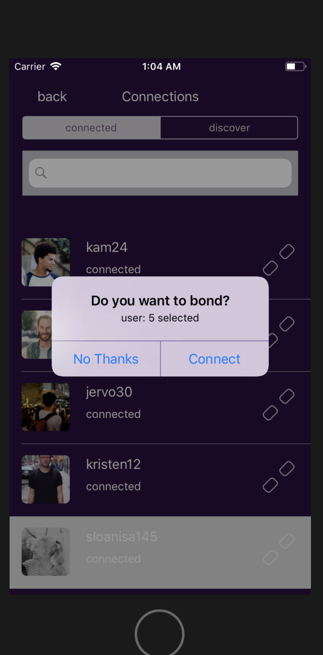
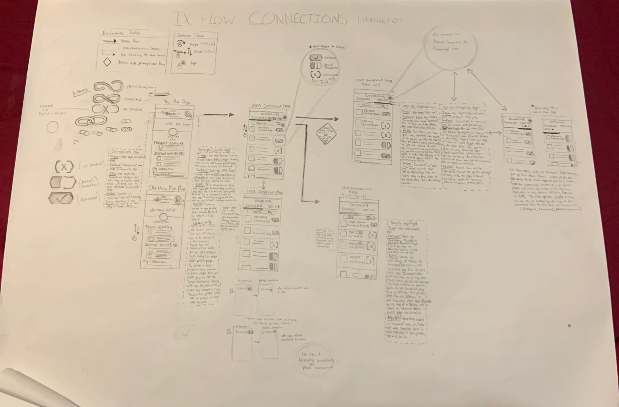
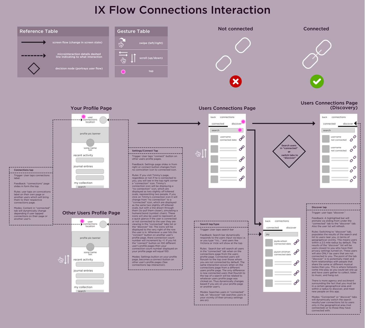
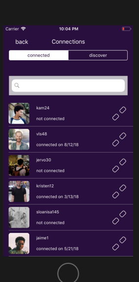
Objectives: My role for the Winter term was to handle the UX, design, and overall base development of the “connections” section (or followers/following functionality) for Souvinear. This included deliverables like an interaction (IX) flow for the connection’s interaction in-app. An IX flow was a detailed tactical look at an interaction, which outlines the flow (steps) of that interaction using arrows, icons, and wireframes in a diagram-like manner. Additional deliverables included an IX flow, I conveyed icons, wireframes, and micro-interaction prototypes to the team. These deliverables were then used as stepping stones to achieve functionality goals or design problems.
The challenge for me definitely resided with the overall large scope of the project, and mastering the techniques of Xcode, considering I had not interacted with it before the Winter term. However, I was able to learn valuable lessons including Xcode strategies (using constraint layouts, segue way performance, basic Swift programming etc.) and scoping projects to the simplest level of functionality and workability.
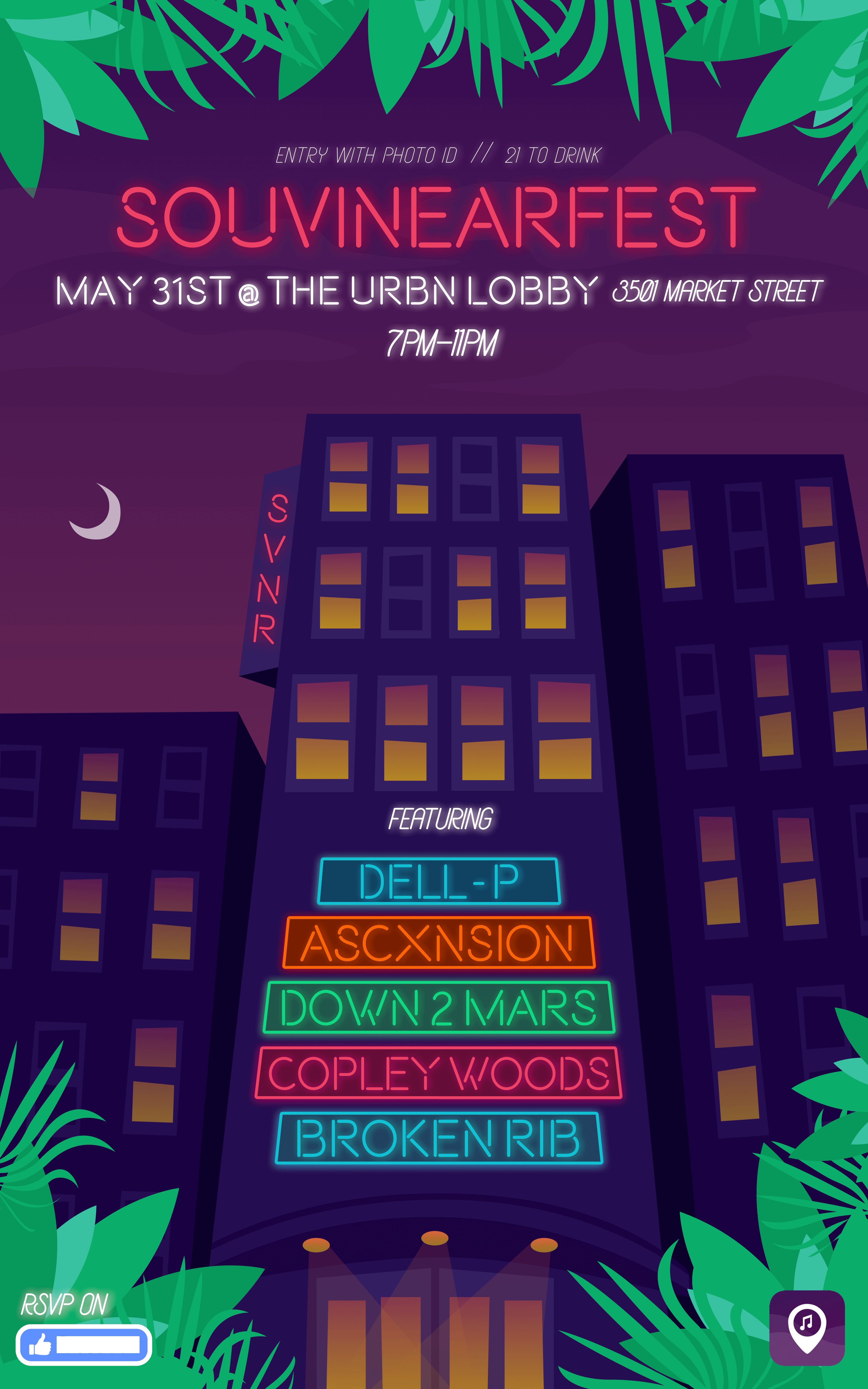
My work required me to make many iterations of any design challenge I was tackling so that I could validly explore all options. The following are just a few examples of some of the work I have completed for Souvinear (high and low fidelity). These examples include progress screenshots, various iterations on designs/micro-interactions, or standalone designs/animation ideas.
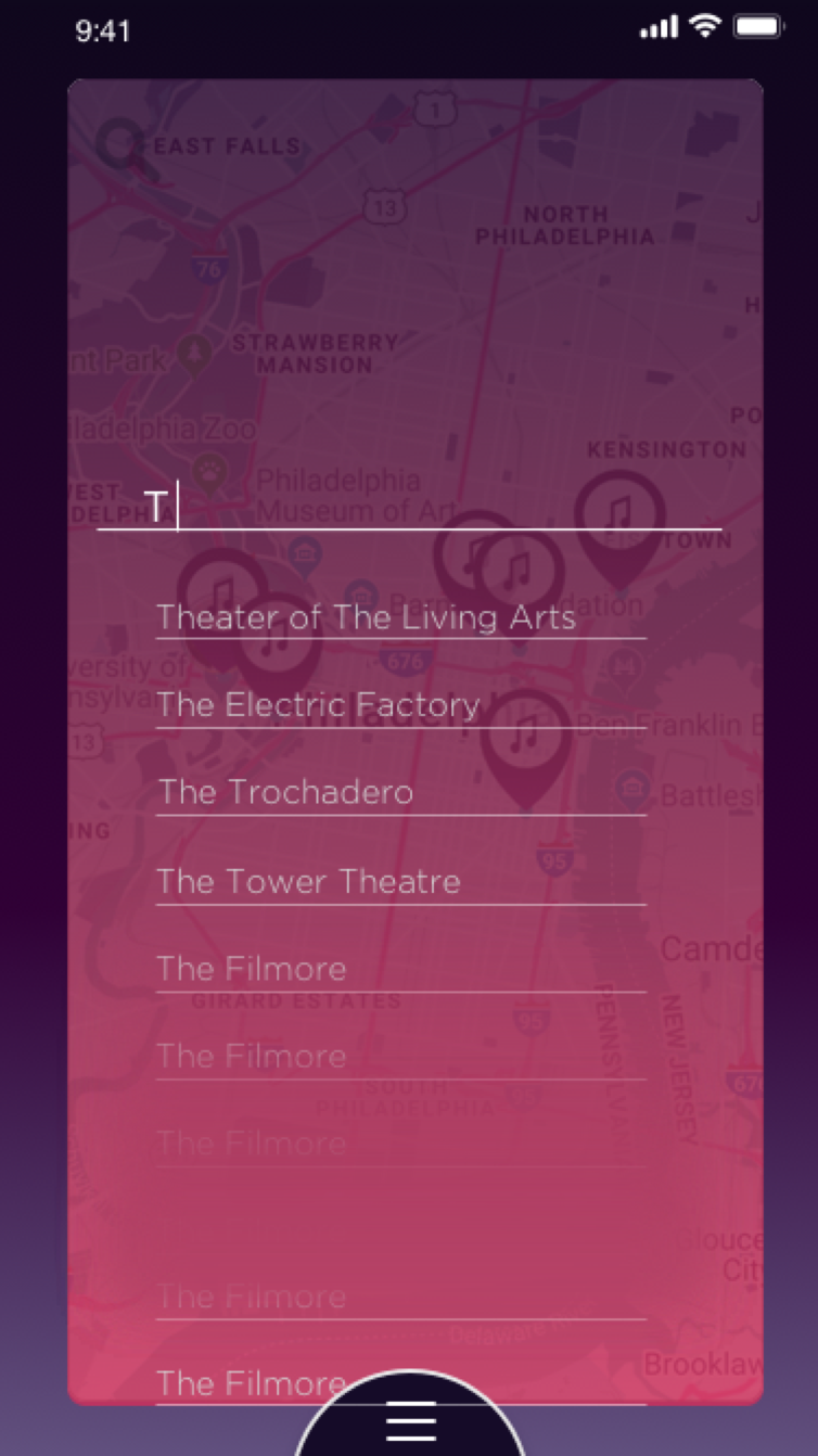
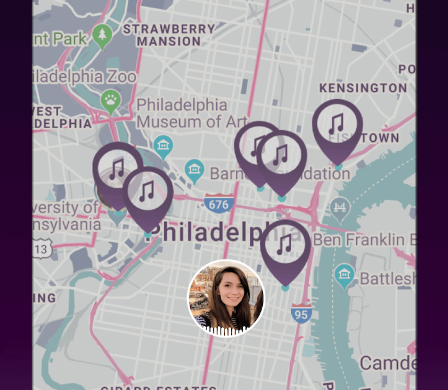
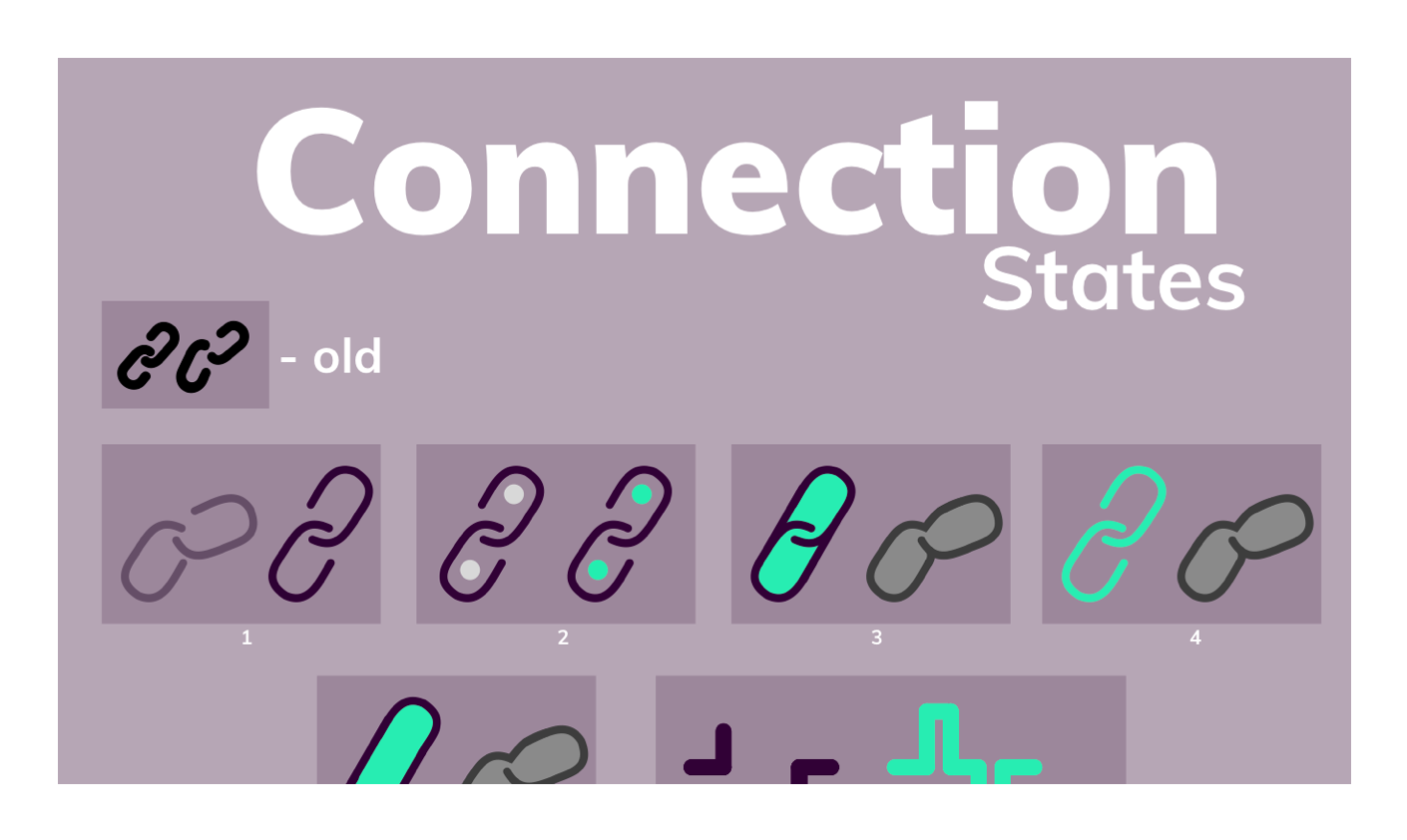
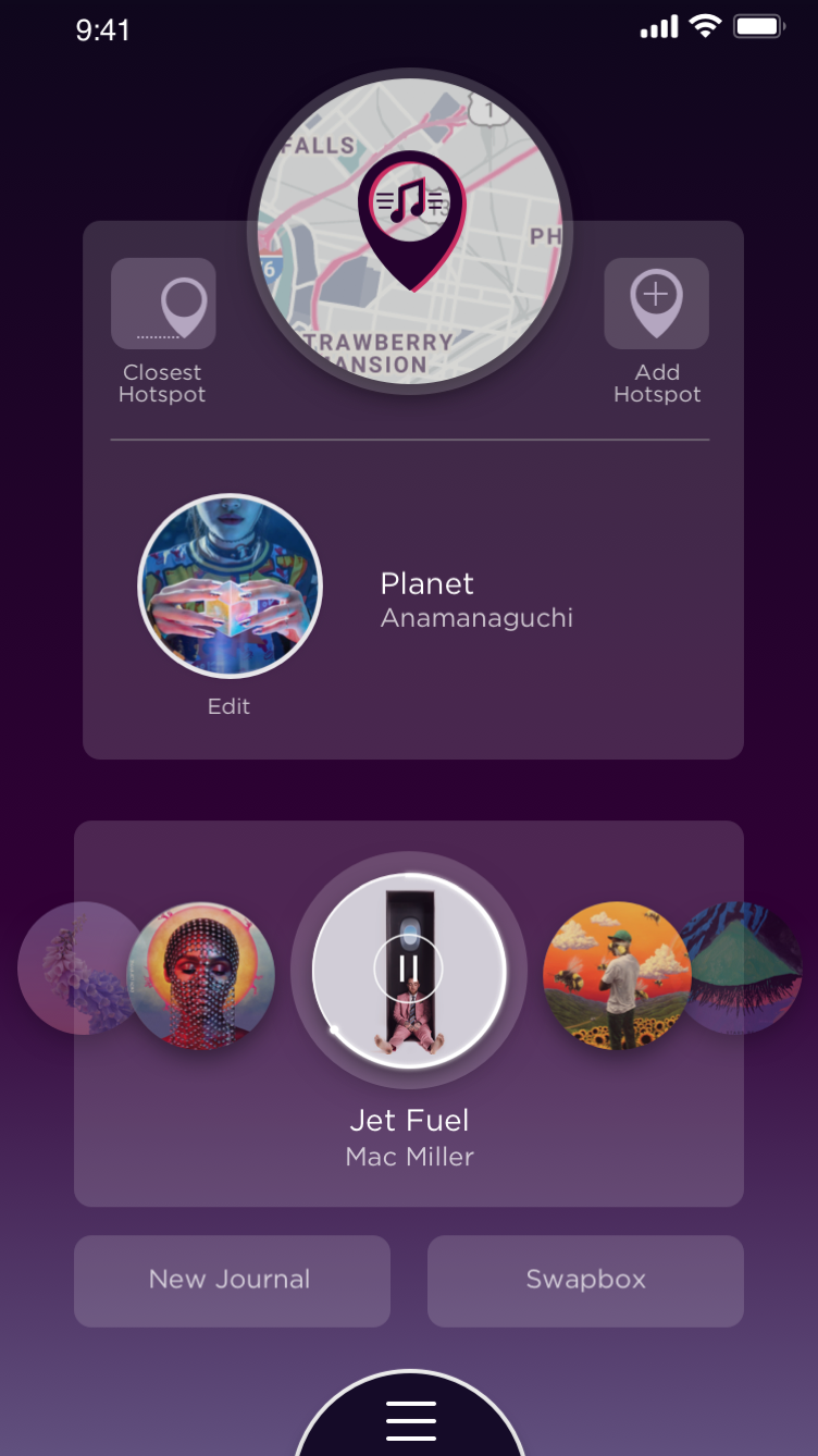
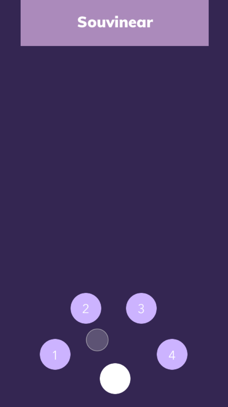
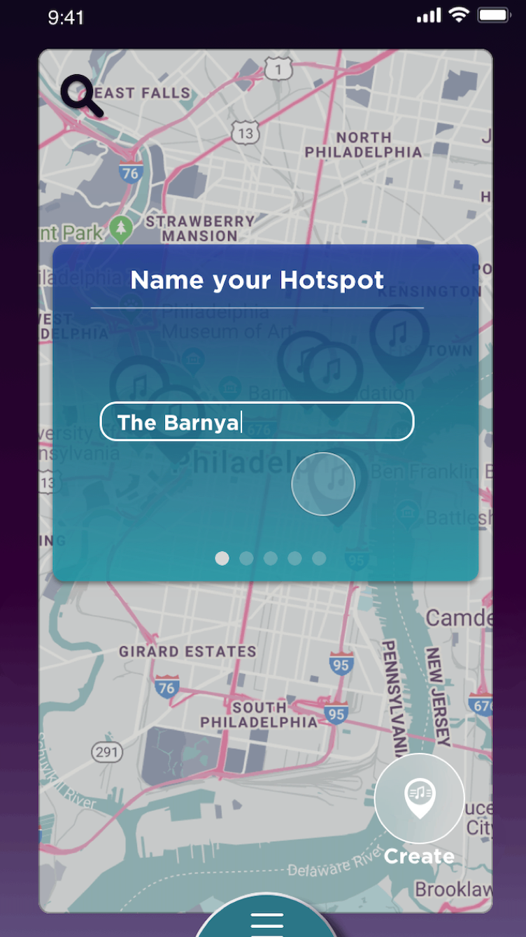



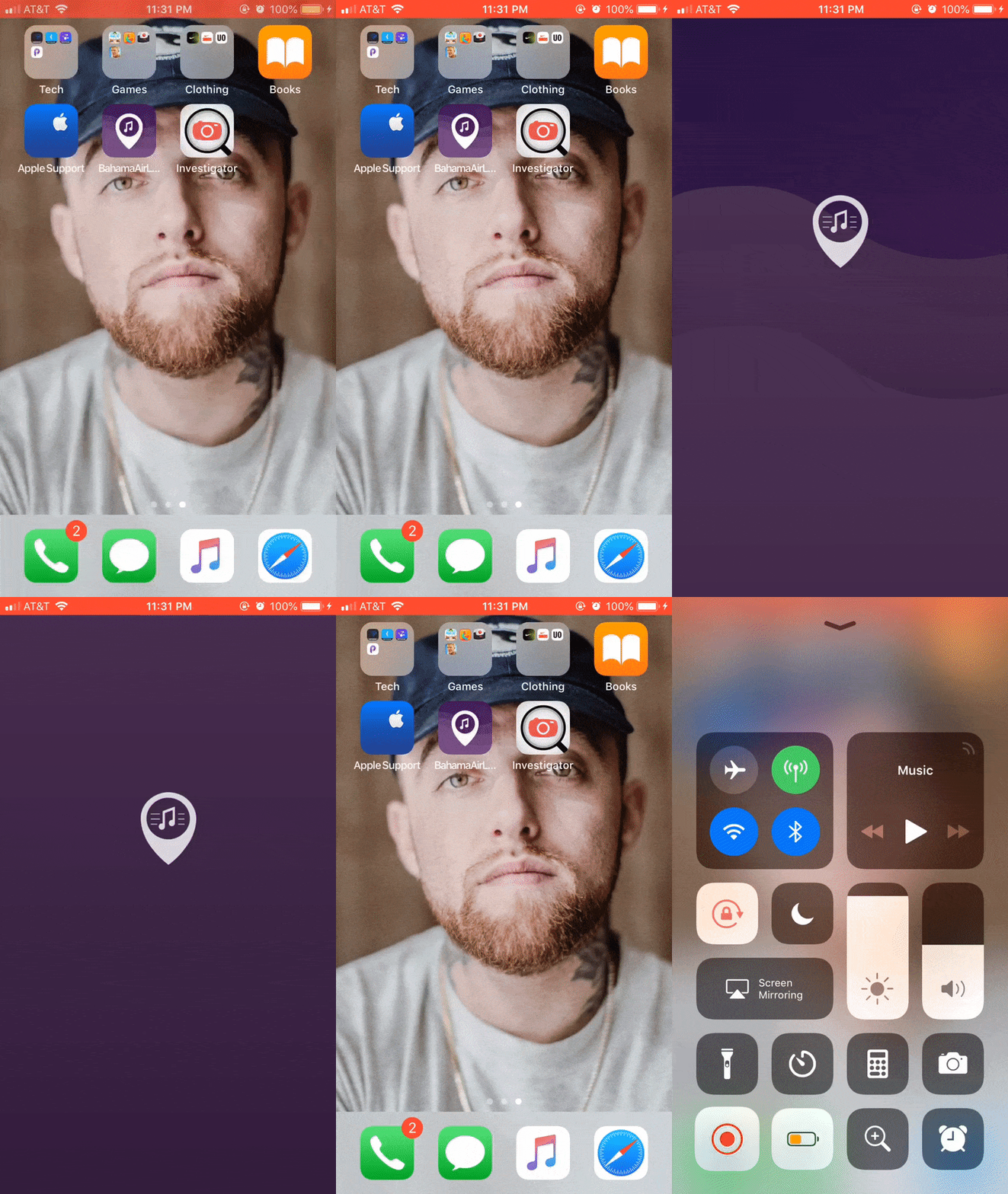
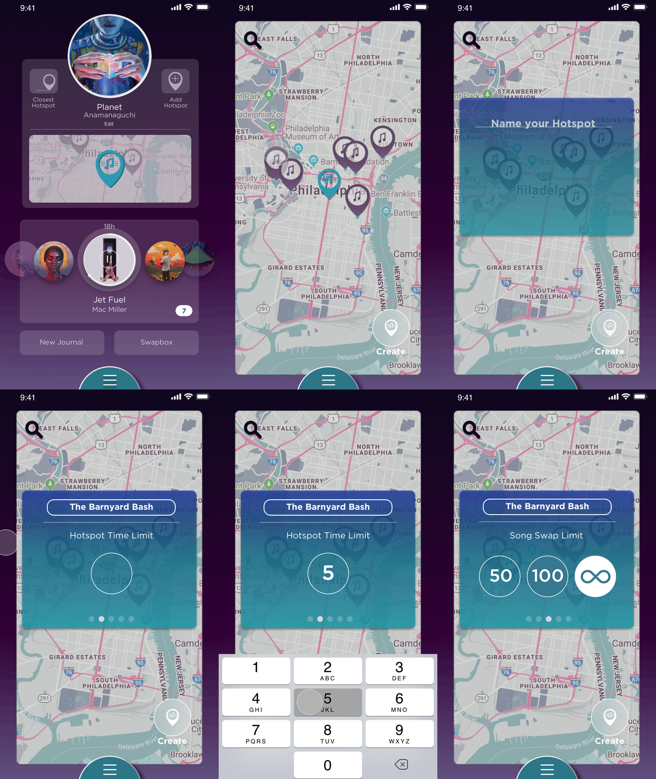
The solution to most of my design endeavors involved collaboration, inspiration, and a versatile toolset. I used software such as Photoshop, Illustrator, Sketch, After Effects, and Principle to bring my wireframes, icons, and animated prototypes to life. When I ran into an Xcode or Swift-related problem, I set appointments with my professor for further assistance or spent hours of online research to aid me in development issues I came across. The layout I made during my Xcode course adheres to the constraint- based layout system and works across all iPhone sizes. For the purposes of the course, core data could be pushed and pulled using entity objects, the entity itself, persistent containers, and managing the relationships between them. A helpful lesson I learned throughout the course of this project is to always scale down and get the most simple and important base functionality (or design) completed as early as possible. This will ensure that I always have a good base (design or code-wise) to move forward and build more layers of complexity into whatever the project or task at hand is.
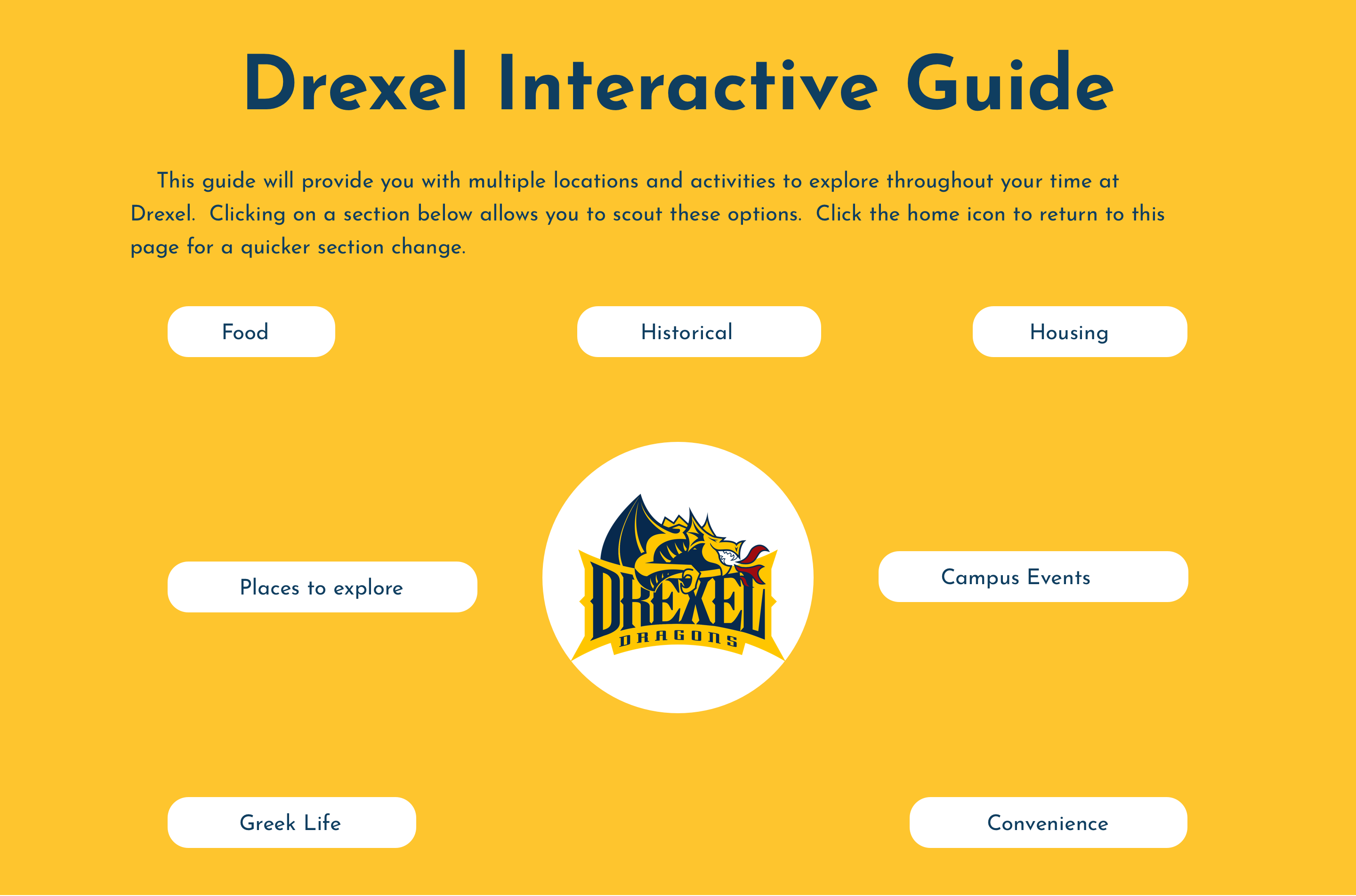
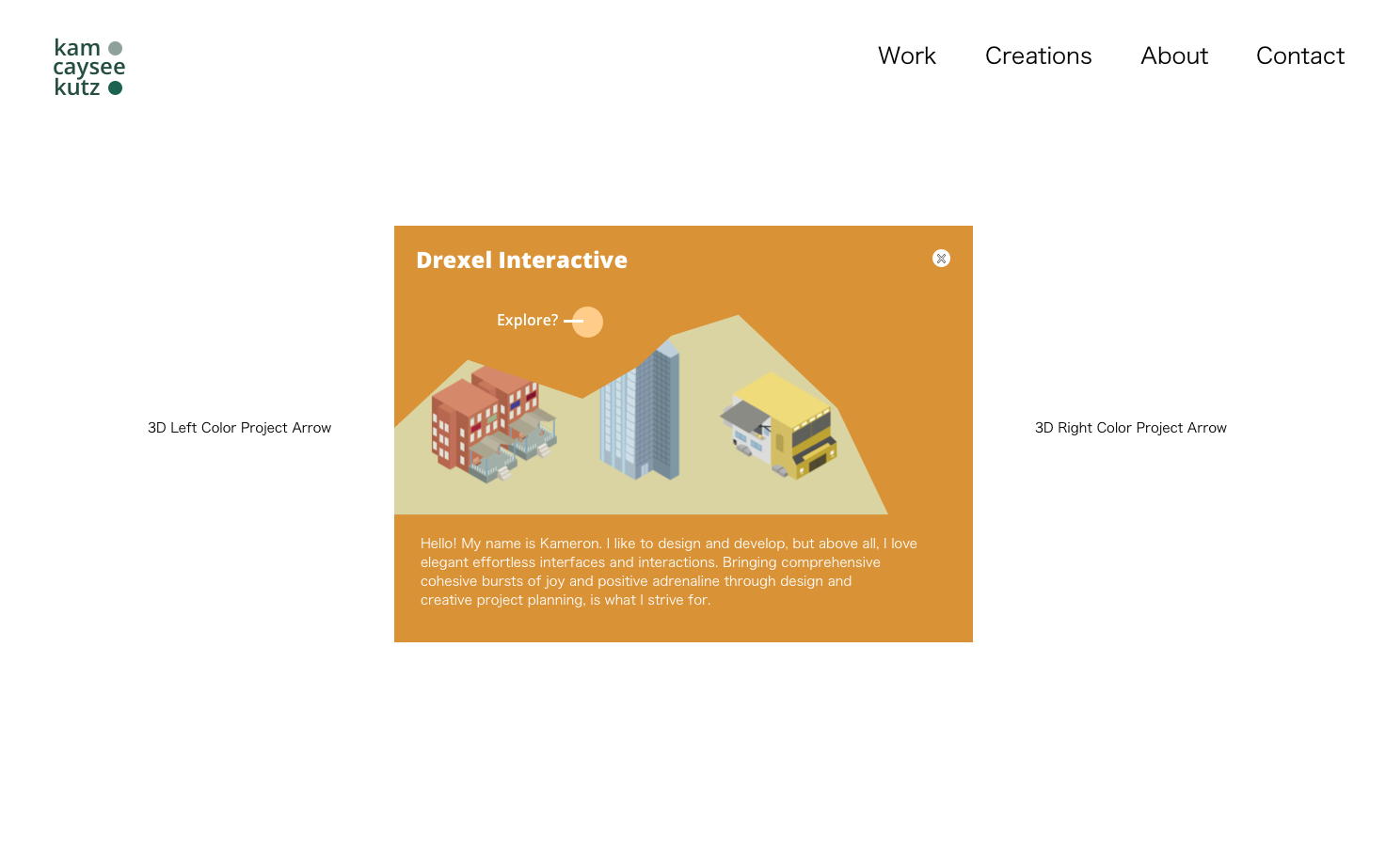
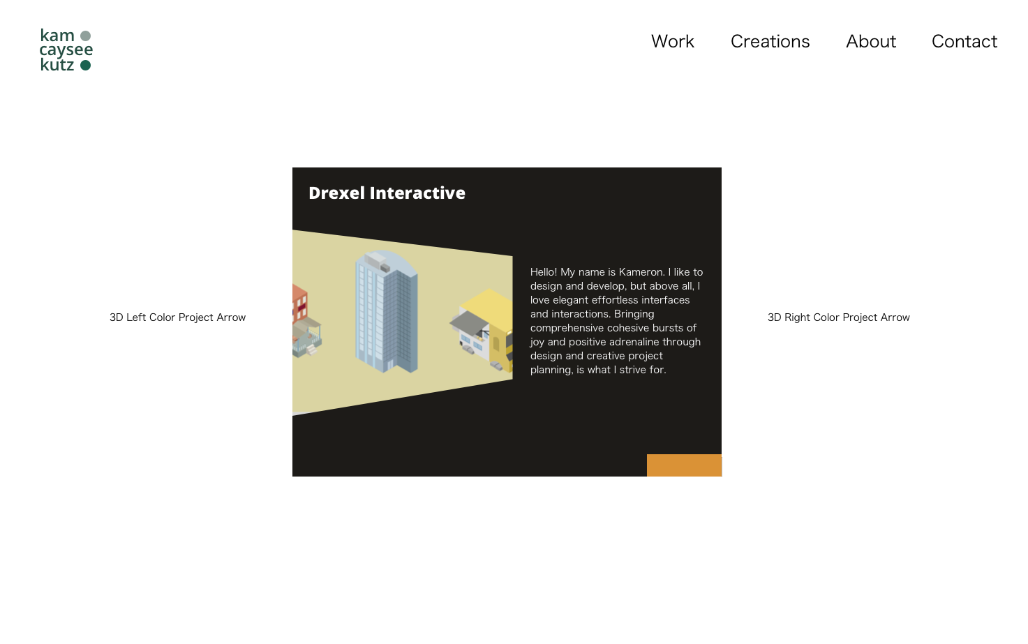
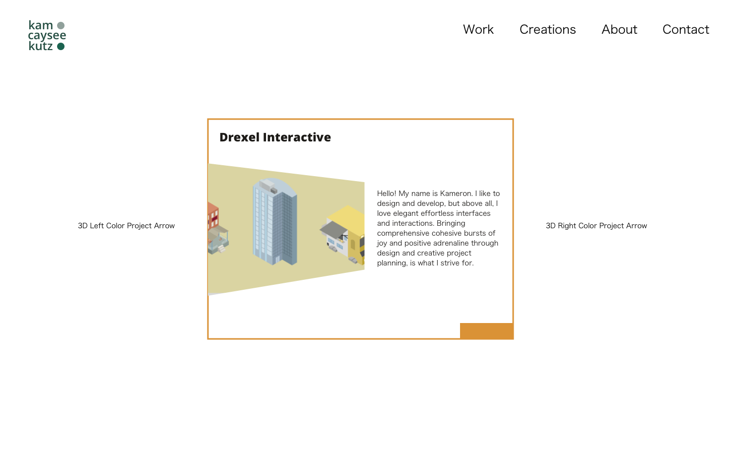
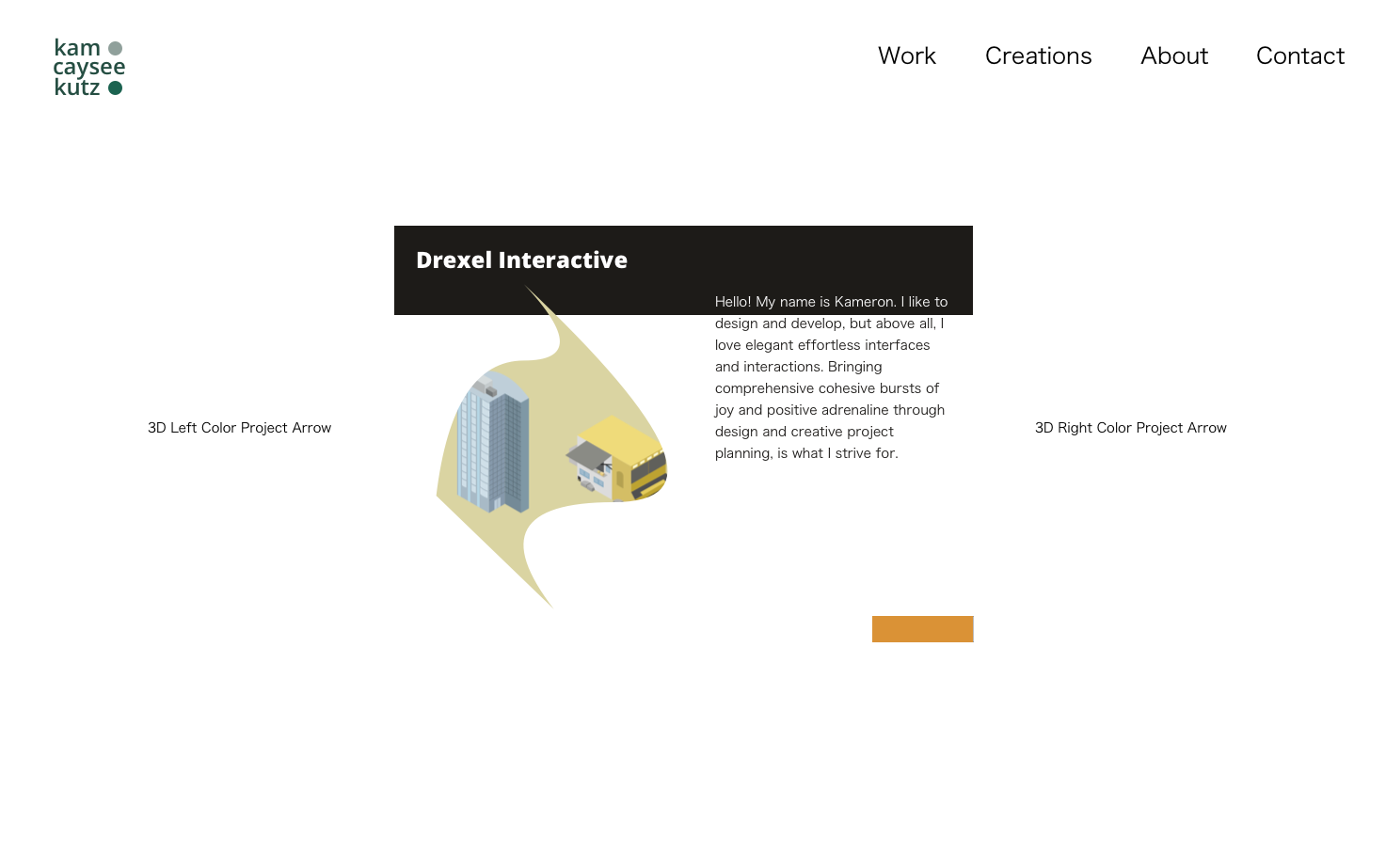
Drexel Interactive was a project I completed during my junior year. The project’s aim was to be a new resource for incoming and current Drexel students. The idea for this project spawned from a brainstorming session during a class at Drexel, where we were asked to come up with three ideas that we would like to work on, figuratively. The idea was to start with an “idea draft,” each student would choose one of the three ideas they came up with to put on the whiteboard. Students would then vote tournament style to determine which projects continued to the next round and who wanted to work on each surviving project.
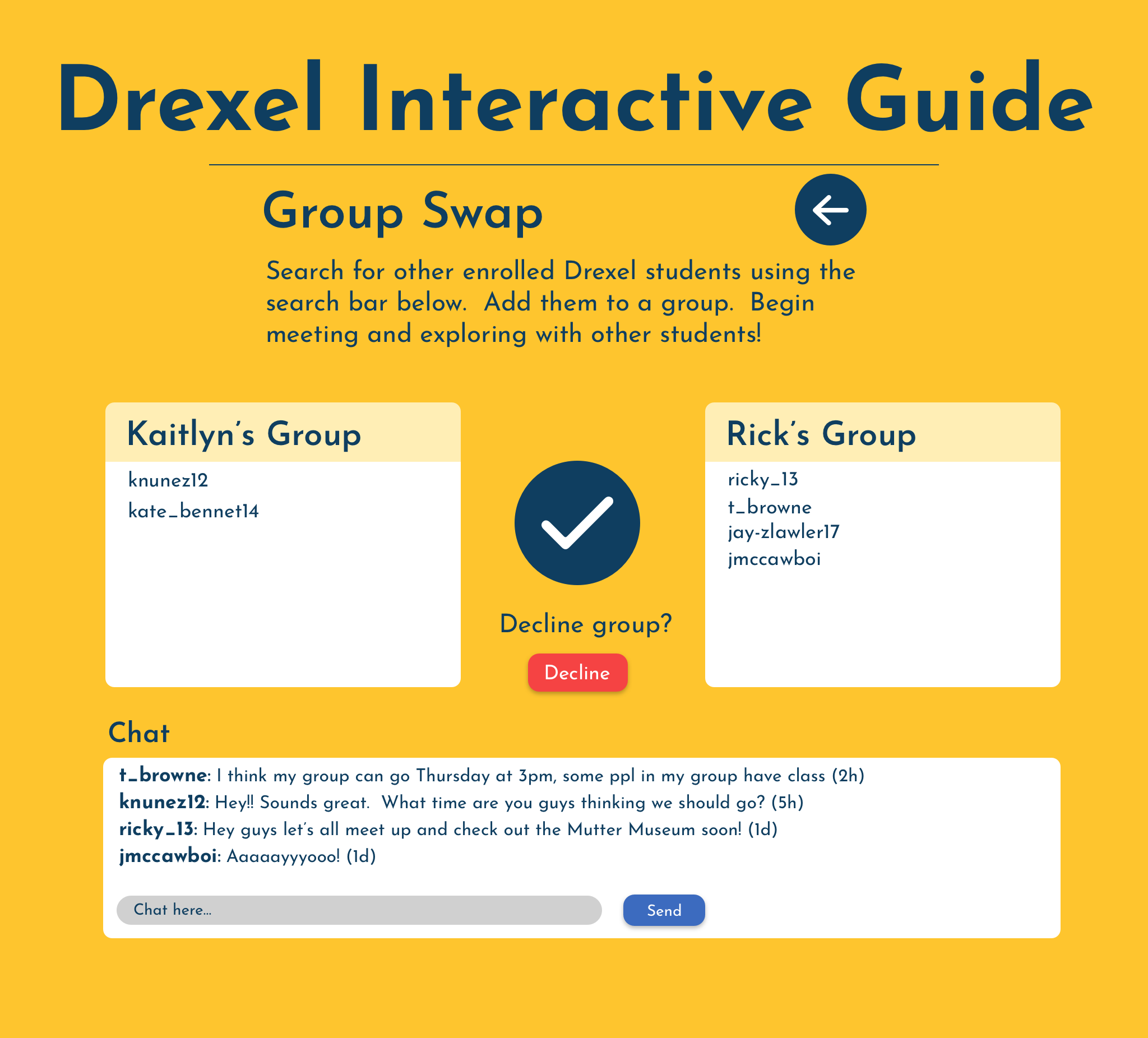
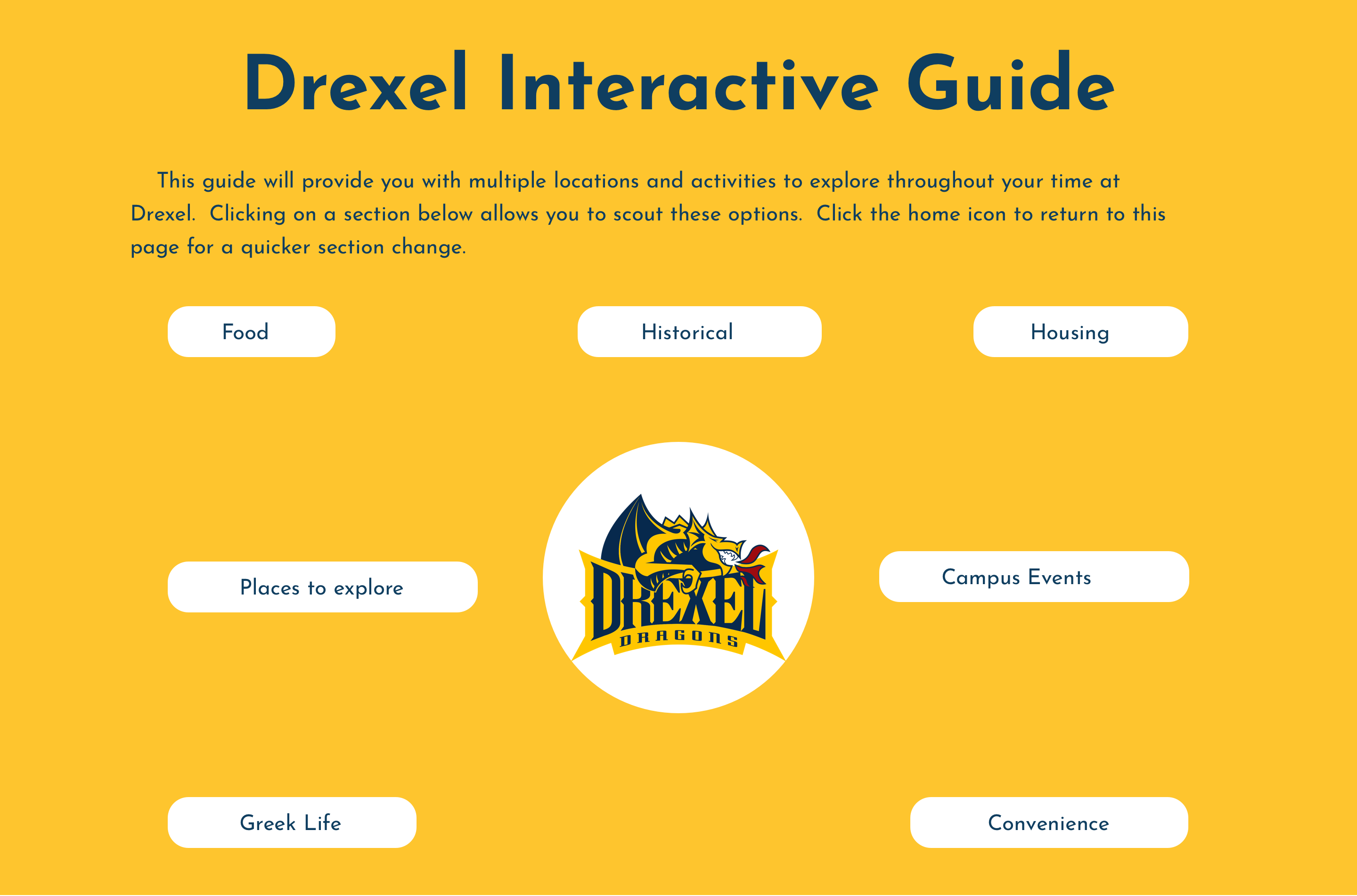
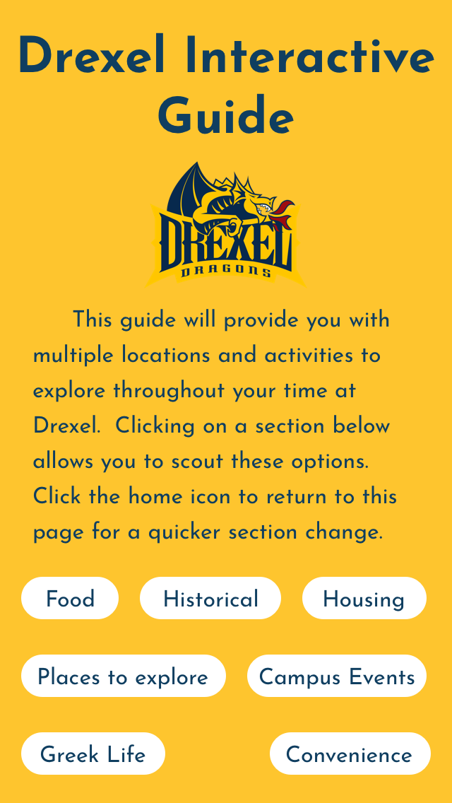
My idea that was chosen was pitched as an SVG Interactive Playground about Drexel, which would take the form of a webpage. The first draft for my idea included a web page that explored various animations and Easter eggs about Drexel. Students would be able to hover their mouse over tons of little animations relative to Drexel to interact with. When users refresh the website the SVG animations would relocate to a different spot on the page, always creating a fresh experience. The idea for the project quickly morphed as other group members added their input and creativity into the mix. As the project became more defined, the idea transformed into an interactive guide for Drexel. Research on Drexel students showed that they would’ve loved a guide to the campus and city as freshmen. Drexel’s Interactive Guide aimed to help students by giving them easy access to all the best spots in Drexel and Philadelphia. The project was focused on learning and discovering the history of landmark locations, but also to relate to other students or exploring the city with a friend.
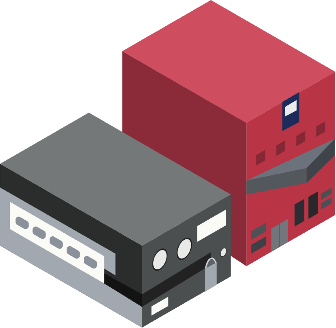
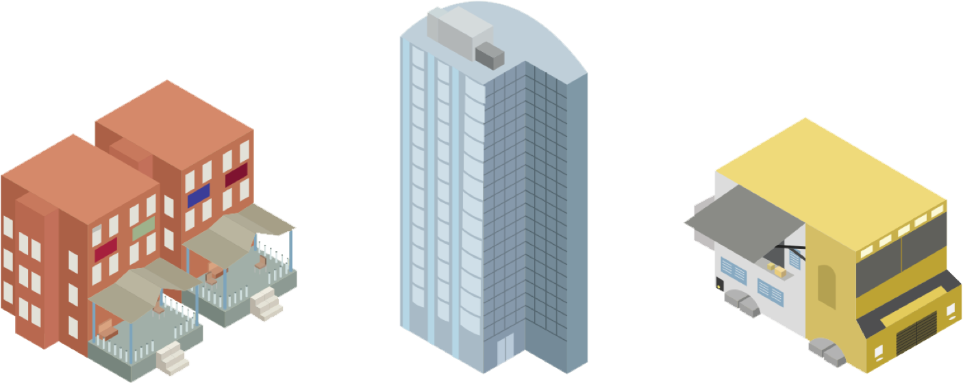
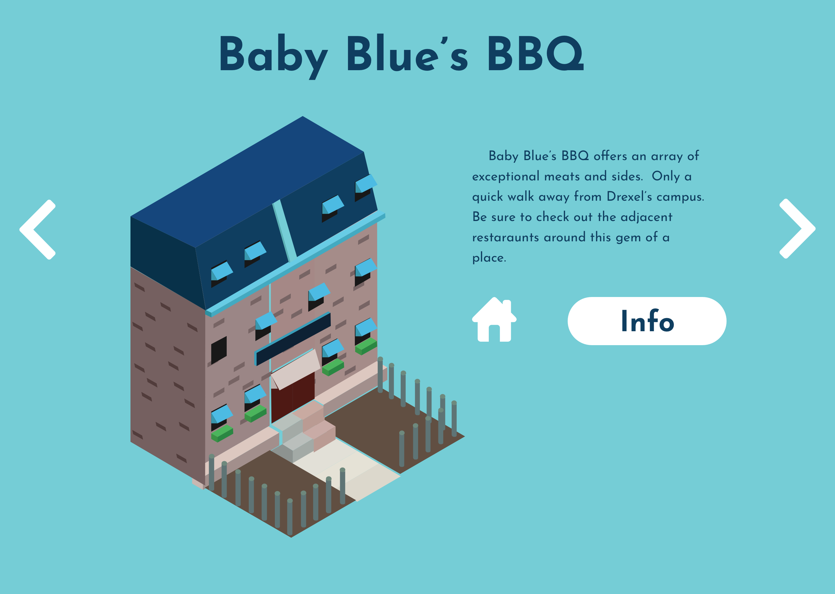
One of the challenges to this project as a designer was to properly portray each landmark/location with a stylized isometric graphic; which aimed at eliciting a unique mood and identity of the landmark. Another challenge we had was the number of team members procured for the project planned. I chose to take the design role for this conceptual project in order to better hone and practice my skills. Two of our team members did not come from a web development/design or UI / UX background so our team was pretty limited in what we could complete for the end of the term. The project was created as if we were actually building it even if we did not have a working product. The main goal of this project was to show we could effectively conceptualize a graphics-based interactive narrative utilizing storytelling methods and digital design strategies.
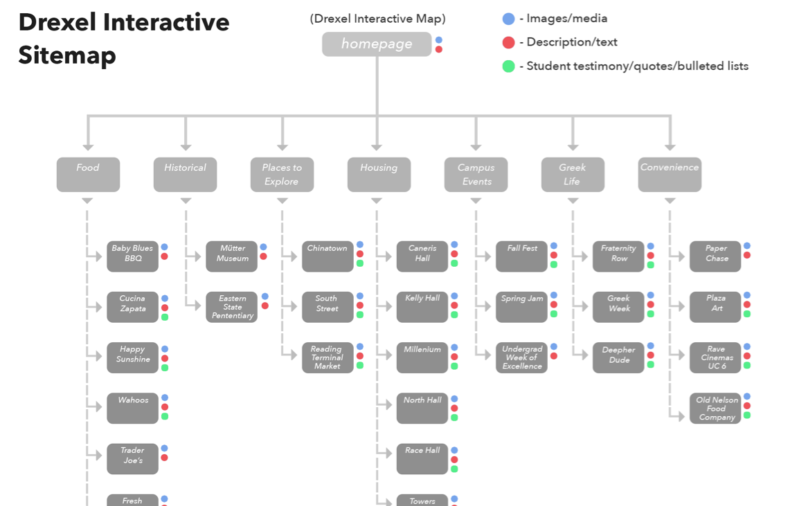
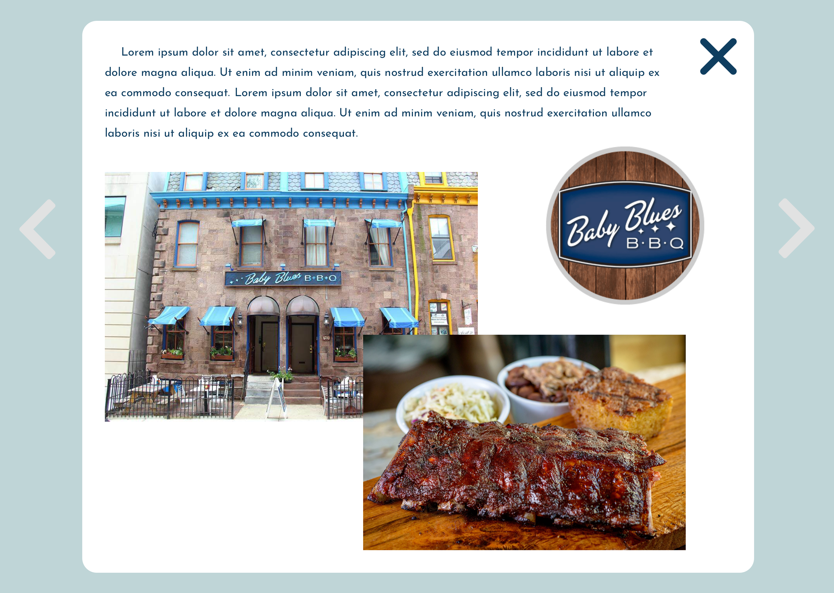
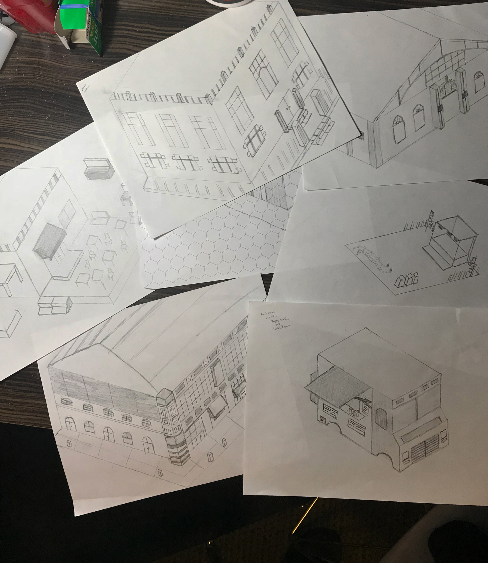
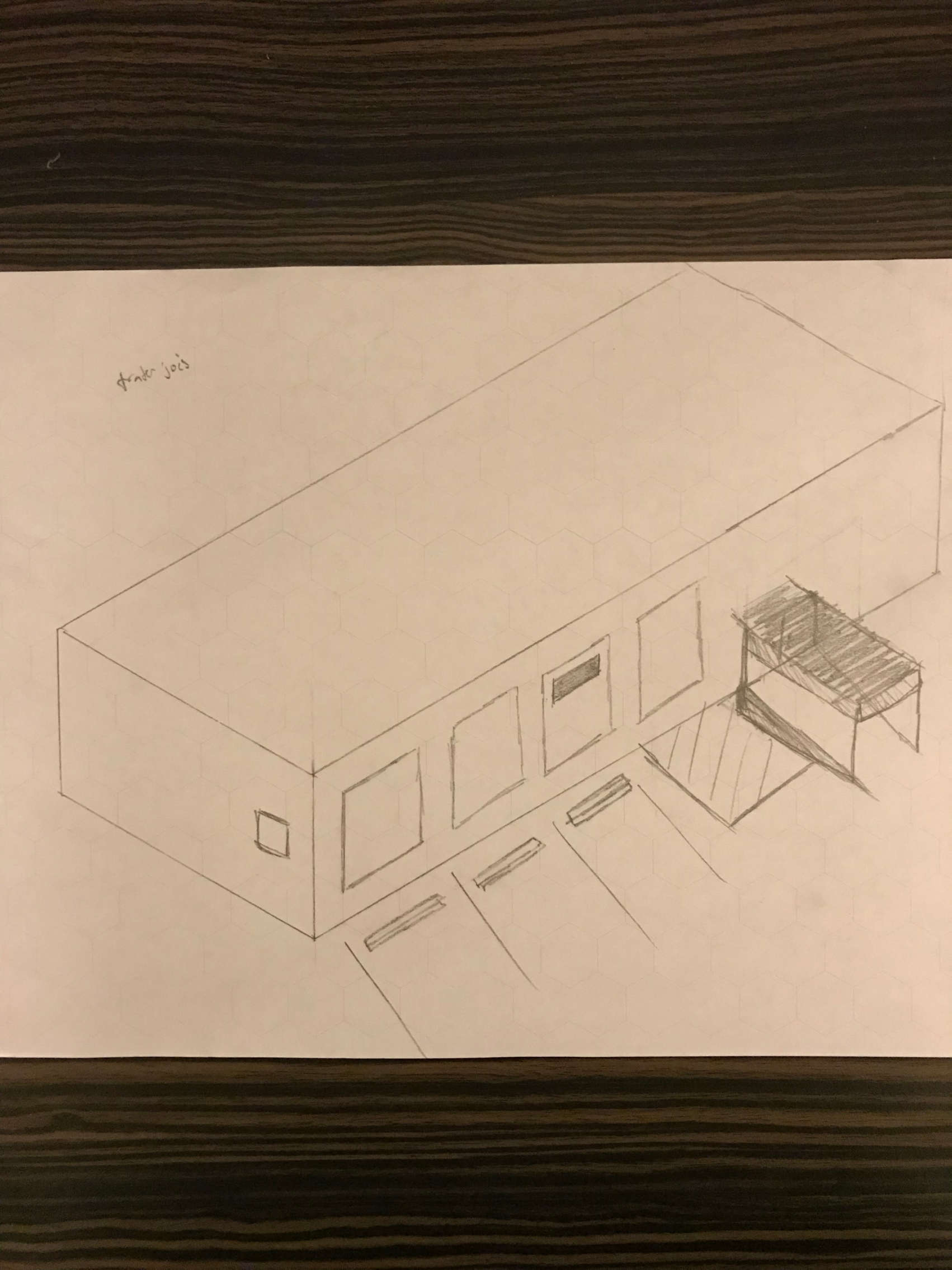
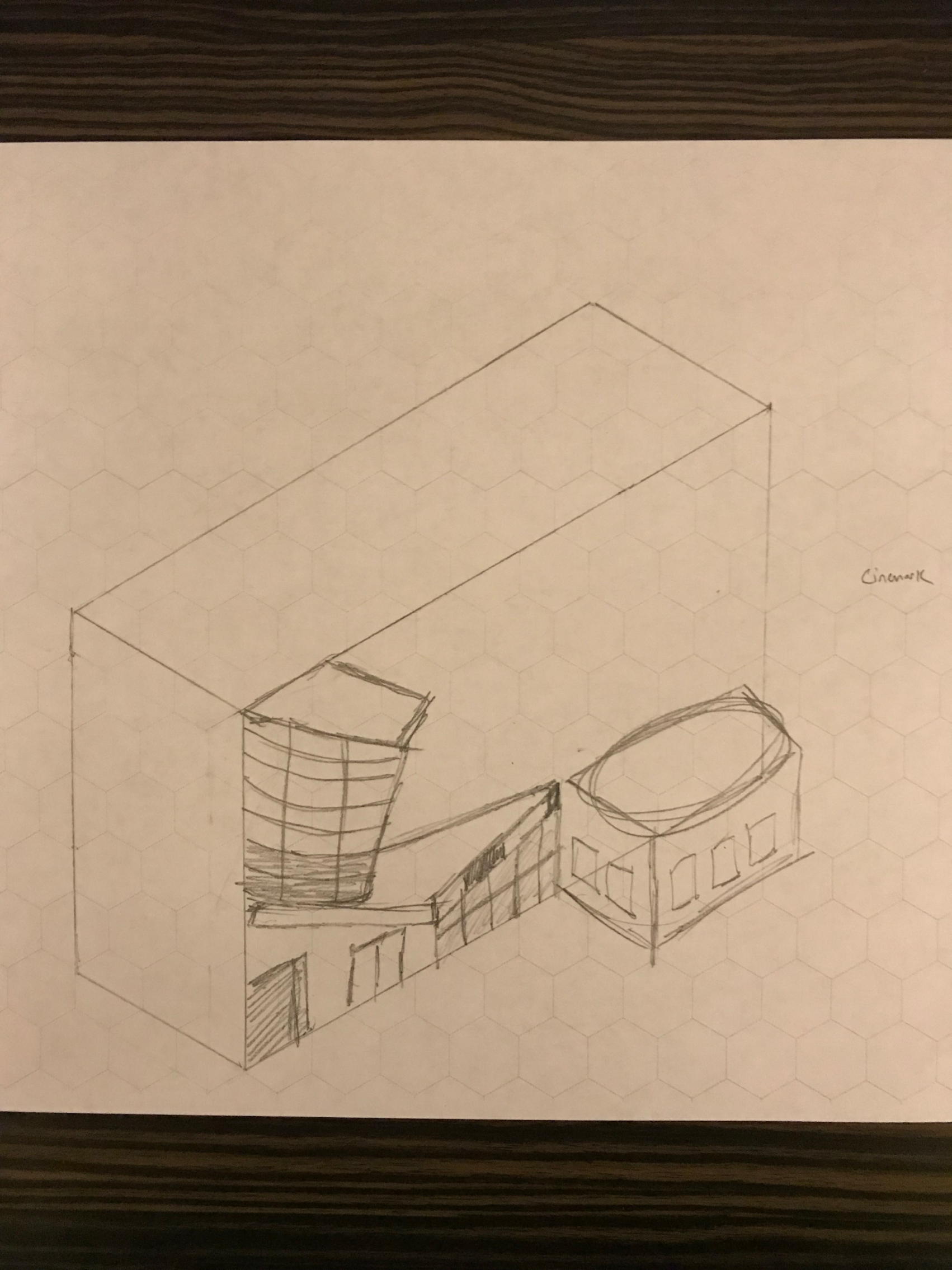
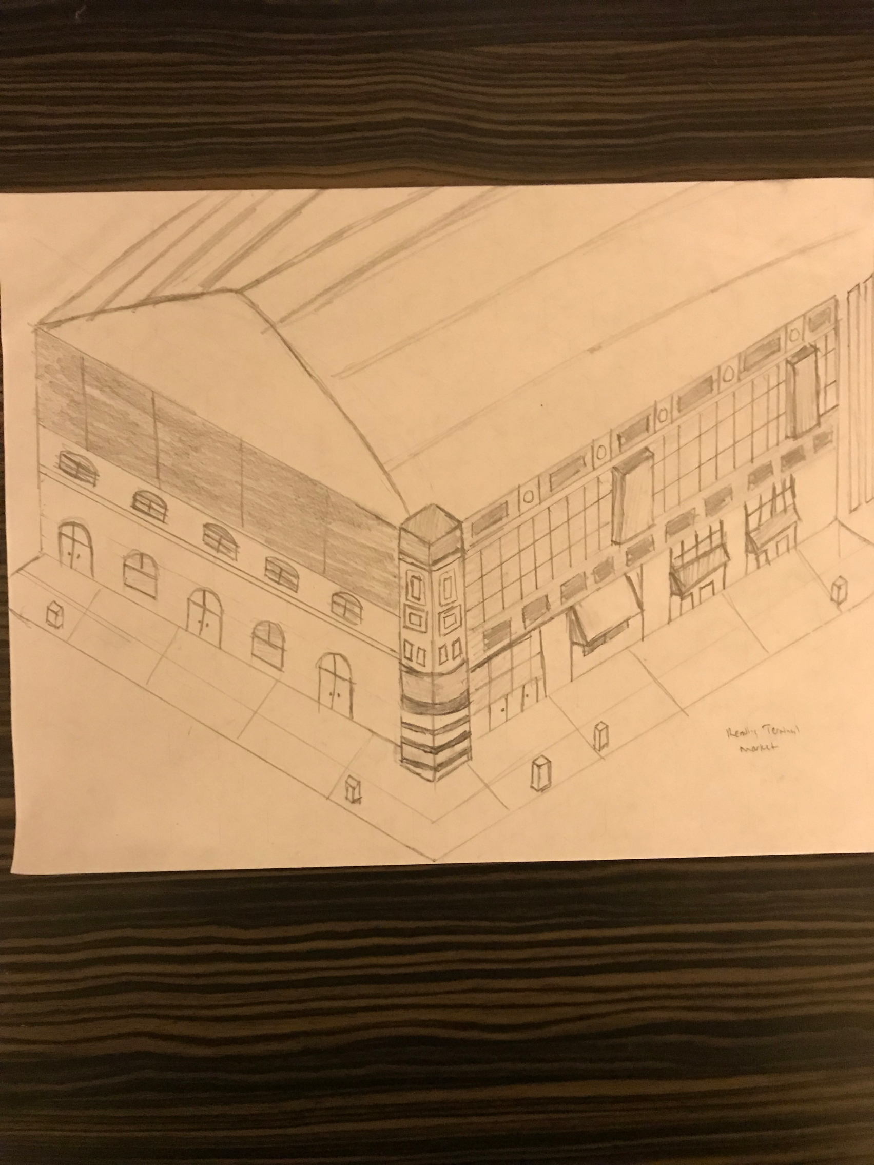
Most of my work here required an iterative design process, which was open to changes as research came in. I also developed multiple landmark locations around Philadelphia. I created multiple deliverables such as a sitemap, 27 unique stylistic art assets, and several mid to high-fidelity wireframes of the UI. Examples of my work for this project can be found below.
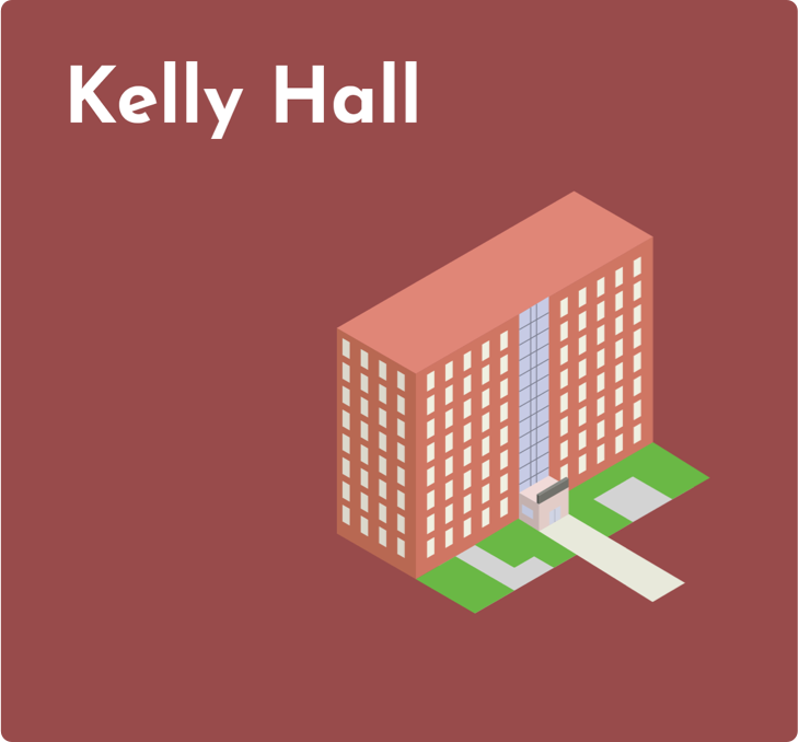
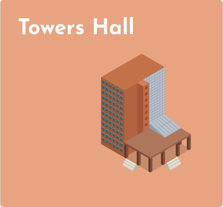
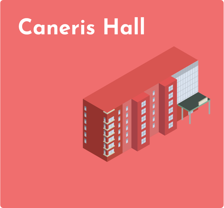
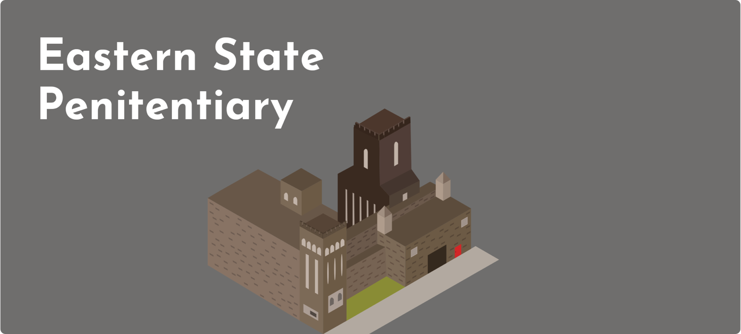
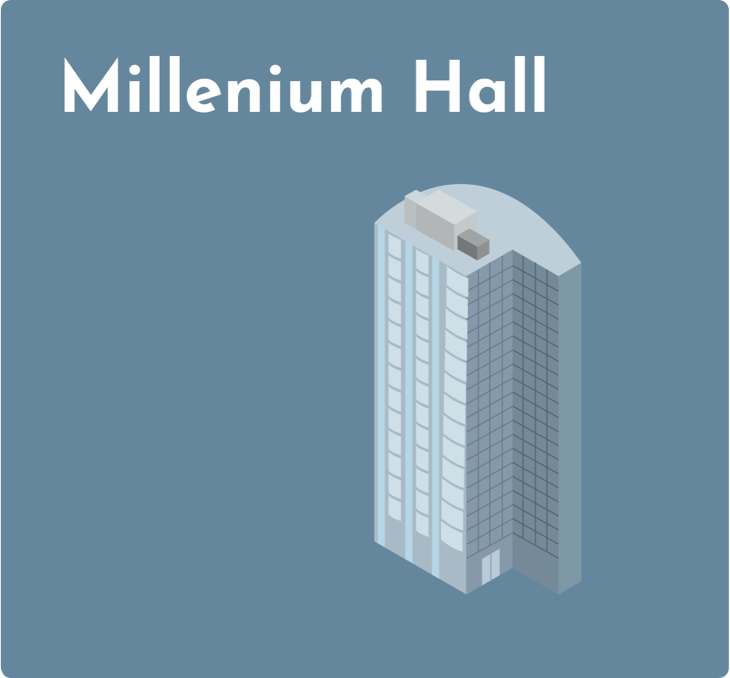
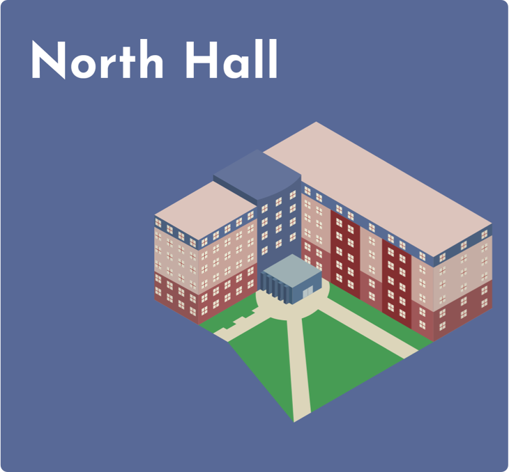
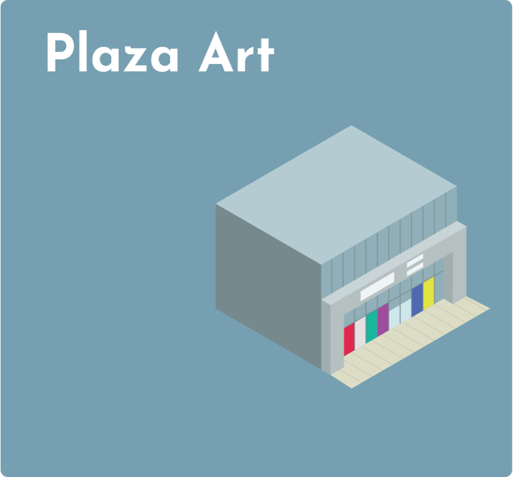
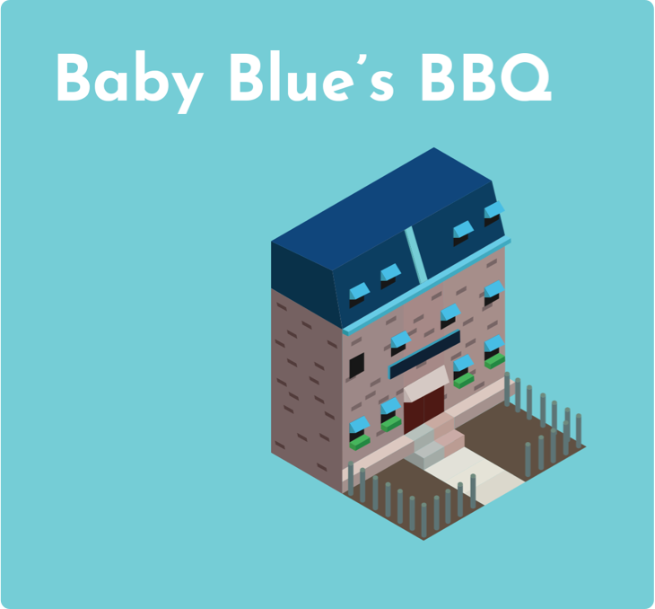
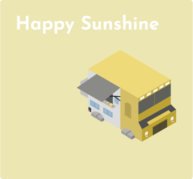
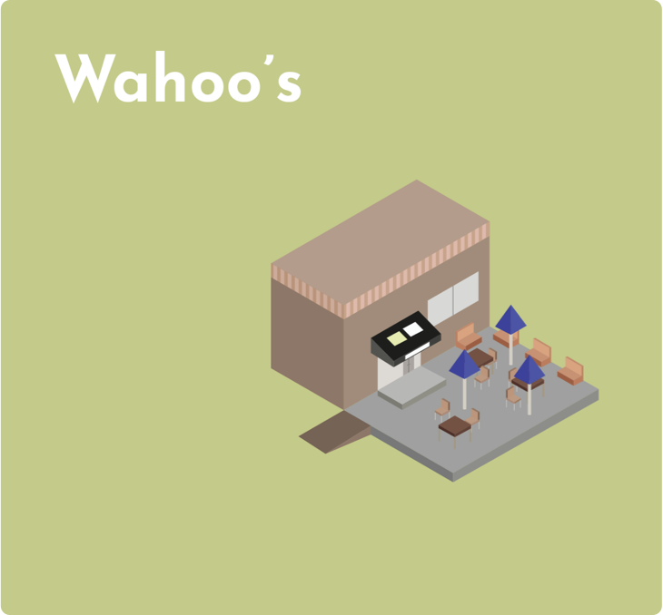
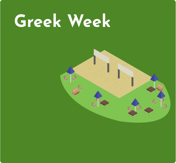
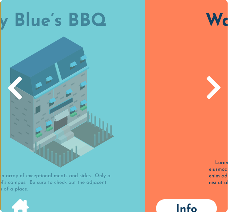
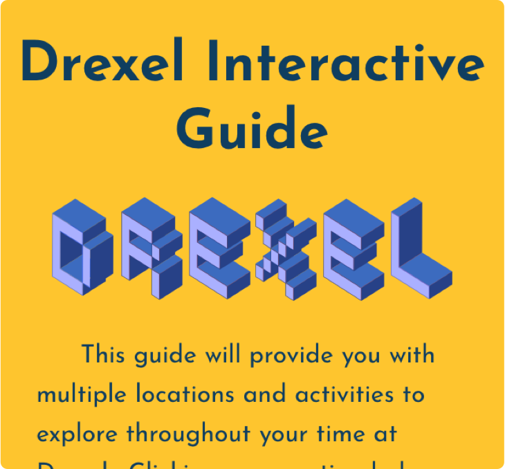
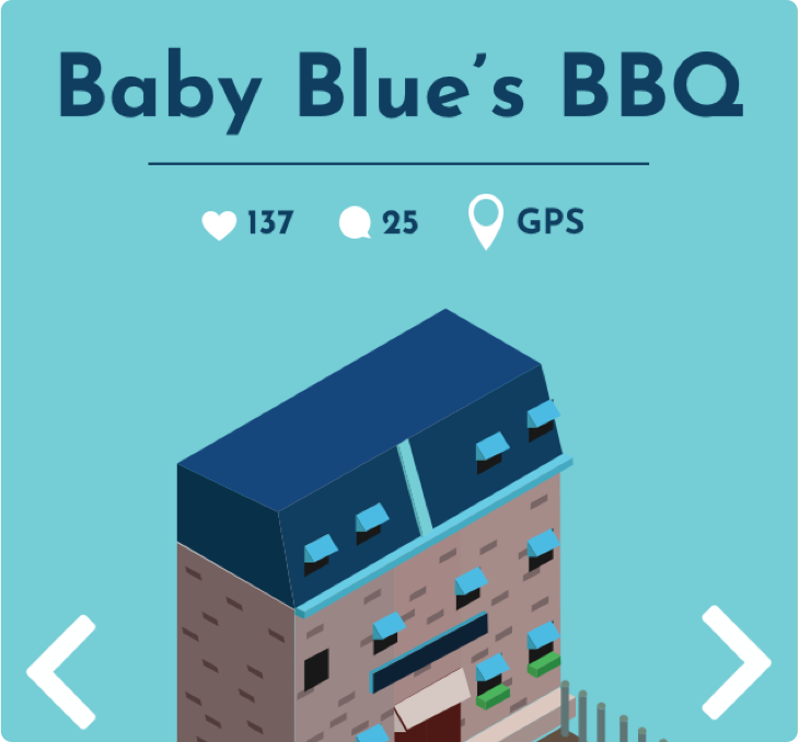
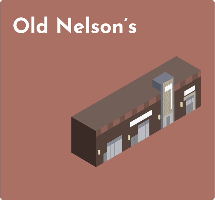
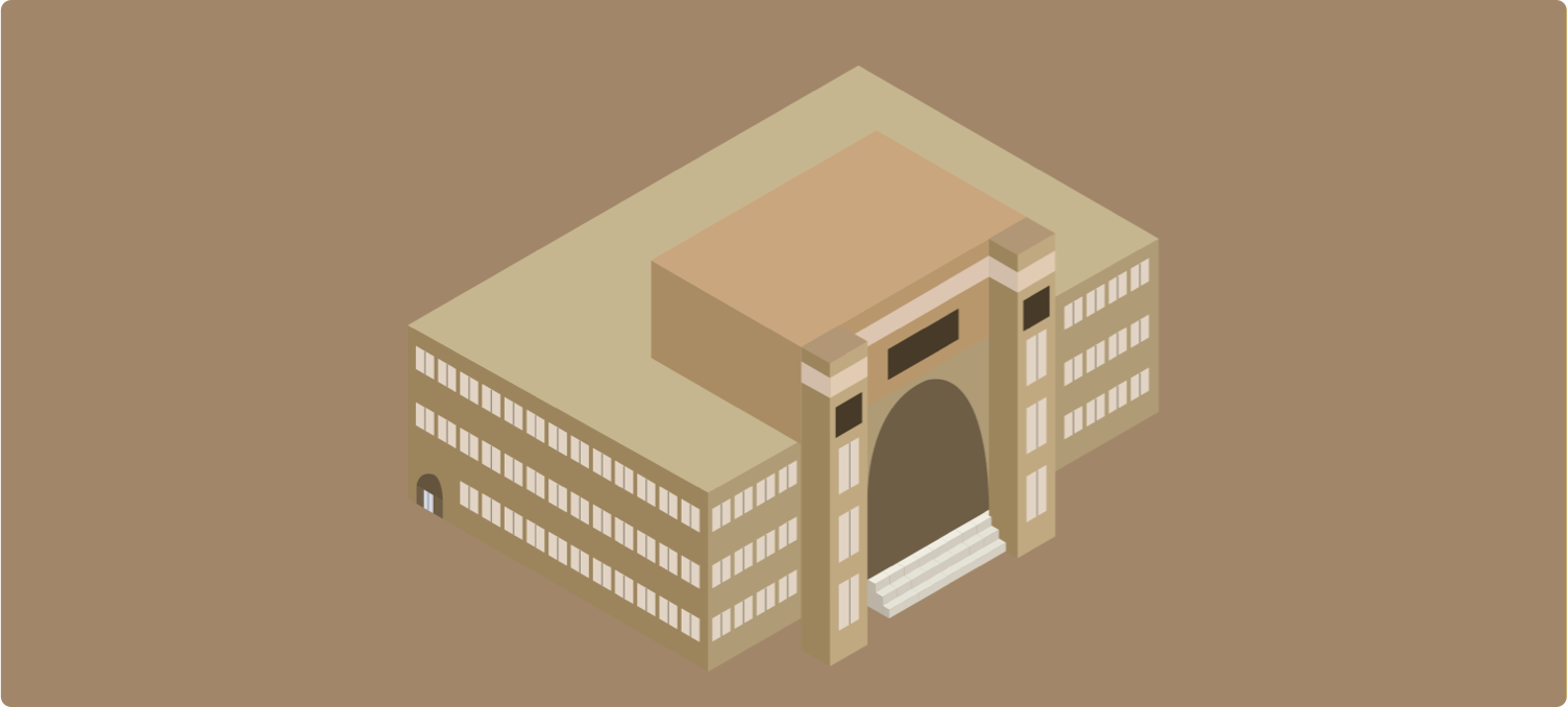
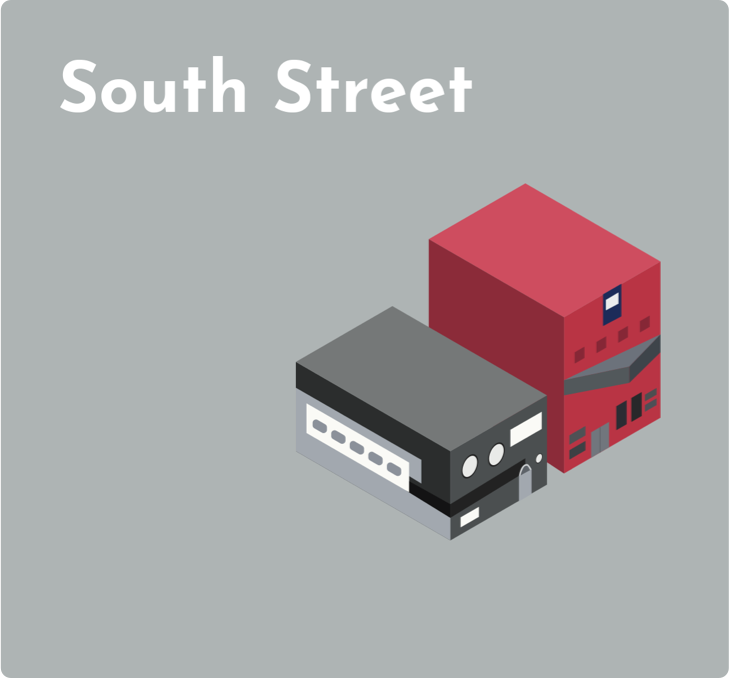
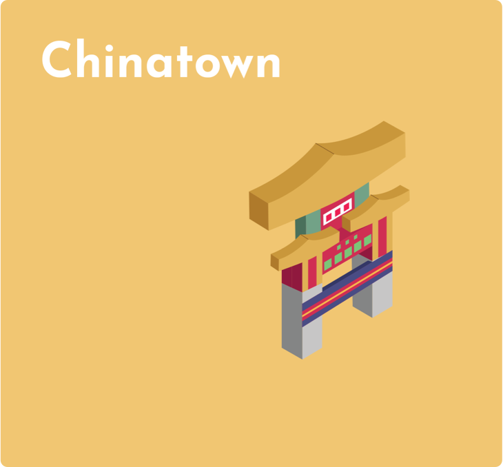
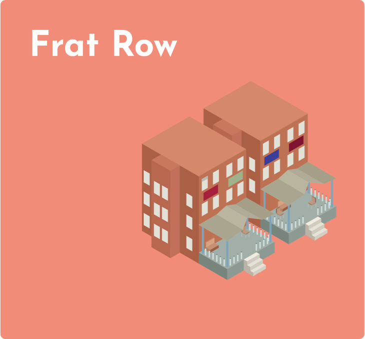
The solution was a clean, simple interface, which encourages student engagement. Unfortunately, most of it was conceptual as we did not have the development power or time to complete a fully fleshed out and working web-app for Drexel. However, our team was able to accomplish a fully documented conceptual project, with design deliverables, research documents, and minor development complete. Something I learned that I will carry to future projects is to always expect and prepare for changes and pivots in a project. Our mid-point checkin resulted in us adding more functionality and designs to the project, yet, if I would have better prepared and anticipated those changes the resulting deliverables would have been implemented more logically and cleanly.
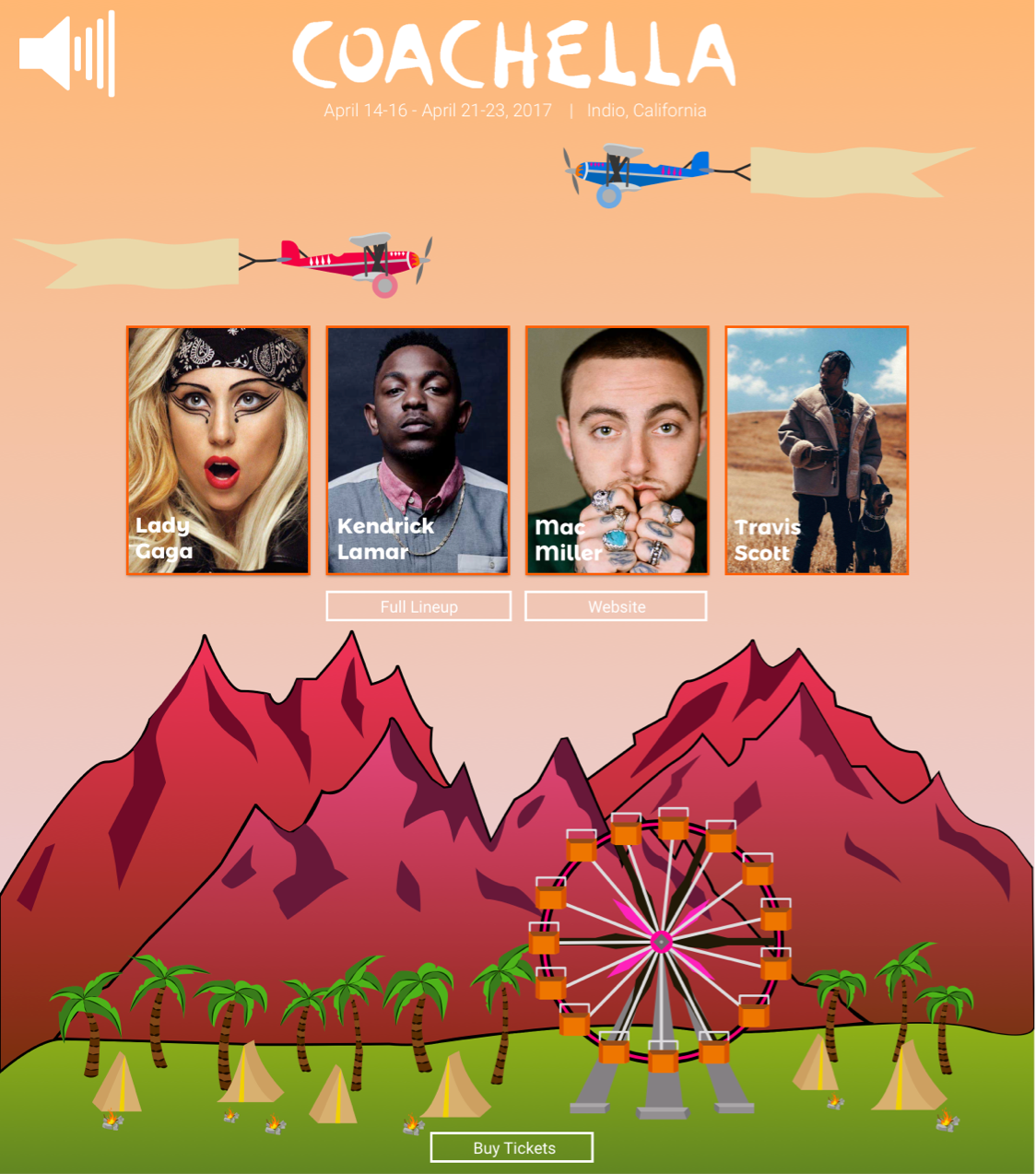
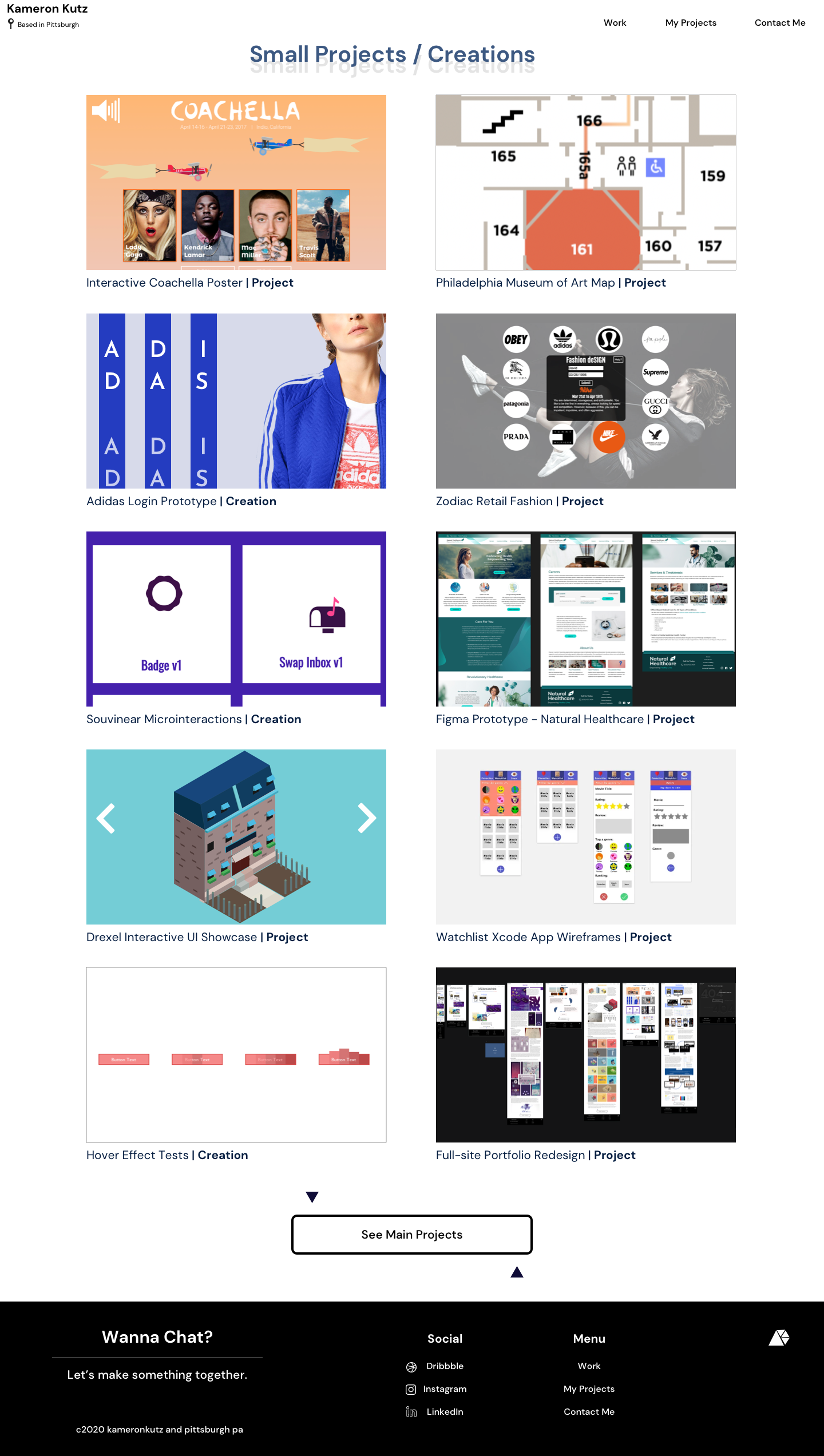
Unleashing the power of SVG animation, HTML, and CSS, this project presents an innovative take on the traditional music festival poster for Coachella.
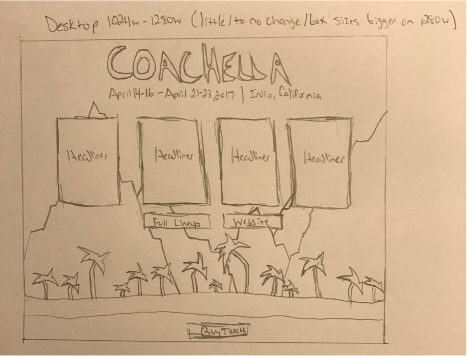
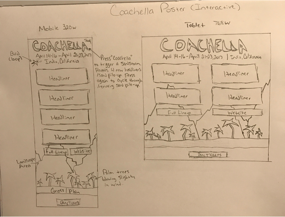
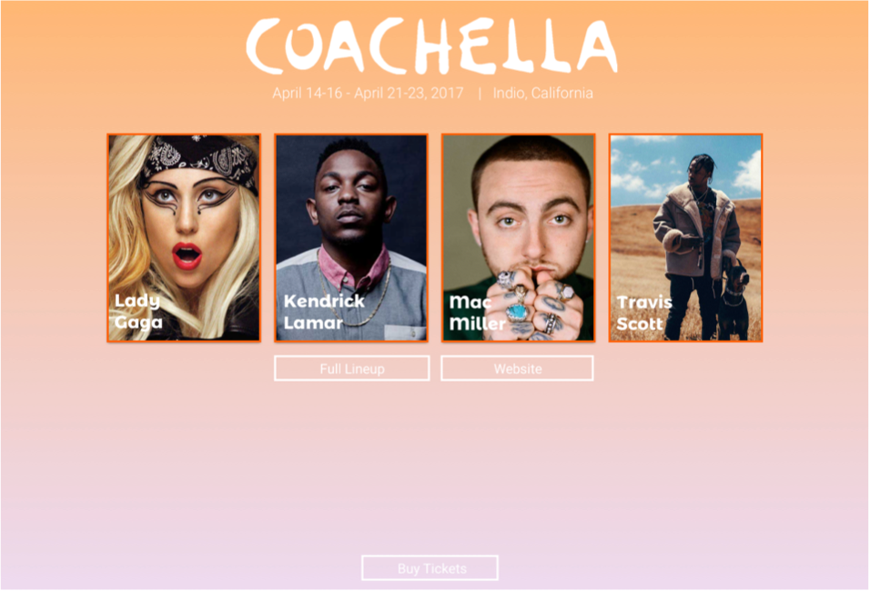

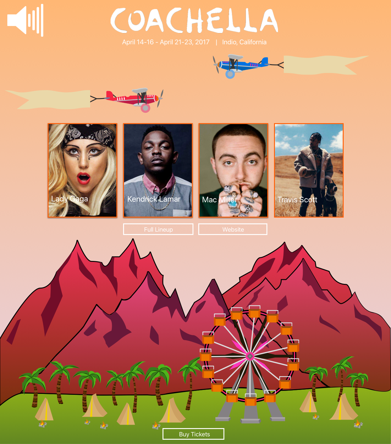
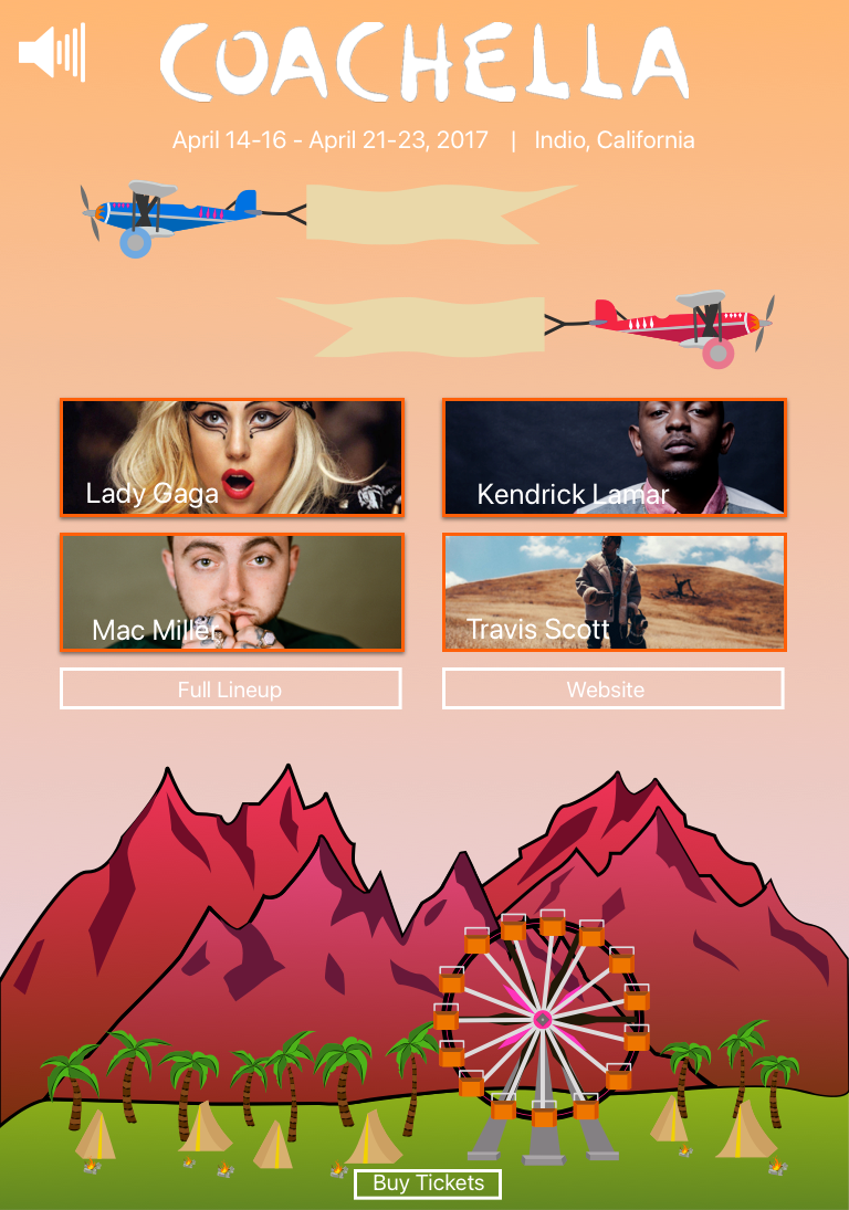
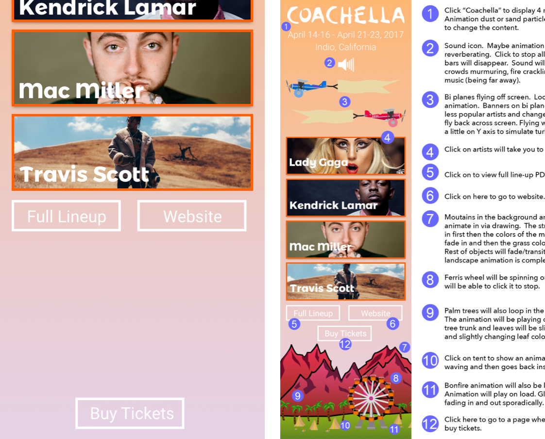
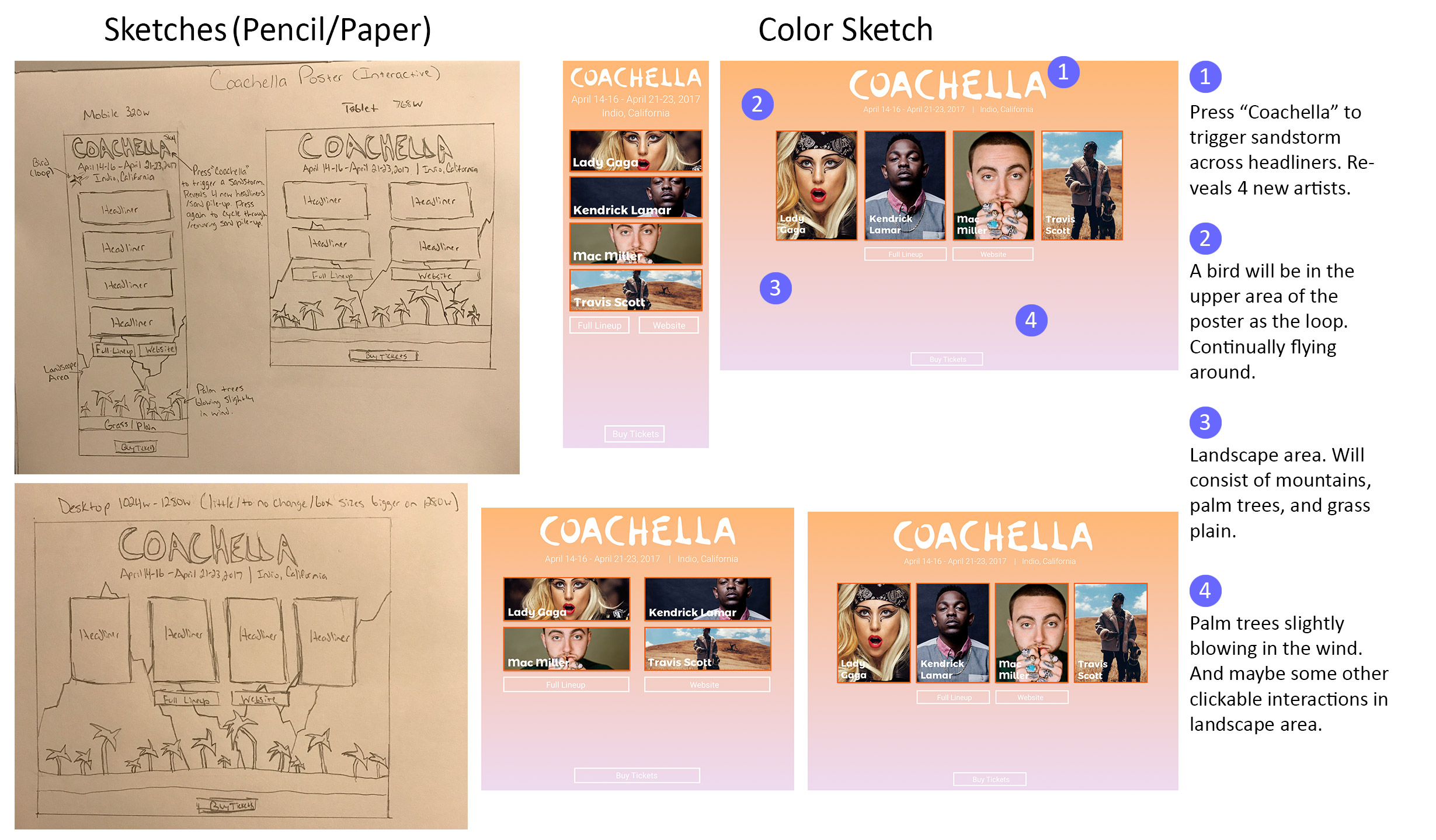
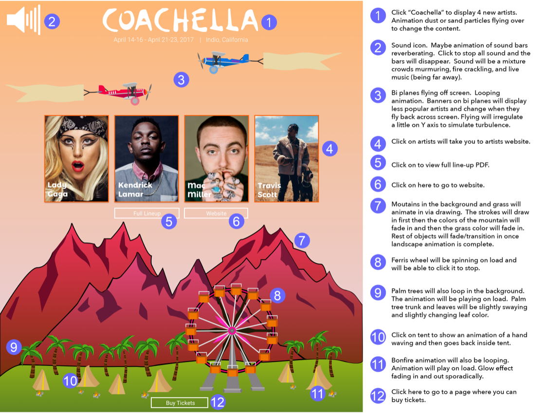
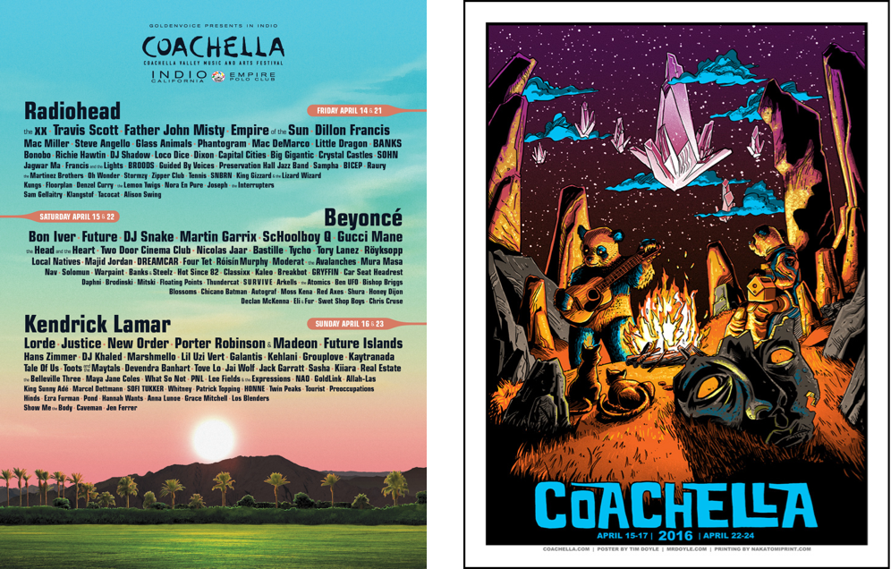
Starting from rough sketches, this journey carries you through the creation of responsive and dynamic poster designs, rendered beautifully across desktop sizes. The thought process, design choices, inspirations, and transitions from low to high fidelity are highlighted. Despite changes in SVG web browser standards severely impacting the live functionality of the project (this made many of the smooth calculated animations and overall functionality buggy), the project showcases versatility in web development and graphic design skills, while encapsulating the vibrancy of the festival experience.


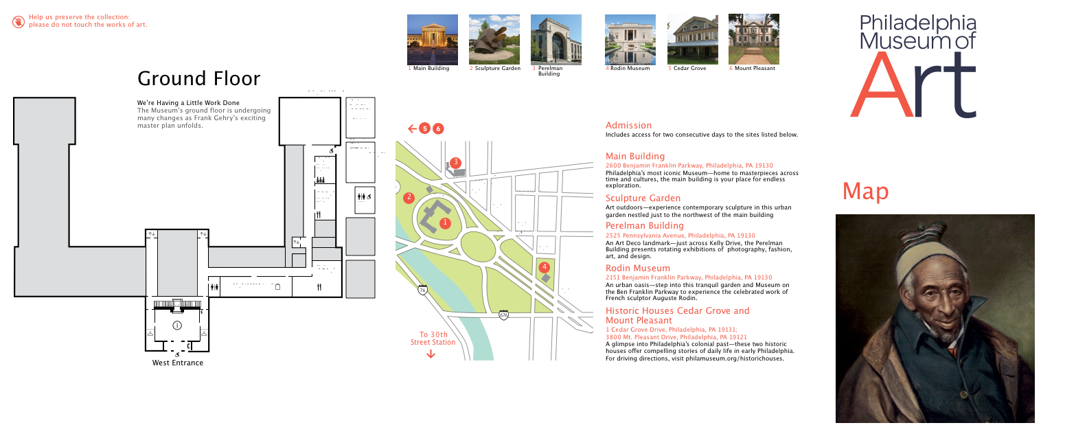
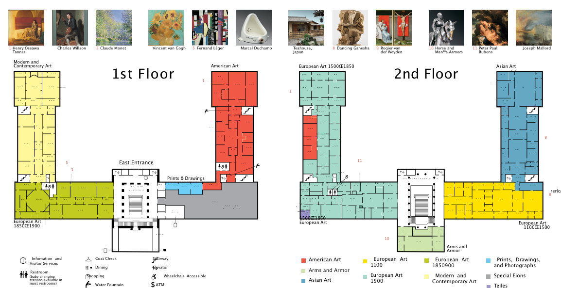
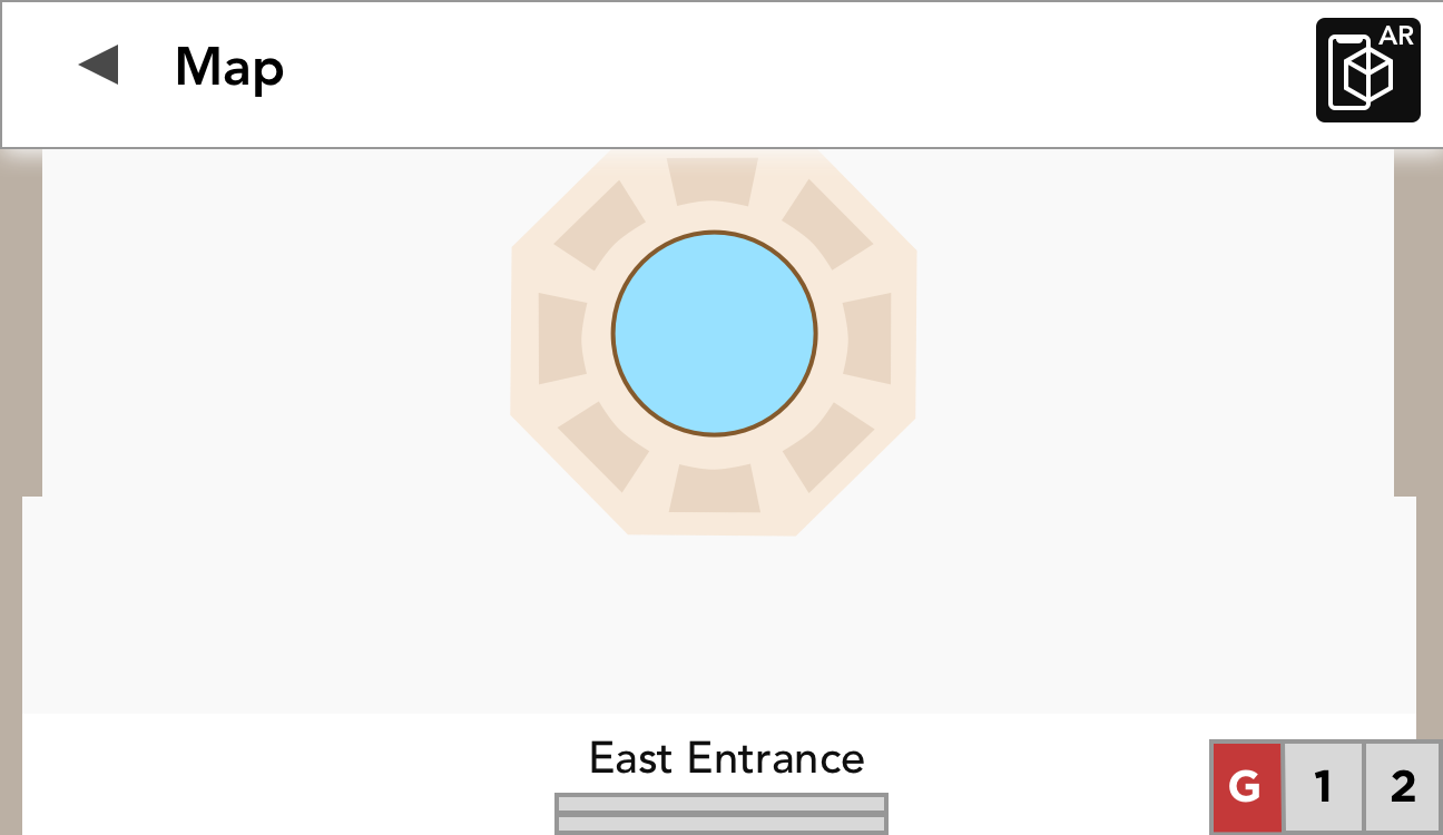
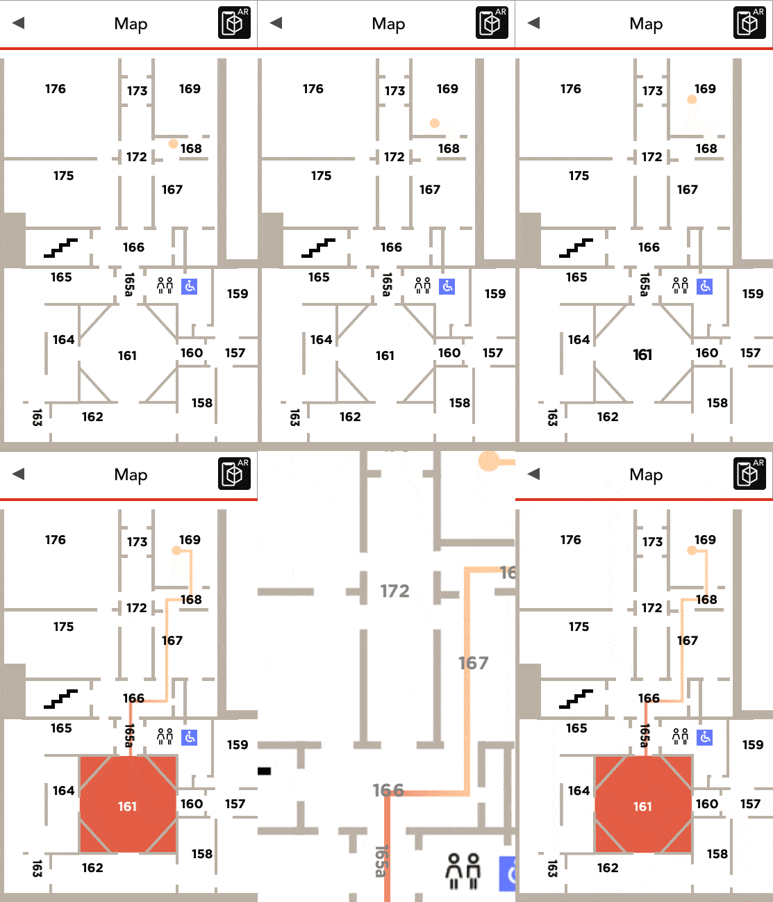
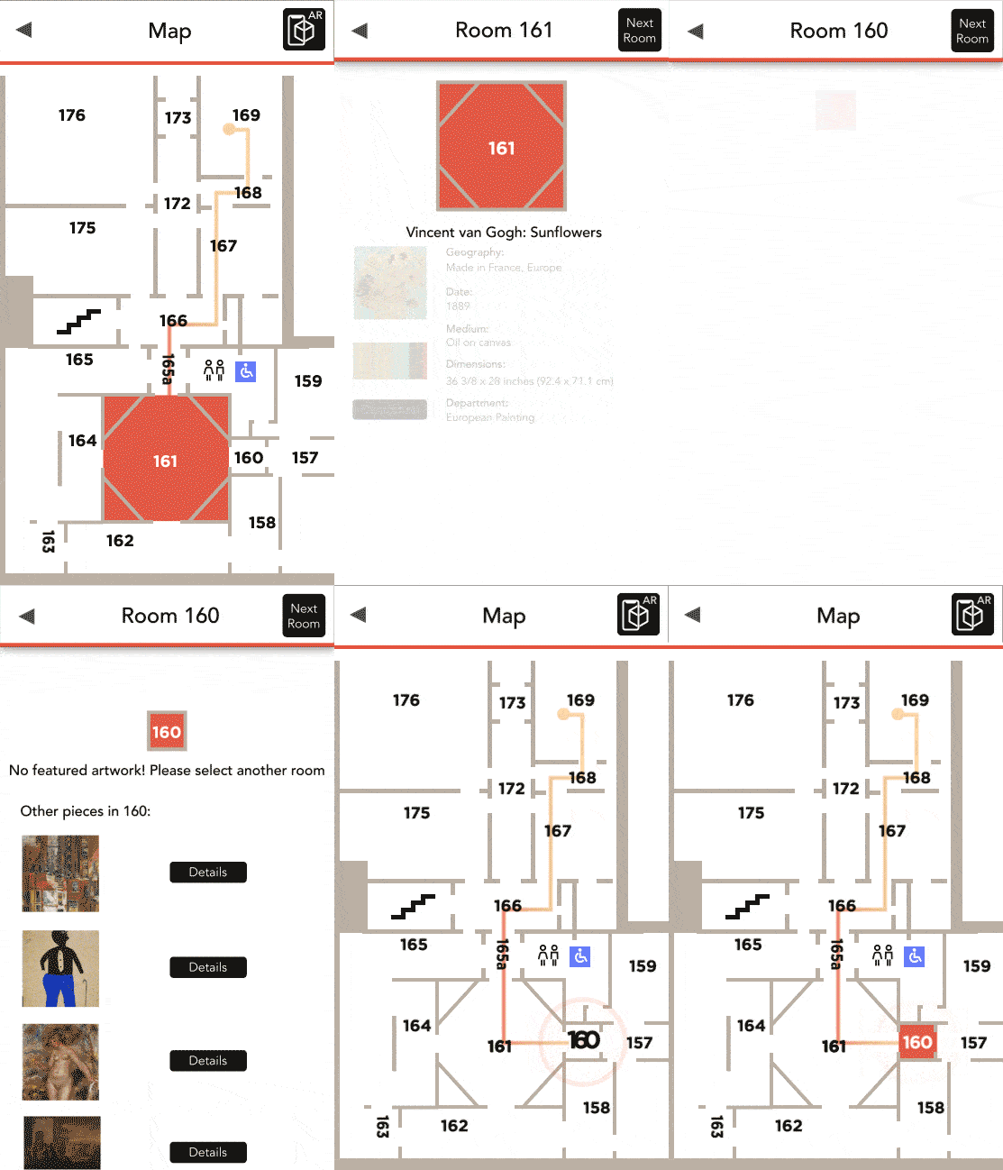
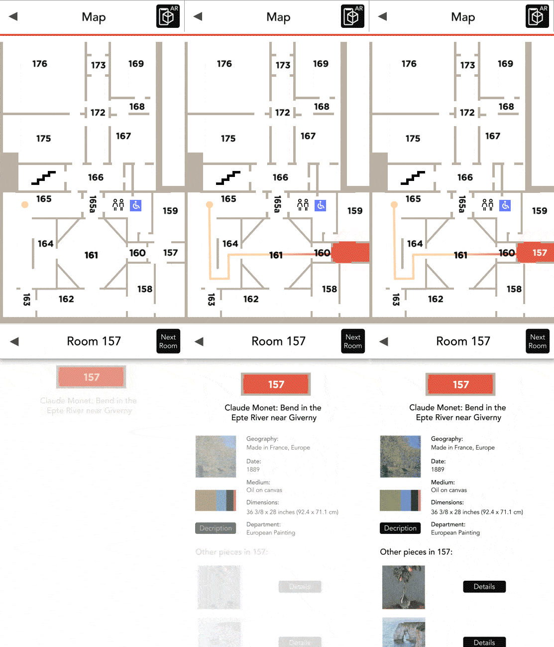
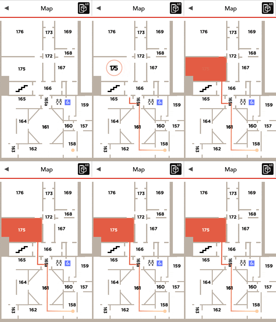
In a collaborative effort at a Drexel University class, this project transforms the way visitors navigate the Philadelphia Museum of Art. Leveraging Augmented Reality (AR) technology, the aim was to create a lightweight, responsive, and intuitive museum map application. The design process was led by me in Figma, with motion effects I crafted in After Effects, reflecting expertise in various prototyping tools.
With an emphasis on clean iconography, interactivity, and playful animations, this AR map integrates joy and engagement into the museum experience. It's an attempt at an innovative approach to an otherwise bland map experience. The navigation's aim was to feel lightweight and responsive, as well as, an opportunity to test a playful tactile feedback response. Creating the microinteraction feedback acted as a small moment of joy such as seeing the room animate, fill, and bounce around.

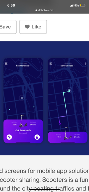
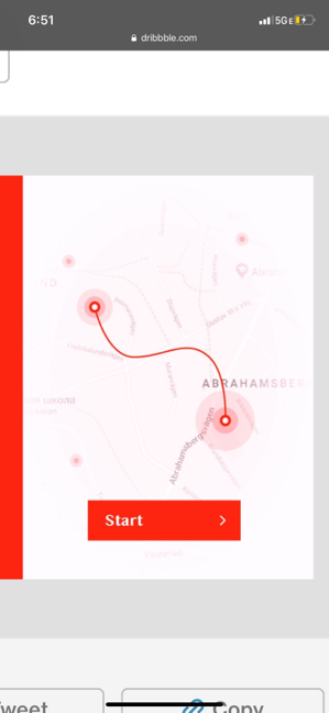
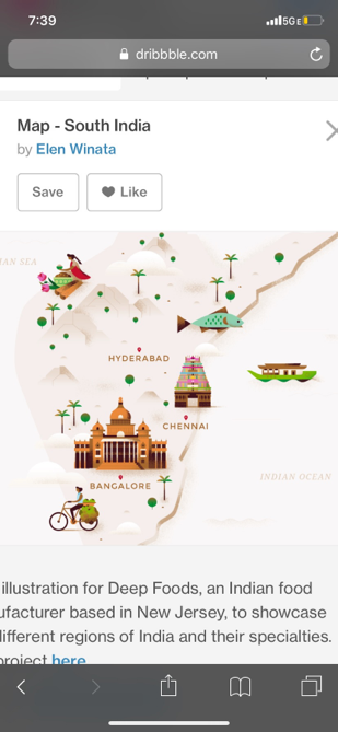

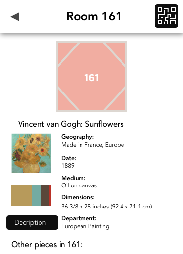
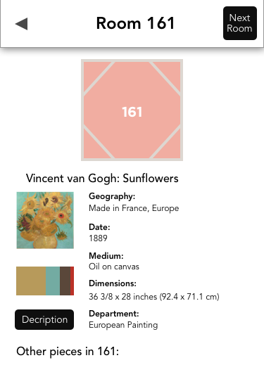
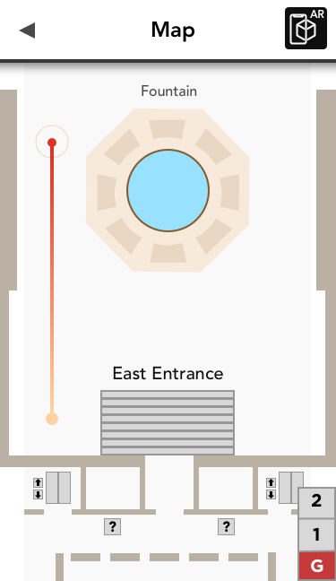
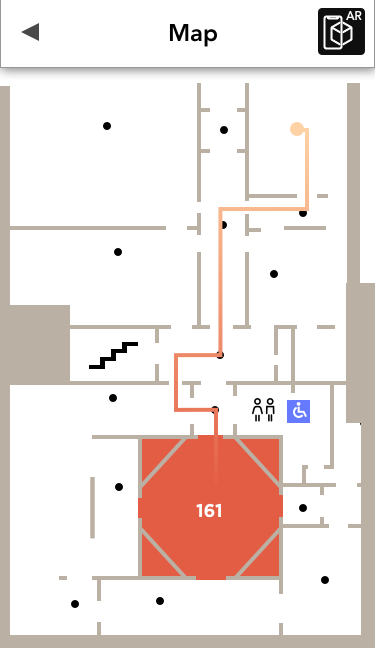

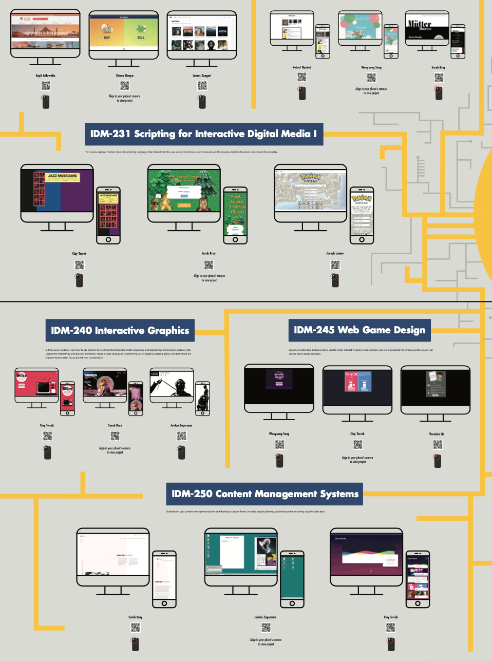
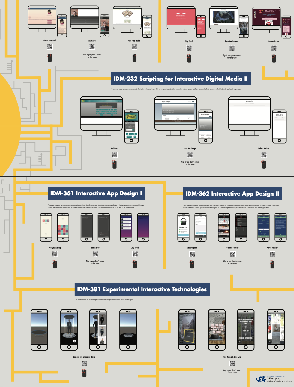
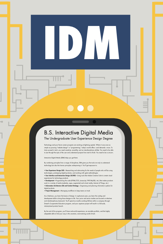
Commissioned by Drexel University, this project involved designing a high quality large-print poster to showcase the curriculum of the Interactive Digital Media major. The process started with design discovery, including font and color selection, style tiles, and overall aesthetics, evolving into various versions that were narrowed down to this final design.
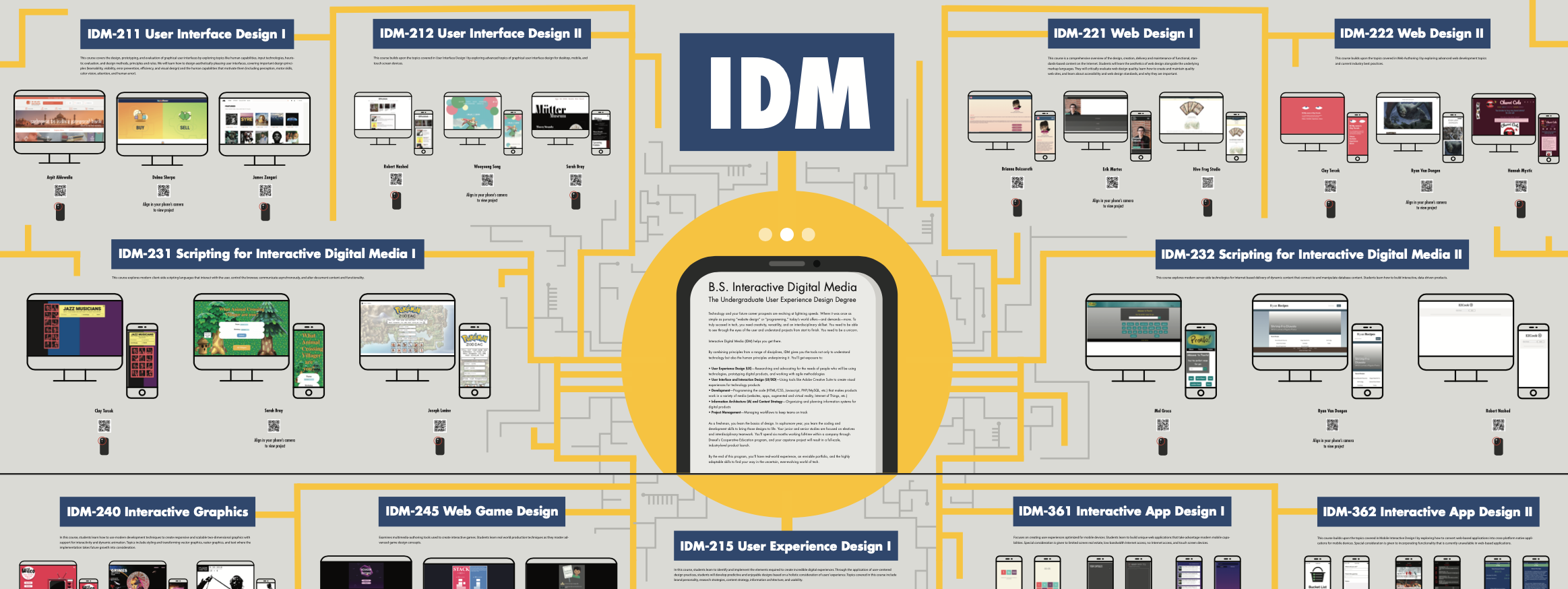
Information architecture planning akin to a site map was crucial to organize content effectively. The task also included curating a selection of remarkable student projects, represented via QR codes that you could visit on your mobile phone by scanning it with the camera for interactivity. The final design, displayed in Westphal College's lobby, provides a comprehensive and engaging overview of the major for prospective students.

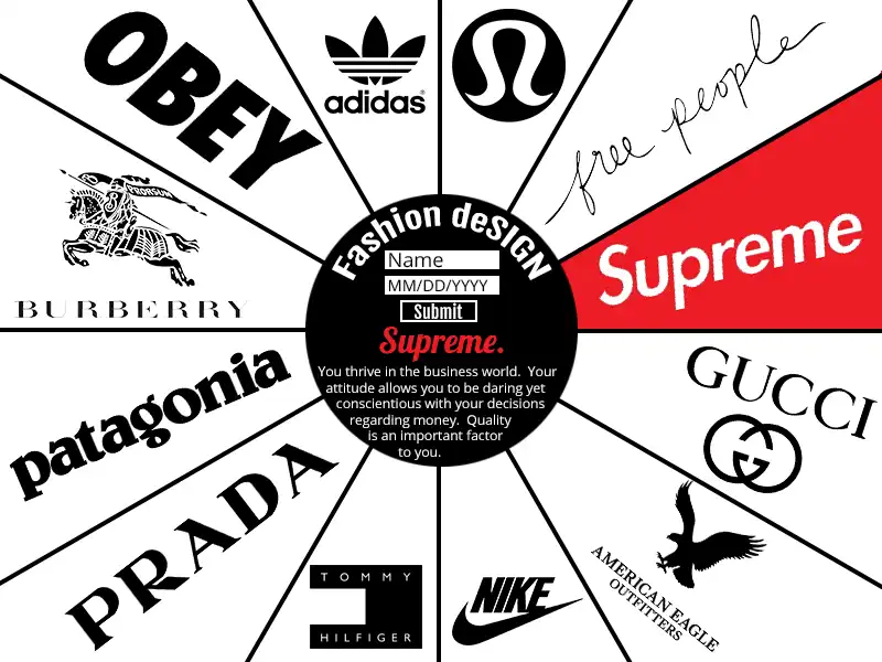
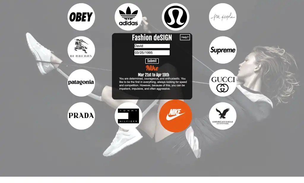
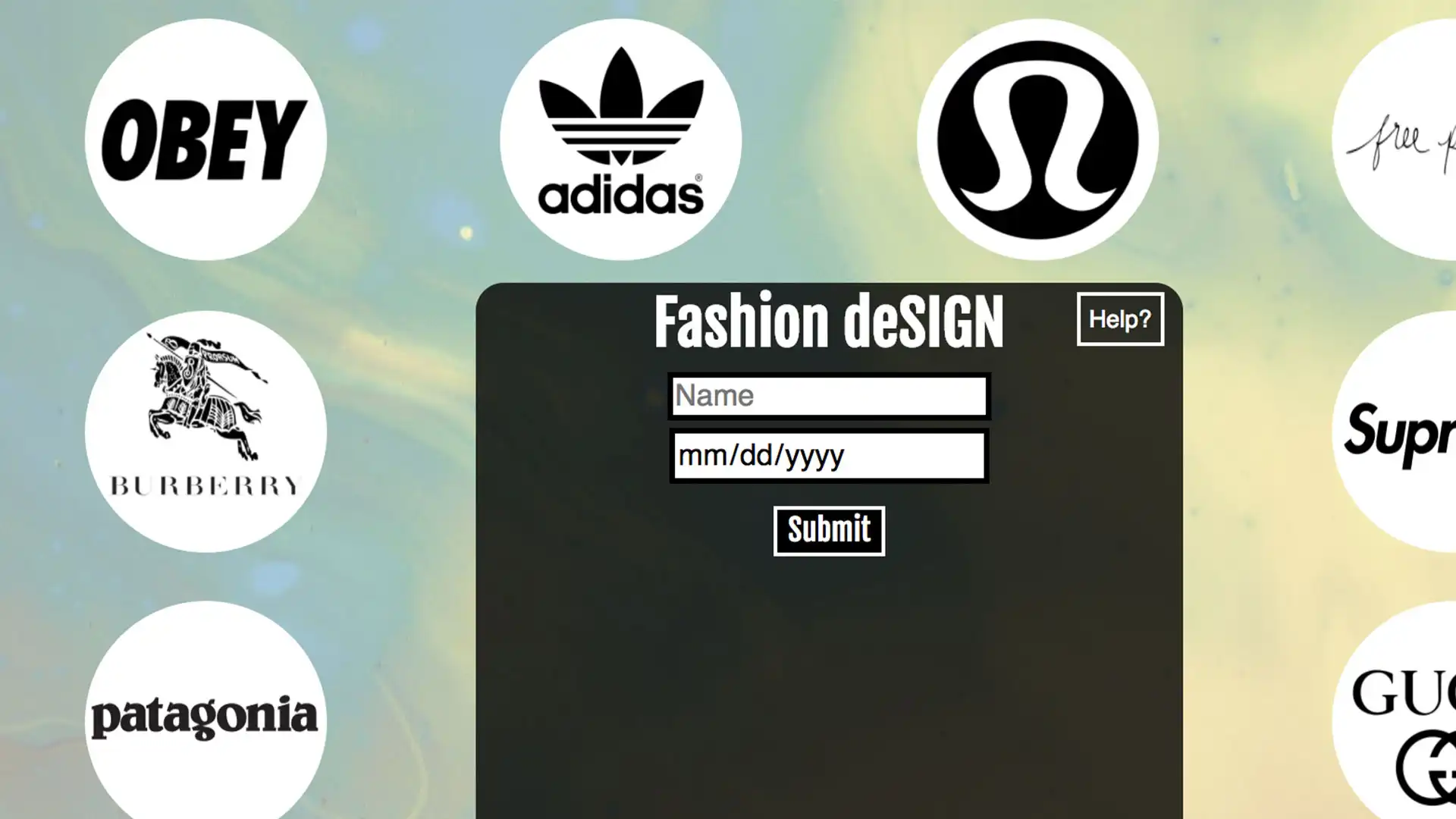
Designer Astrology is a zodiac calculator web project created during my second year at Drexel. The application, developed using HTML, CSS, and JavaScript, matches users with fashion brands based on their Zodiac signs. It required brand research and user testing to accurately match the brands' vibes and moods with the Zodiac signs.
A live demo can be accessed for desktop viewing only, as the project and class was mainly tailored to learning JavaScript development with inputs, layouts, basic animations, adding audio, as well as, control structures, exception handling, loops, and conditional statements. The class focused less on pixel pefection with the overall layout and spacing, and more attention and goals were set for the overall functionality of the JS calculator. Demo

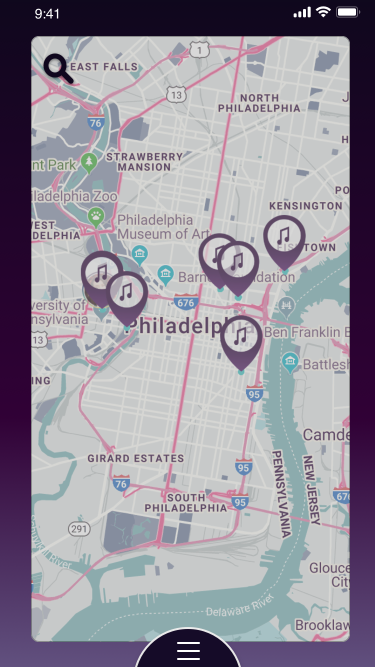
Souvinear, a two-year graduation project, showcases a small portion of my work during the early stage conceptualization of potential motion characteristics in the app's UI, initially intended for desktop screen viewing. The development process included rudimentary initial sketches and early static prototype screens of the app focusing on animation, layout, visual design, iconography, and product mockups. Demo (best viewed on desktop)


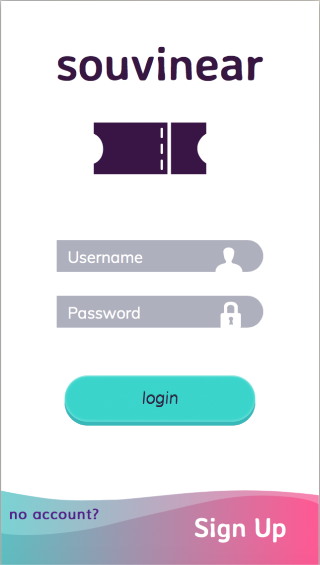
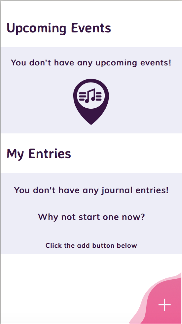
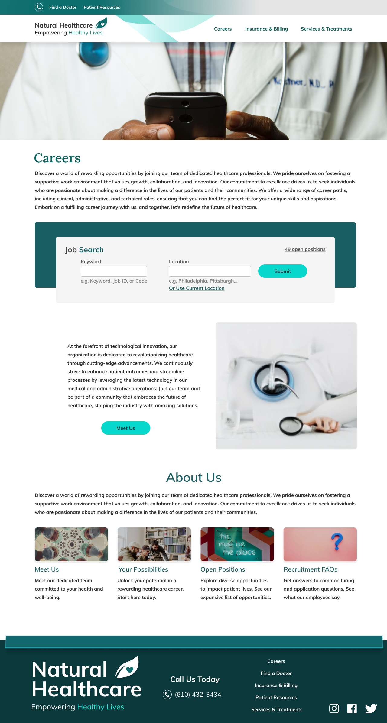
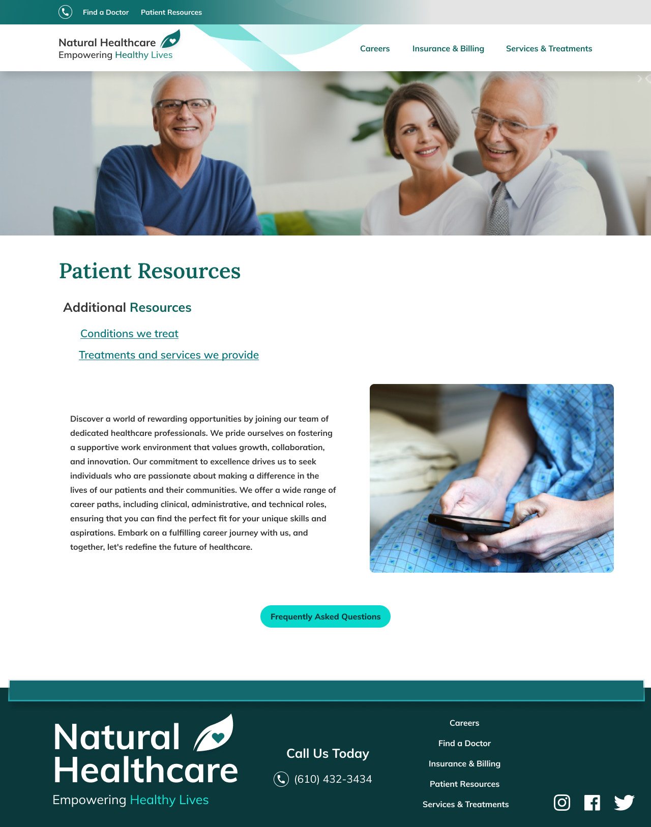
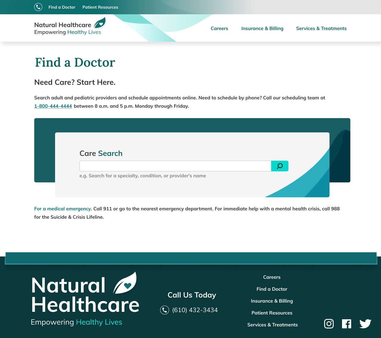
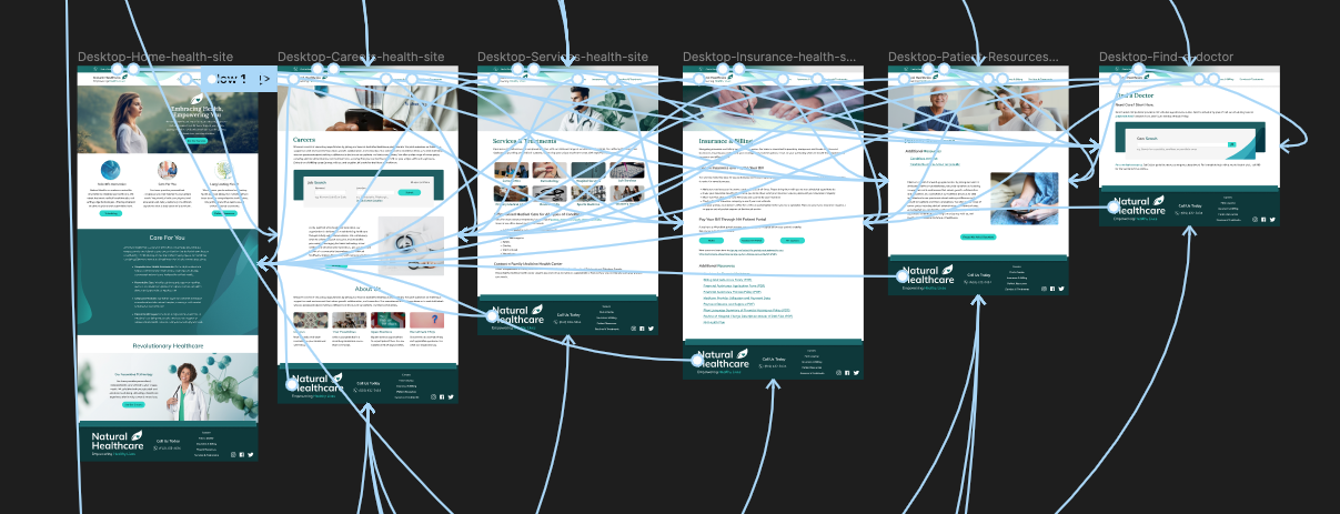
This project presents the development of an interactive prototype for a fictitious healthcare company, Natural Healthcare, designed in Figma. Spanning from the initial wireframing stage to high fidelity design, it emphasizes a user-centric approach, with active buttons and accessible input fields.


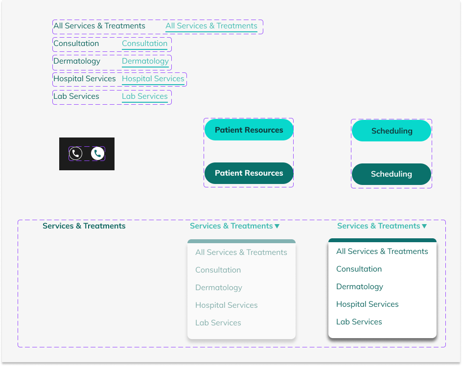
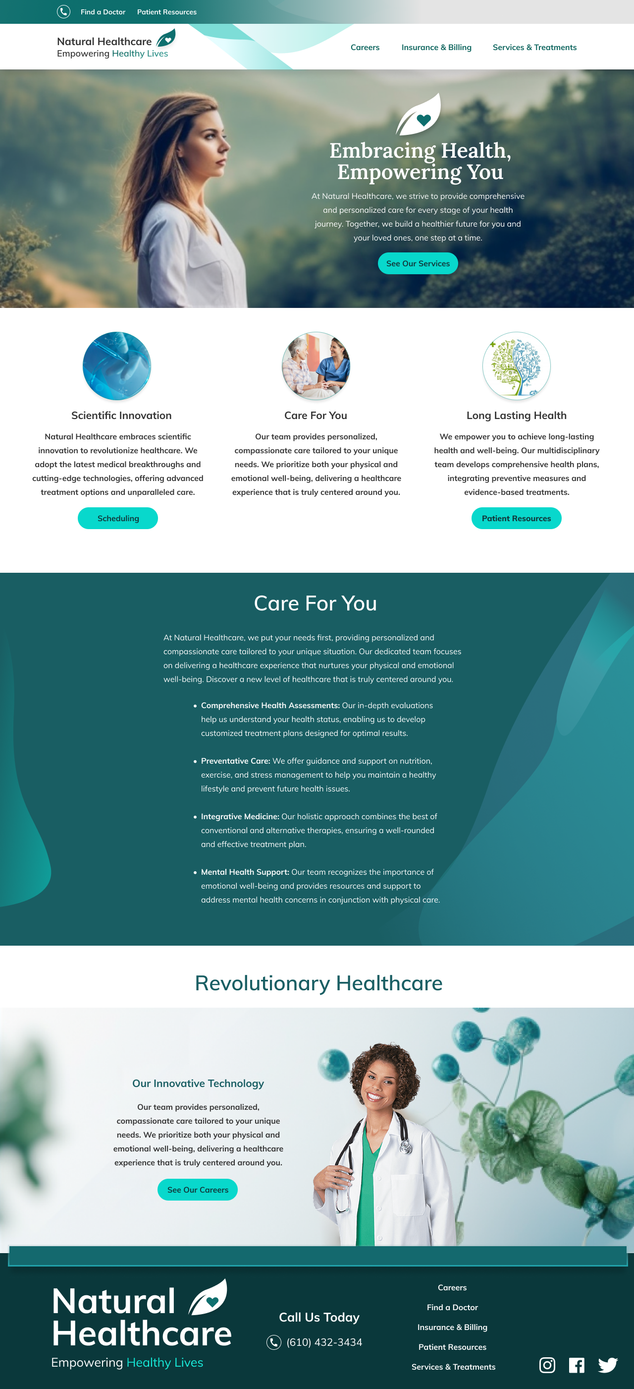
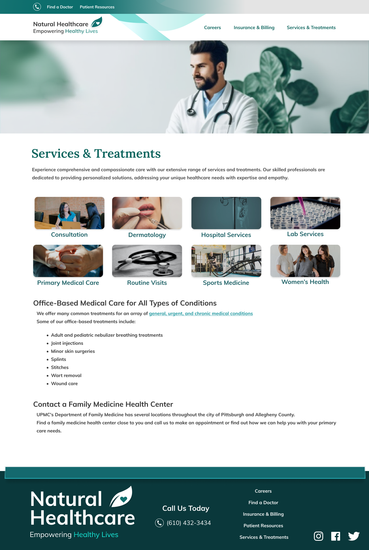


A mix of calming greens and blues complement stunning visuals to provide an aesthetically pleasing, user-friendly experience. With a live link to the Figma prototype, this project offers an in-depth look into meticulous detail orientation and proficiency in Figma, crafting a seamless web experience in the healthcare domain. Figma Prototype Link
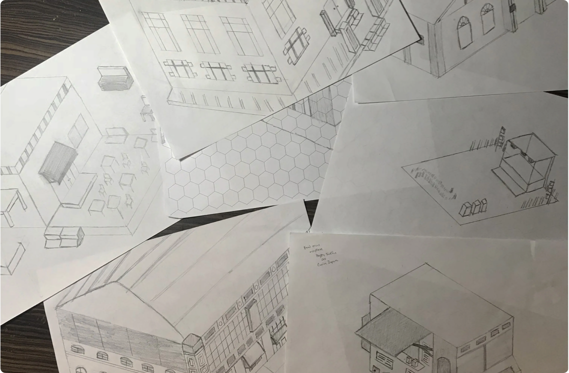
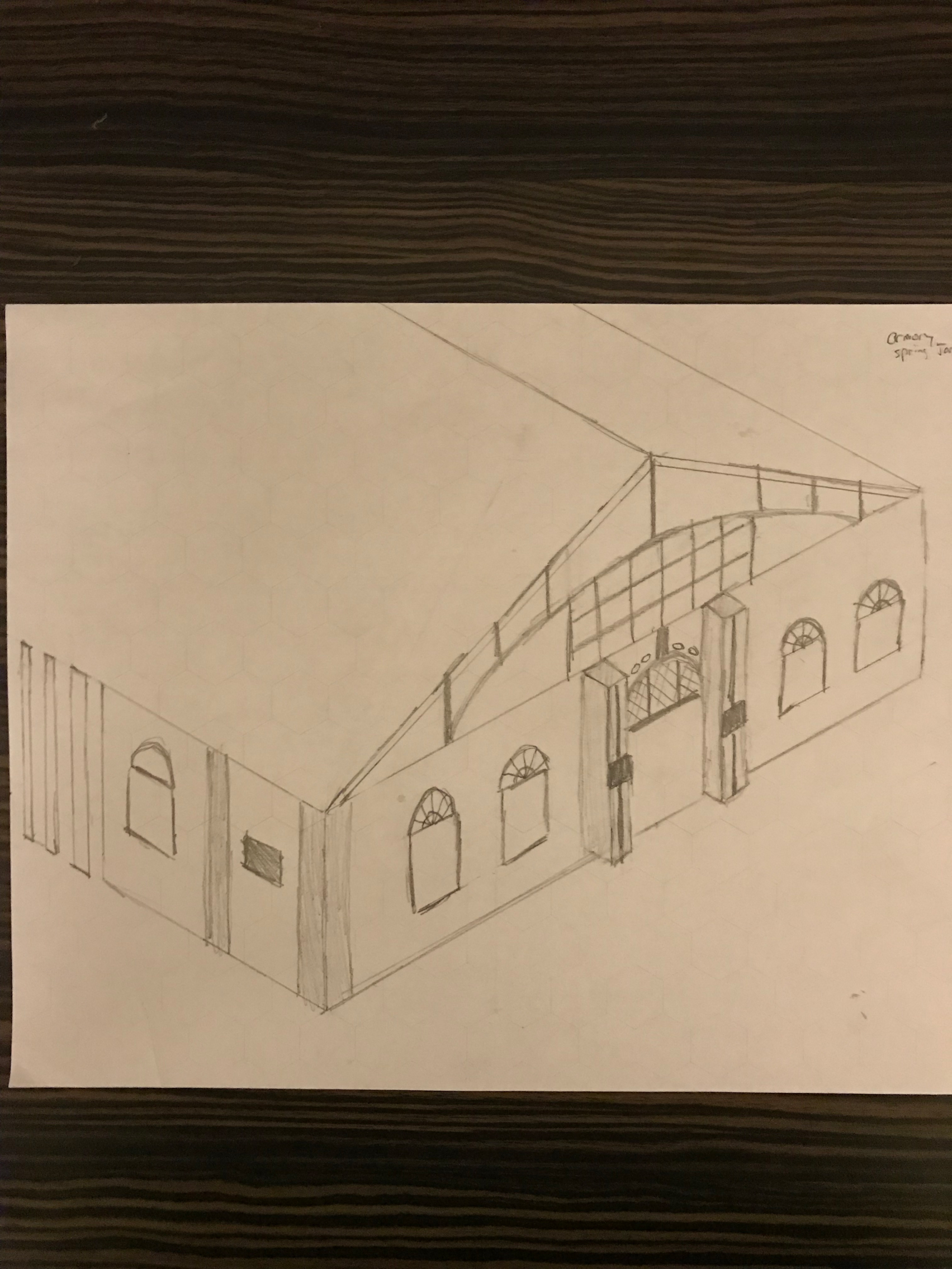
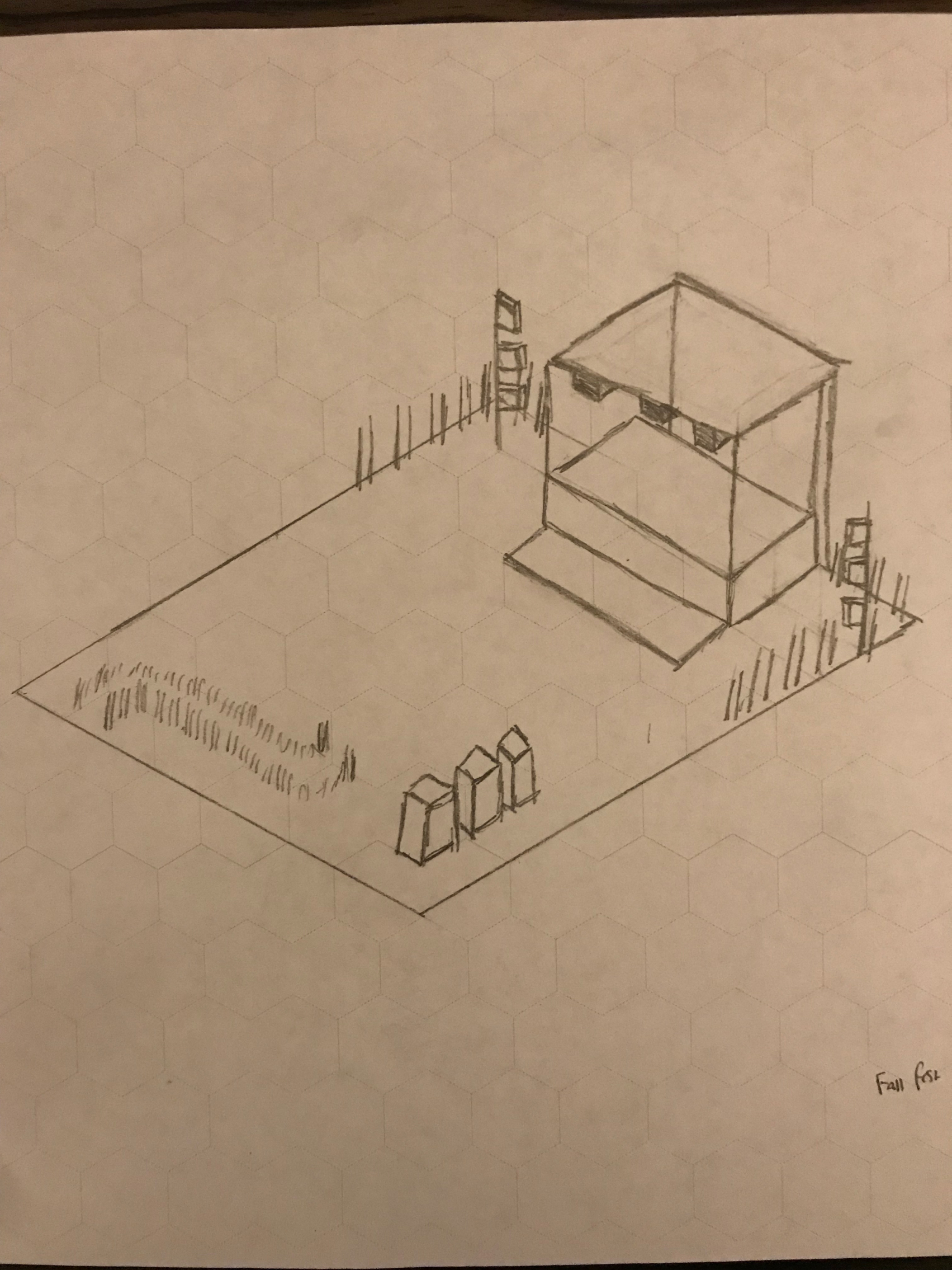
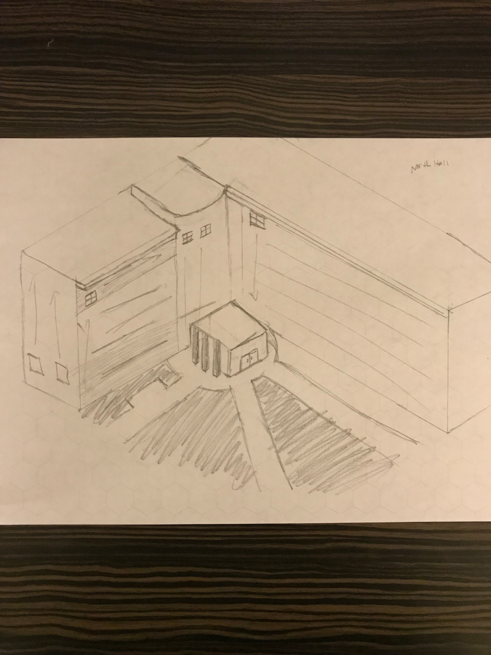
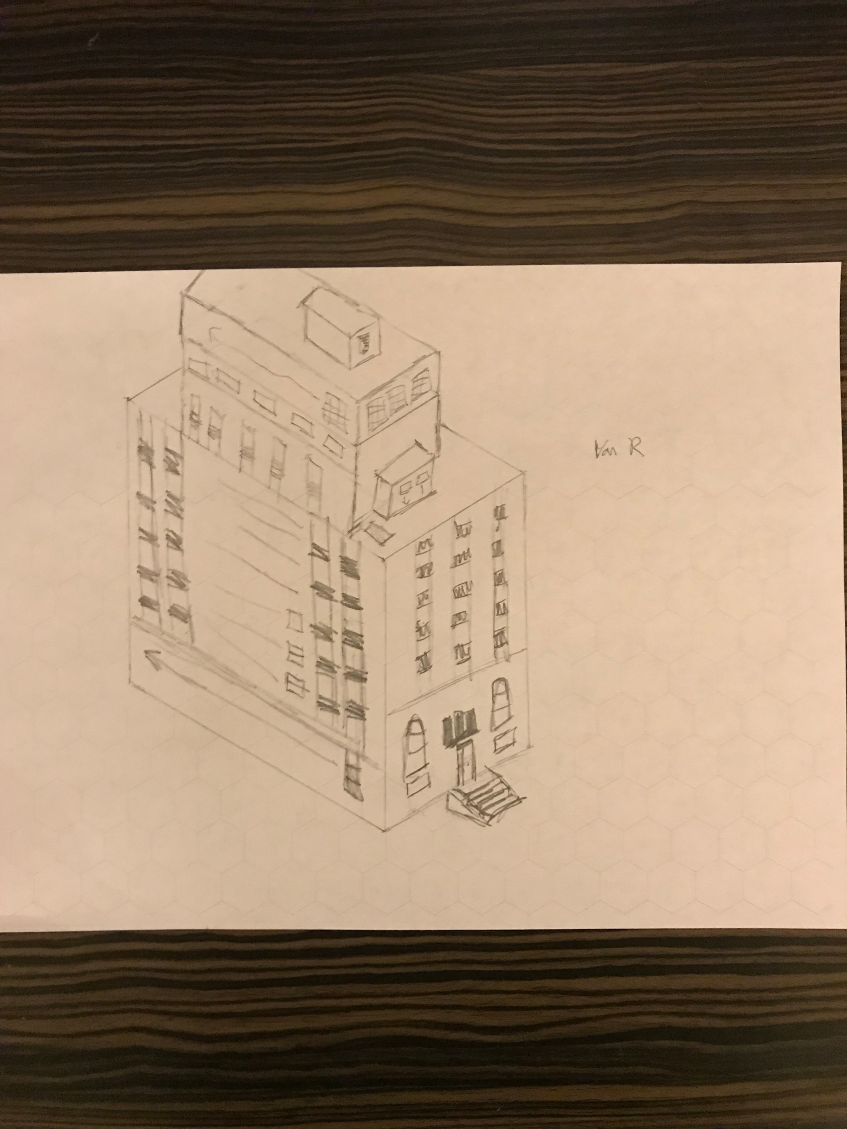
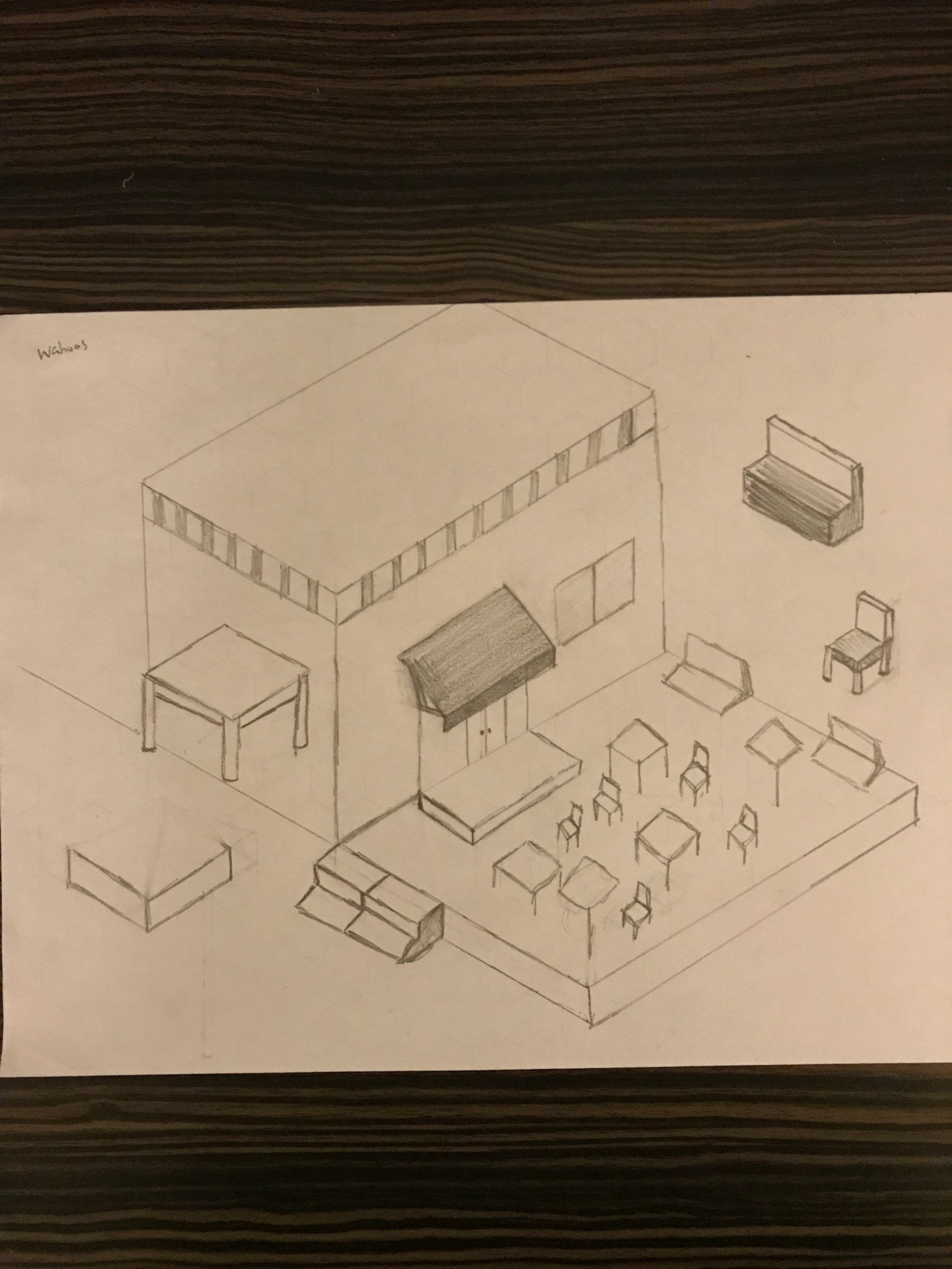
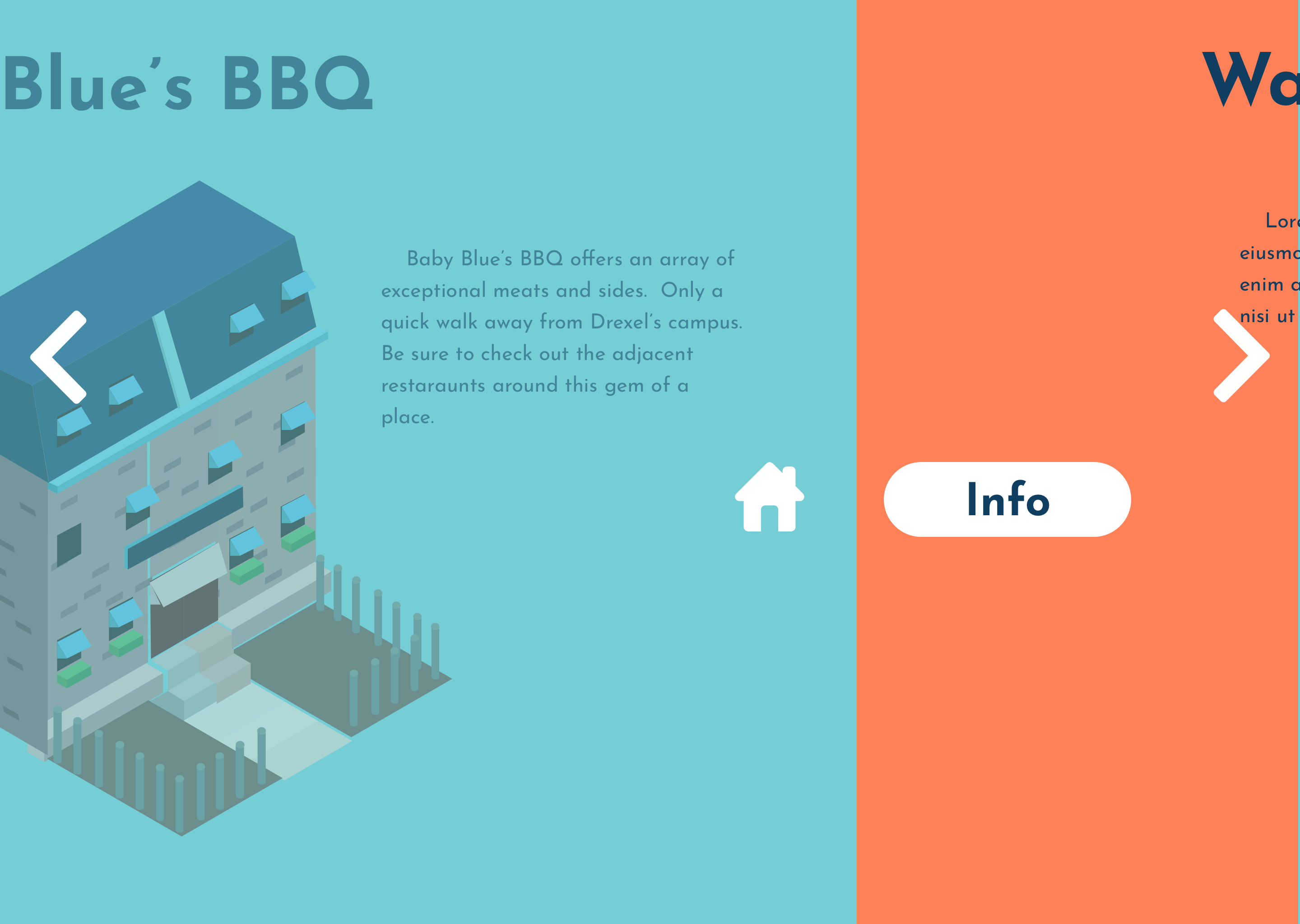
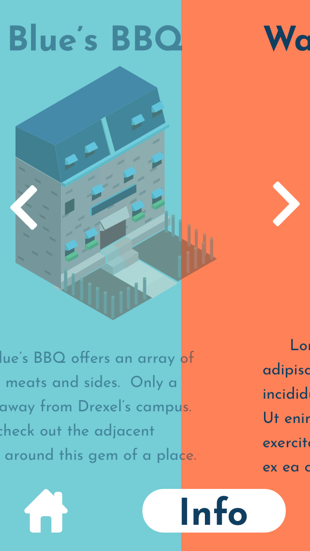
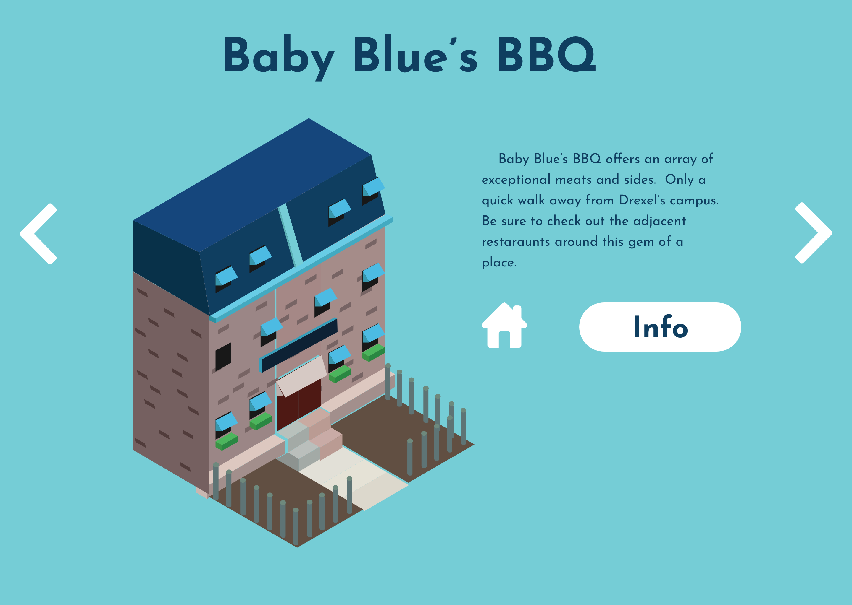
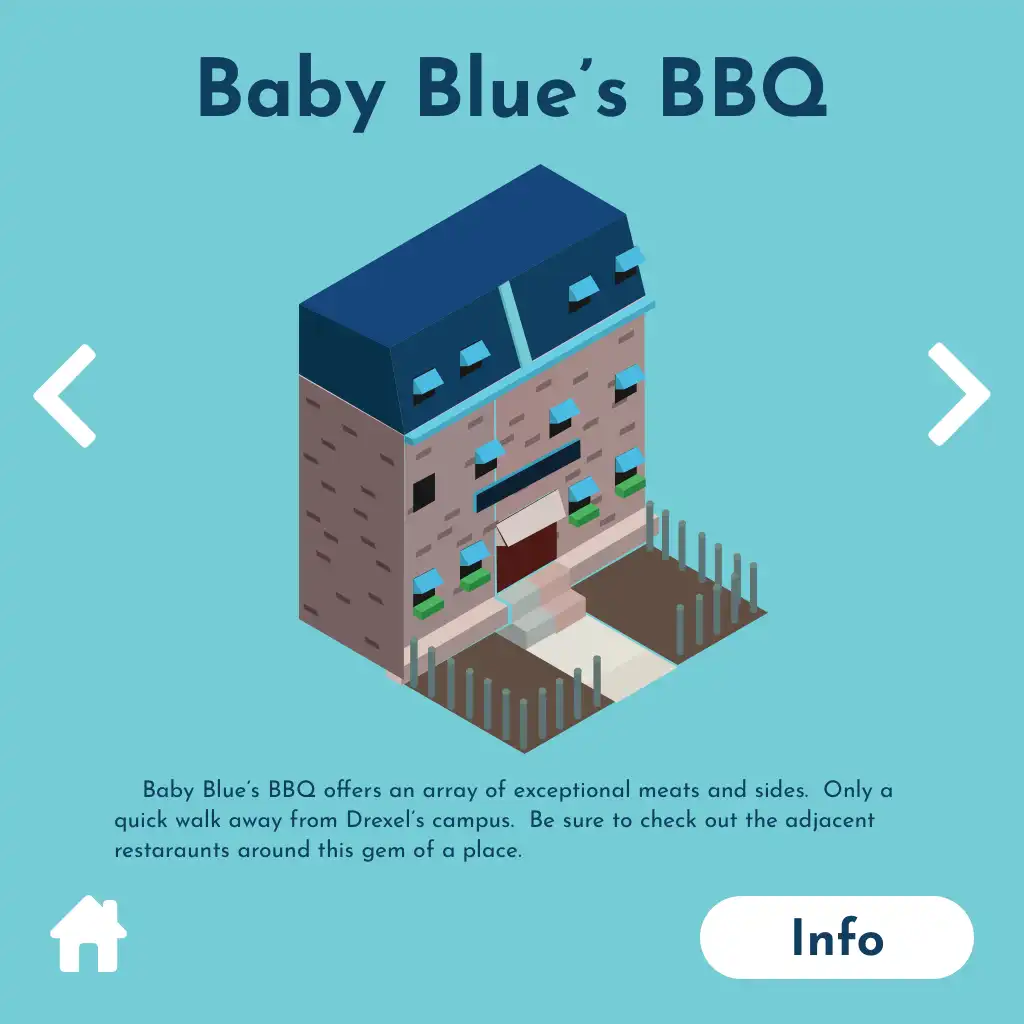
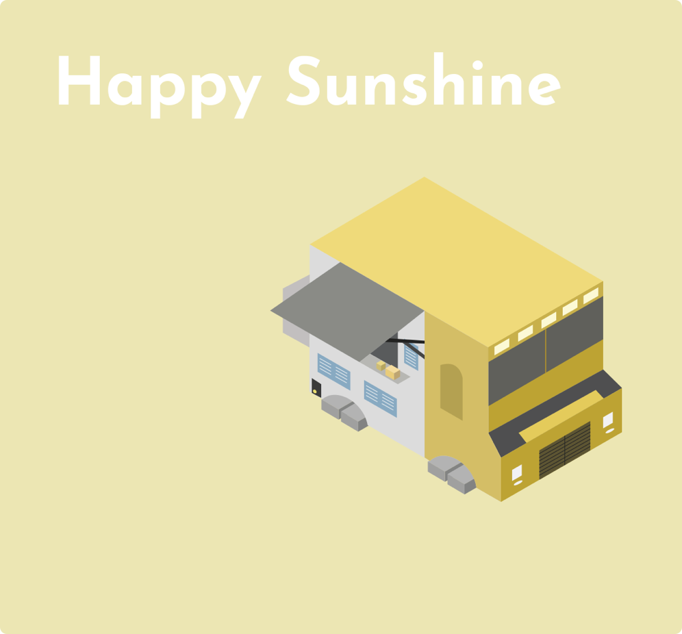
As part of the three capstone project experiences, the Drexel Interactive App featured high fidelity isometric design assets that were designed to depict landmark locations around Drexel and the city. The designs spanned from preliminary sketches to finalized high fidelity graphic images. Showcased landmarks included popular locations like the Happy Sunshine Food Truck among others. A digital print of the isometric asset was also included, which served as a guideline for creating the isometric designs.





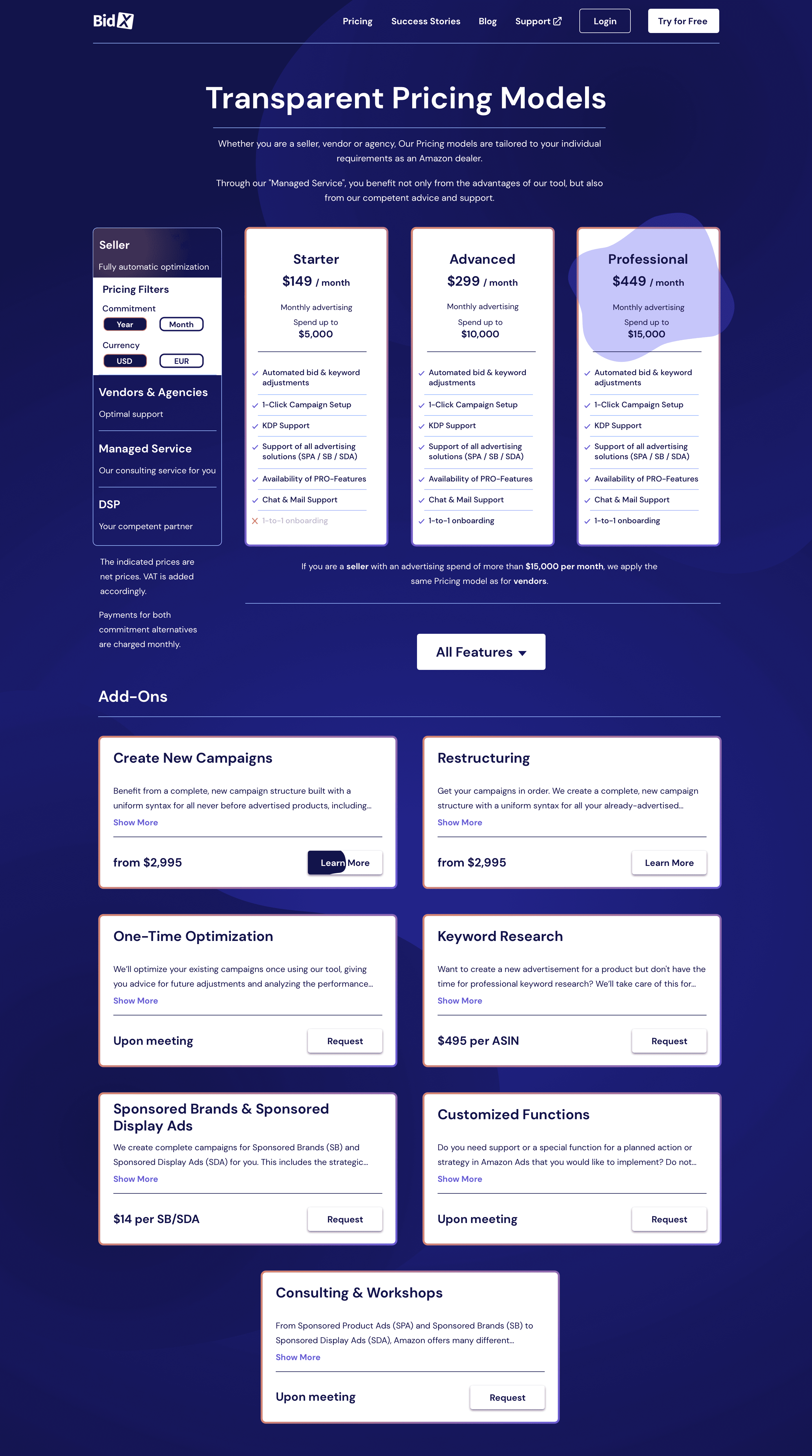
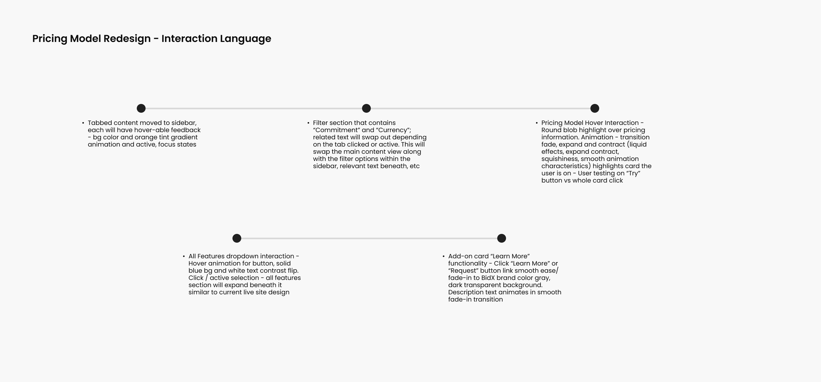
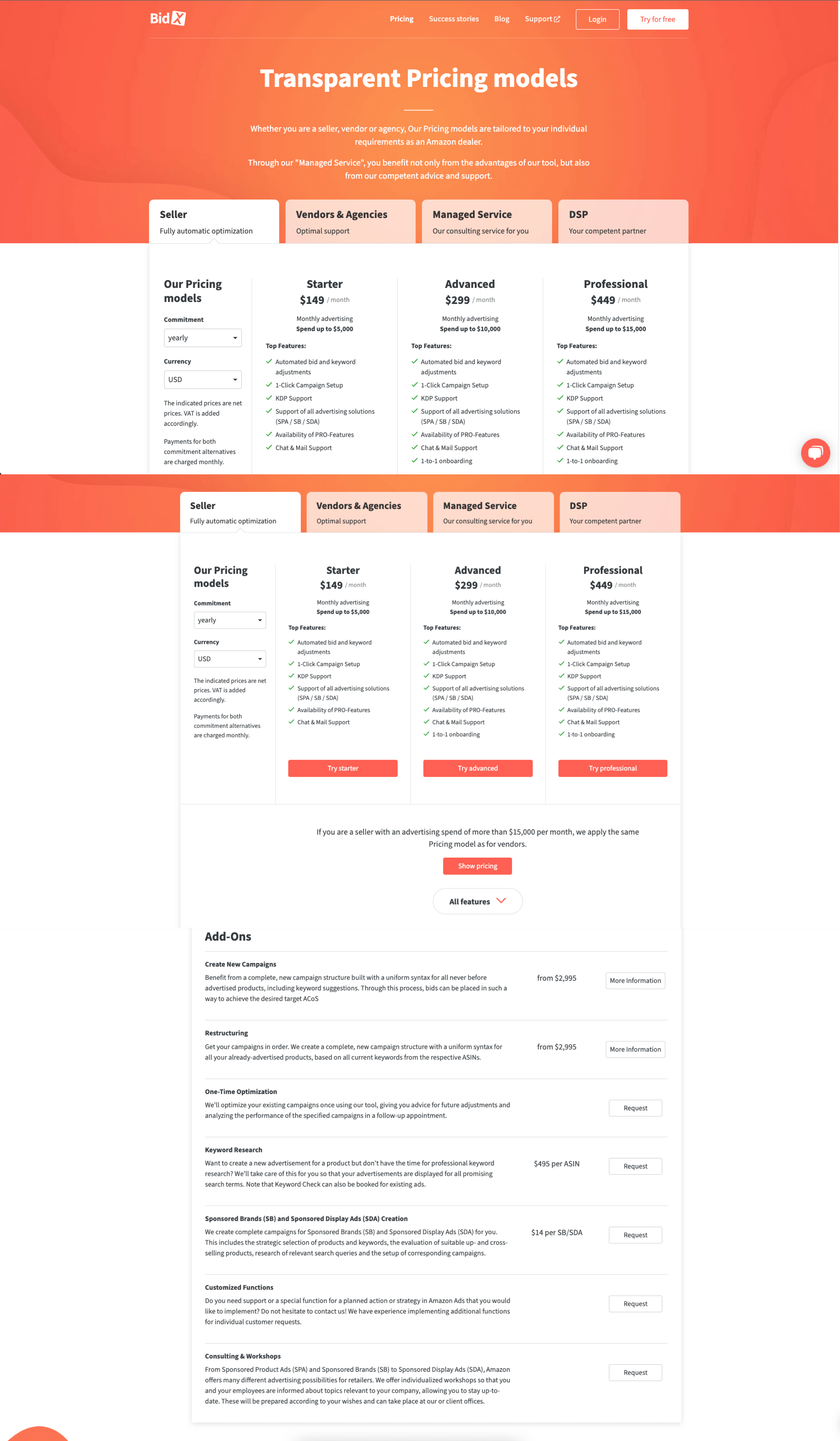
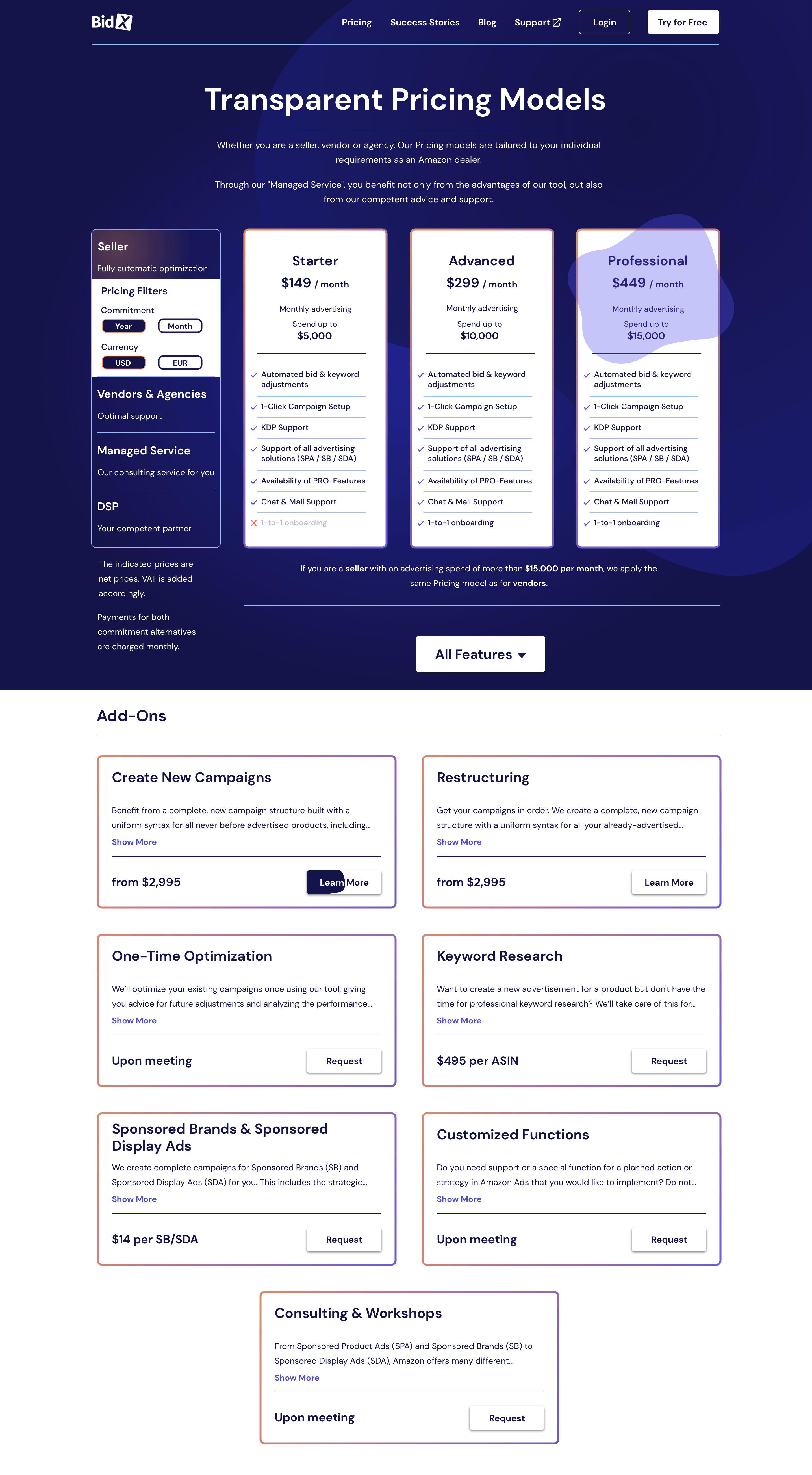
This conceptual project is a redesign of a pricing model section for an eCommerce services company. Transitioning from a vivid, passionate orange-red to a calm, grounded deep blue color palette, the project also contains some well-needed UX adjustments to the flow of particular interactions and design elements.
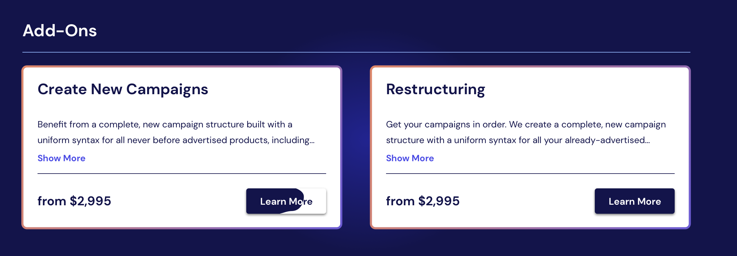
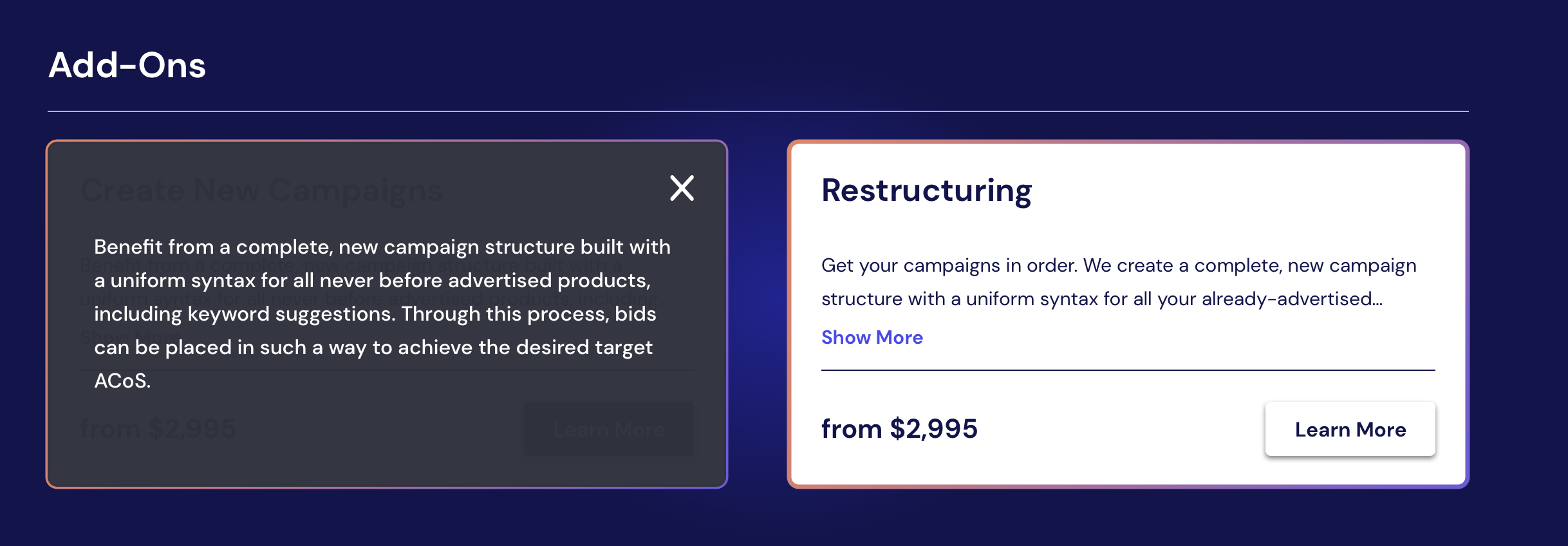
The redesign includes two versions, one featuring a stark contrast with a white background in the add-on section. It pays special attention to the flow of interactions and the overall user experience in eCommerce contexts, from micro-interactions to state progressions.

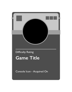
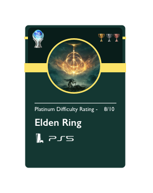
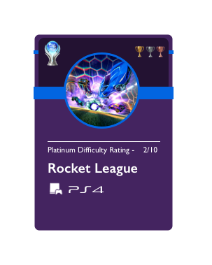
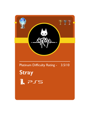
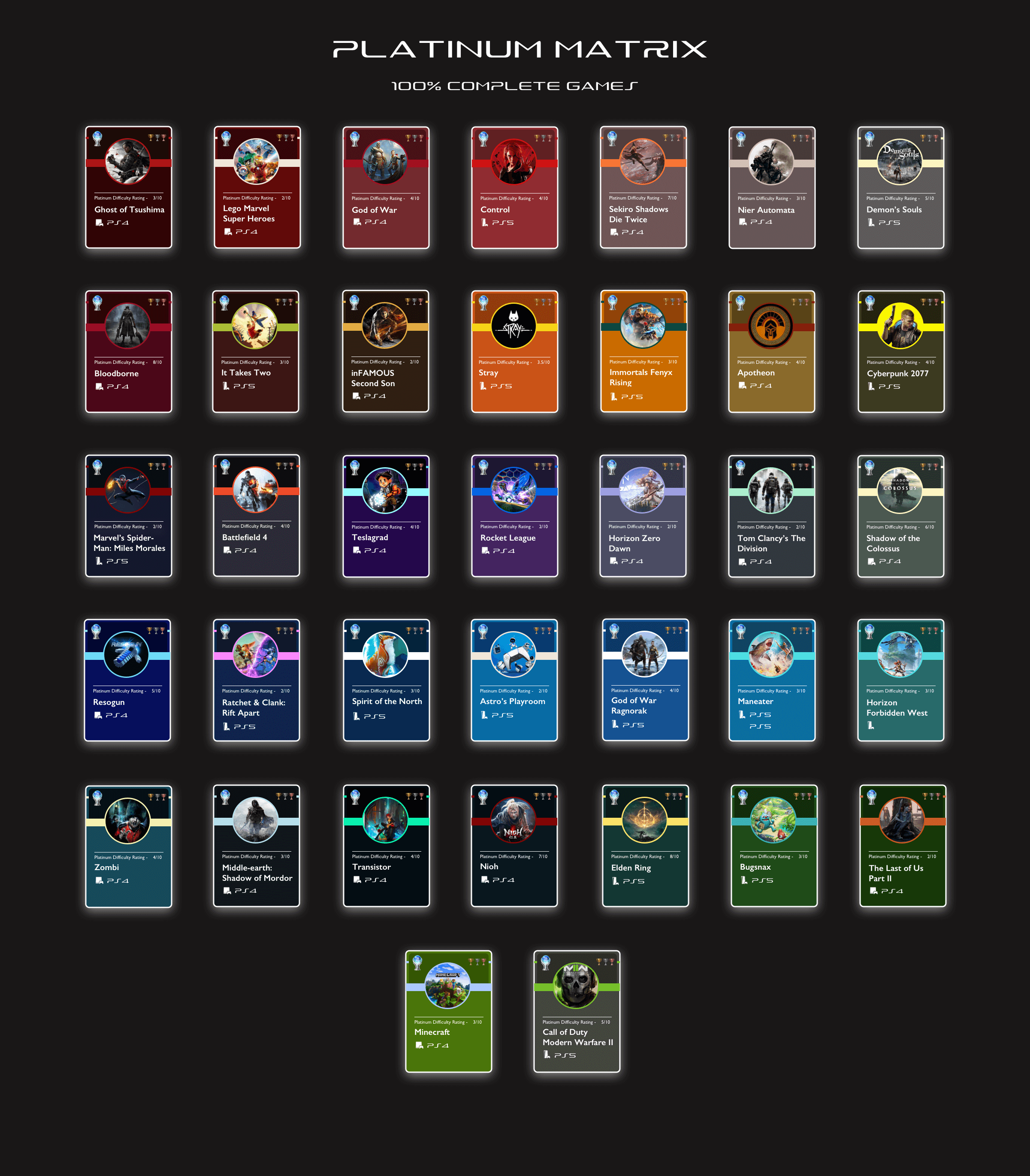
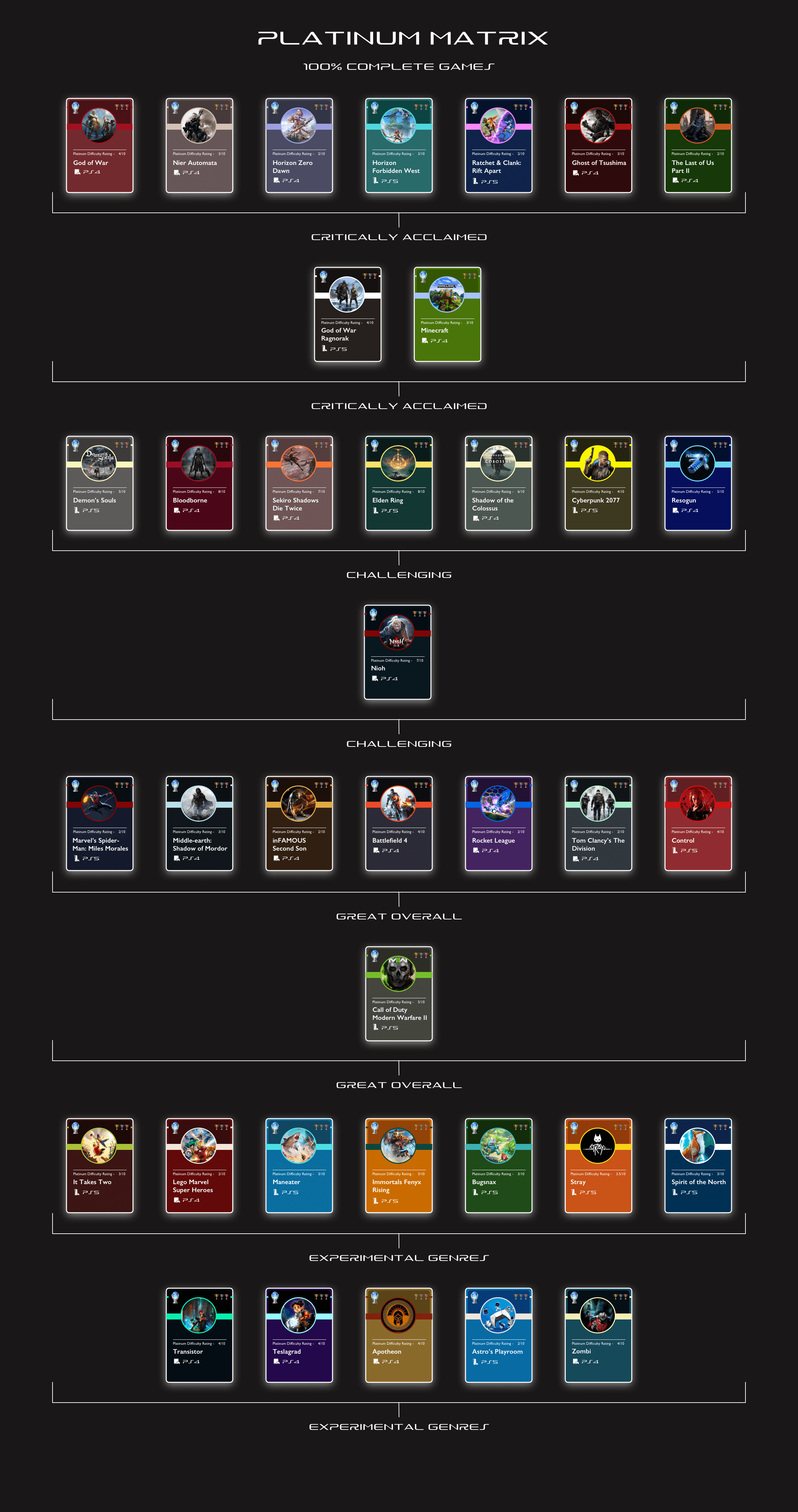
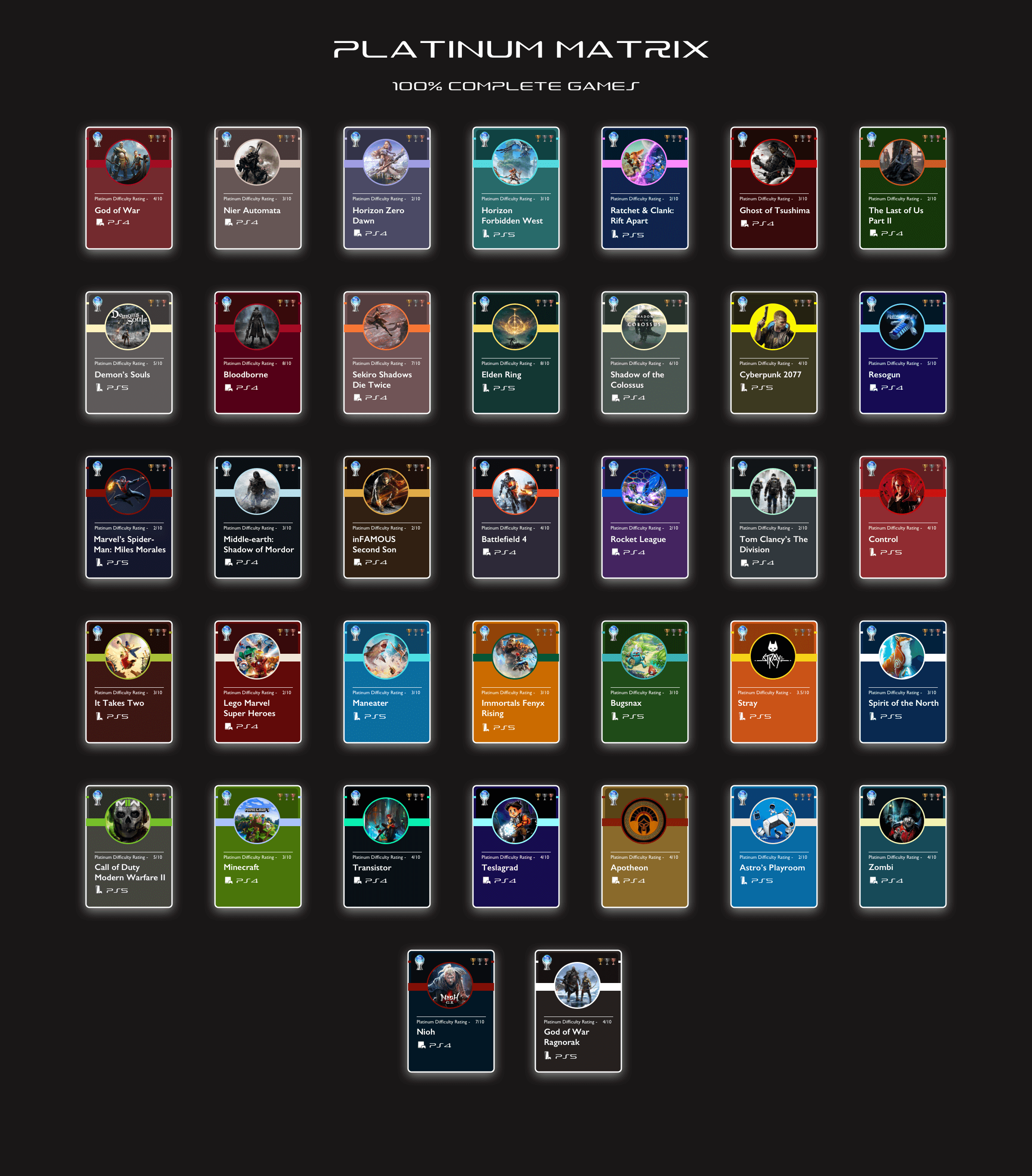
This project presents a creative and personalized approach to celebrating gaming milestones. Utilizing Figma, a card-style grid matrix design was developed for showcasing platinum trophies from the PlayStation platform - a testament to achieving 100% completion in a game. The design process led to three distinct layouts: color-labeled, trophy-categorized, and a default view, each depicting the collected achievements over the years.
The project distinguishes between PlayStation 4 and PlayStation 5 games with console icons to assigning difficulty ratings for each achievement. Custom colors and labels were created for each card further enhance the viewing experience, demonstrating a deep understanding of UI design. I plan to update these designs to better fit into the greater context of Sony's PlayStation UI system (filter options, different views, user-generated custom colors).


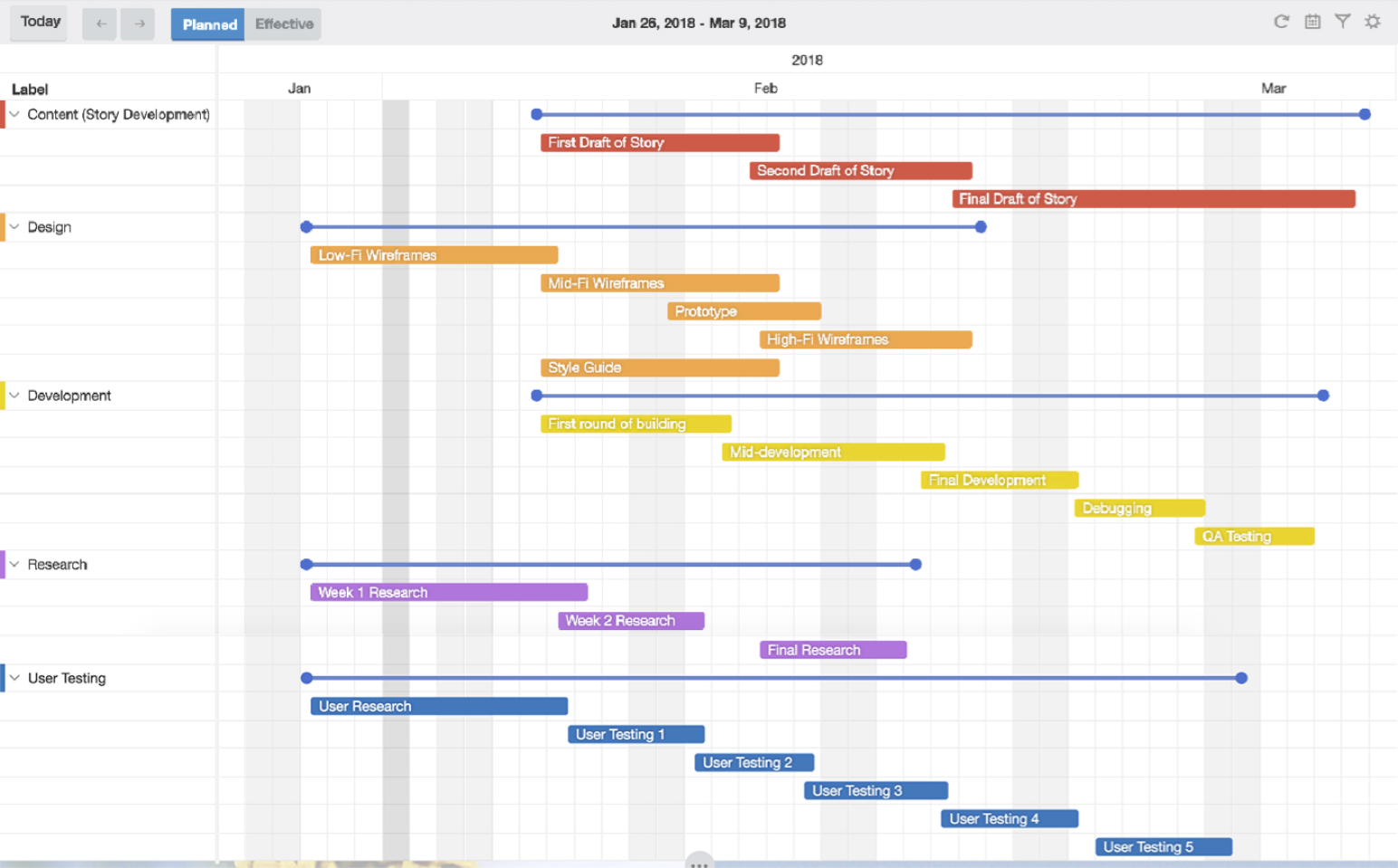
Culminating a blend of technical skills, project management, visual design, and UX principles, this project presents a live, responsive redesign of a personal portfolio website.
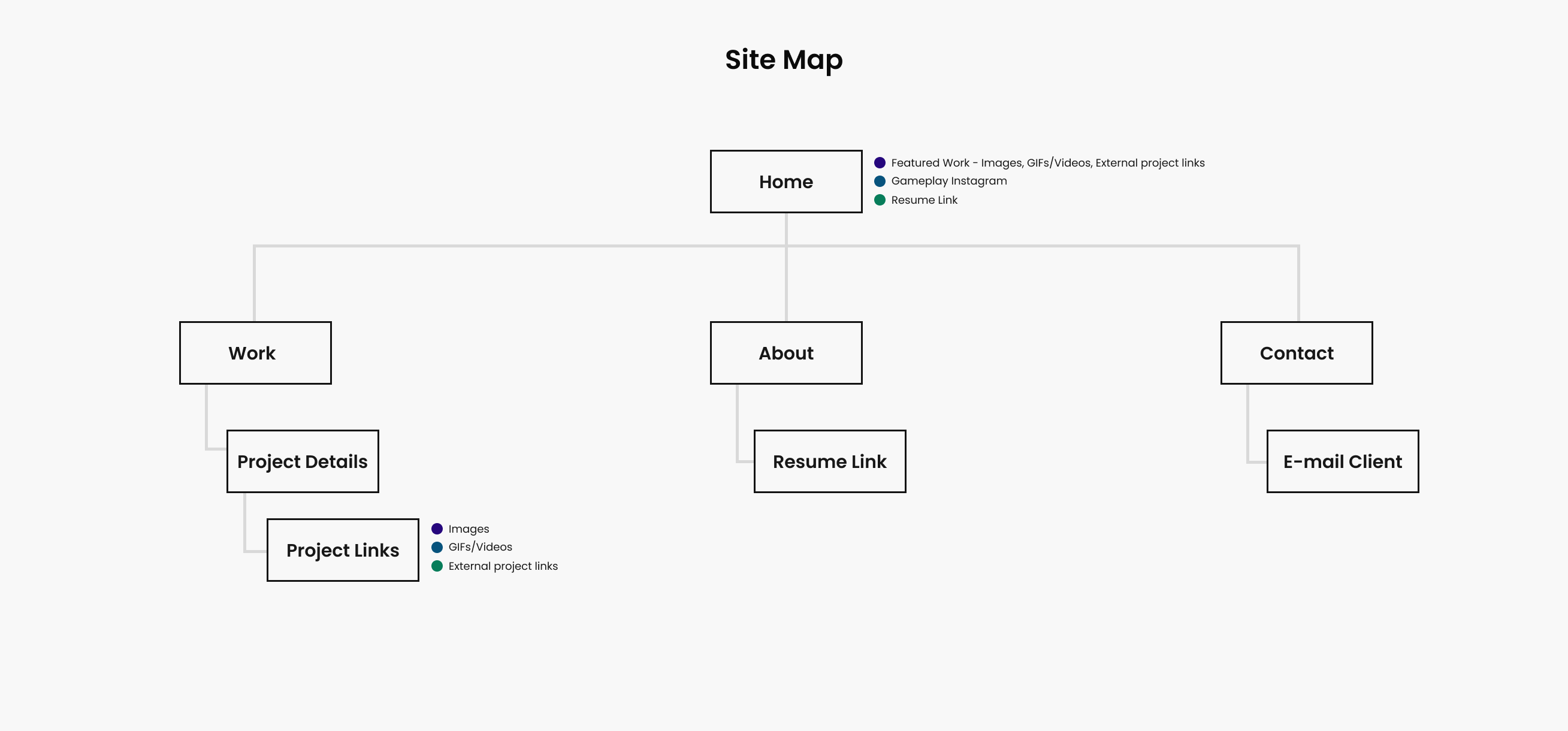
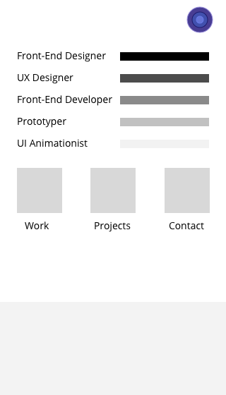
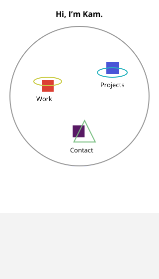
Showcasing an evolution from low-mid to high fidelity mockups, the project focuses on standard web accessibility semantics using HTML, CSS, and JavaScript (jQuery), enhanced with GreenSock animations. The redesigned website not only represents a professional image but also embodies personal creativity, with a lightweight yet elegant feel.



Take a gander.